Semantic HTML as Interface Infrastructure
The foundation behind accessible design systems and resilient UI.
Semantic HTML is the building blocks of the web.
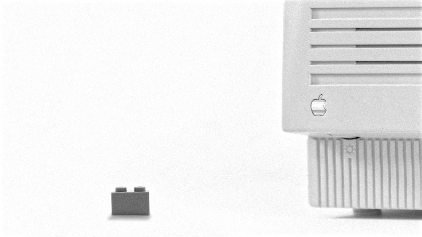
I tend to think about semantic HTML the same way I think about Lego bricks. The power is not in how they look individually, but in the fact that they connect predictably. If you glue bricks together because it was faster, you can still build something. You just cannot rebuild it later without breaking everything.
When teams talk about infrastructure, they usually mean tooling, pipelines, or frameworks. But long before a component library or design token system does any work, the HTML underneath has already decided whether the interface will be accessible, maintainable, and understandable.
Semantic HTML is not a styling choice. It is interface infrastructure.
As a designer who builds and maintains design systems, and who regularly works close to implementation, I have learned that most accessibility problems and most painful developer hand-offs trace back to one thing. The markup does not express intent. Everything else is a workaround.
This article treats semantic HTML as the structural layer of a design system. The part that makes accessibility predictable, components portable, and collaboration smoother across design and engineering.
What Semantic HTML Actually Means in Practice.
Semantic HTML means choosing elements based on what they represent, not how they look.
A <button> represents an action. A <nav> represents navigation. A <main> represents the primary content of a page. These elements communicate meaning to browsers, assistive technologies, search engines, and developers reading the code.
A <div> communicates nothing.
<!-- Visually identical, structurally different -->

<div class="cta">Save</div>

<button type="button">Save</button>
Only one of these:
- Is focusable by default
- Responds correctly to keyboard input
- Announces itself properly to screen readers
- Works without additional JavaScript or ARIA
Semantic HTML encodes behavior, not just structure. That is why it belongs at the infrastructure layer.
Why Semantic HTML Is a Design System Concern
Design systems often focus on components, tokens, and documentation. But if the underlying markup is inconsistent or incorrect, those layers inherit the problem.
Accessibility Depends on Structure
Screen reader users do not navigate interfaces visually. They navigate by landmarks, headings, and semantic roles.
If your system does not consistently use <header>, <nav>, <main>, <section>, and <article>, users lose their ability to move efficiently through the interface.
Think of accessibility like making sure every brick connects using the standard stud pattern. When you follow the rules, anyone can build with your system, regardless of the tools they use.
<header>
  <nav aria-label="Primary navigation">
    <ul>
      <li><a href="/work">About</a></li>
      <li><a href="/work">Work</a></li>
      <li><a href="/writing">Writing</a></li>
      <li><a href="/work">Contact</a></li>
    </ul>
  </nav>
</header>

<main id="content">
  <h1>Hello World</h1>
</main>
This is not optional accessibility polish. This is baseline usability.
Developer Hand-offs Get Easier
When markup reflects intent, developers do not have to infer meaning from class names or comments.
<article>
  <header>
    <h2>Release notes</h2>
  </header>
  <p>Version 2.1 highlights.</p>
</article>
This reads the same way in design docs, code review, and assistive technology. That alignment reduces misinterpretation and rework.
Design Systems Scale Better
Semantic consistency allows components to be reused in different contexts without breaking accessibility expectations.
A card component that is always an <article> behaves predictably. A navigation component that is always wrapped in <nav> is discoverable everywhere it appears.
Infrastructure decisions compound over time. Semantic HTML is one of the few that improves as systems grow.
This is also why I treat semantic HTML as a first-class concern in any design system work. When structure and accessibility are not explicitly checked early, they become expensive to retrofit later.
I keep a public design systems checklist that I use in my own work to sanity-check these decisions, especially around semantics, accessibility, and hand-off expectations. It is intentionally framework-agnostic and meant to be adapted, not followed blindly.
Check it out here: https://tylercoderre.com/projects/design-systems-checklist.html
Core Structural Elements as Interface Infrastructure
<header>
Represents introductory content for a page or section. It is not just a top bar.
<header>
  <h1>Settings</h1>
  <p>Manage your account preferences.</p>
</header>
<nav>
Used for groups of navigational links. If it helps users move through the product, it belongs here.
<nav aria-label="Account navigation">
  <ul>
    <li><a href="/profile">Profile</a></li>
    <li><a href="/security">Security</a></li>
  </ul>
</nav>
Multiple nav elements are acceptable as long as each is labeled clearly.
<main>
Defines the primary content of the page. There should only be one.
<a href="#content">Skip to content</a>

<main id="content">
  <h1>Reports</h1>
</main>
This is critical for keyboard and screen reader users. Every page should have a clear main landmark. Along with skip to content links to allow the bypassing of the navigation, letting users get straight to the page's content.
<section>
Groups related content under a common theme. Sections should almost always have a heading.
<section>
  <h2>Billing details</h2>
  <p>Payment and invoice information.</p>
</section>
If you cannot justify a heading, the content may not need to be a section.
<article>
Represents standalone, reusable content. This is especially relevant in design systems.
<article>
  <h3>Notification preferences</h3>
  <p>Control how you receive updates.</p>
</article>
Articles can be nested and reused across views without losing meaning.
<aside>
Supplementary content that is related, but not essential to the main flow.
<aside>
  <h2>Help</h2>
  <p>Need assistance with reports?</p>
</aside>
Think contextual, not secondary navigation dumping ground.
<footer>
Closing or supporting content for its nearest ancestor.
<footer>
  <p>Last updated <time datetime="2026-01-26">January 26, 2026</time></p>
</footer>
Pages, sections, and articles can all have their own footer.
Text-Level Semantics Designers Often Miss
Headings Define Structure, Not Style
Headings create a navigable outline. Visual size is irrelevant.
<h1>Dashboard</h1>
<h2>Recent activity</h2>
<h3>Last 7 days</h3>
Skipping levels breaks the outline for assistive technology.
<strong> & <em>
Communicate Meaning. These are not purely visual.
<p>This action is <strong>permanent</strong>.</p>
<p>Please <em>review carefully</em> before submitting.</p>
Screen readers announce emphasis and importance differently.
<time>
Enables machine readability.
<time datetime="2026-01-26">January 26, 2026</time><abbr>
Supports clarity and comprehension.
<abbr title="Web Content Accessibility Guidelines">WCAG</abbr>This is especially useful in technical and compliance-heavy interfaces.
Images and Media as Accessible Content
<img> & Alt Text
Alt text is not decorative filler. It is content.
<img src="flow.png" alt="User flow from login to dashboard">If the image adds no information, use empty alt text.
<img src="divider.svg" alt=""><figure> & <figcaption>
Use when an image needs explanation or reference.
<figure>
  <img src="layout.png" alt="Semantic page layout">
  <figcaption>Recommended structure for content-heavy pages.</figcaption>
</figure>
Interactive Elements as Infrastructure
<button>
Is not optional. If it performs an action, it should be a button.
<button type="submit">Save changes</button>This ensures keyboard support, focus behavior, and correct announcement.
If you need a checklist to make a div act like a button, it probably should not be a div.
<details> & <summary>
Native disclosure that supports progressive enhancement.
<details>
  <summary>Accessibility considerations</summary>
  <p>This component uses native semantics.</p>
</details>
This works without JavaScript and integrates well with design systems.
Forms and Controls
Native form elements provide built-in accessibility and predictable behavior.
<form>
  <label for="email">Email address</label>
  <input id="email" type="email" required>
  <button type="submit">Submit</button>
</form>
Rebuilding form controls should be the exception, not the default.
ARIA as an Enhancement, Not a Fix
ARIA should clarify behavior when native semantics fall short.
Avoid this:
<div role="button" tabindex="0">Save</div>Prefer this:
<button>Save</button>If ARIA is doing heavy lifting, something upstream is wrong. While ARIA is a powerful tool. It is not a get-out-of-semantic-jail-free card.
A Complete Semantic Page Example
<!doctype html>
<html lang="en">
<head>
  <meta charset="utf-8">
  <title>Semantic HTML as Infrastructure</title>
</head>
<body>
  <header>
    <nav aria-label="Primary navigation">
      <a href="/">Home</a>
      <a href="/system">Design system</a>
    </nav>
  </header>

  <main id="content">
    <article>
      <header>
        <h1>Semantic HTML as Interface Infrastructure</h1>
        <time datetime="2026-01-26">January 26, 2026</time>
      </header>

      <section>
        <h2>Why structure matters</h2>
        <p>Semantic markup underpins accessibility and scalability.</p>
      </section>
    </article>

    <aside>
      <h2>Related resources</h2>
      <a href="#">Accessibility checklist</a>
    </aside>
  </main>

  <footer>
    <p>© 2026</p>
  </footer>
</body>
</html>
Final Thoughts
Semantic HTML is not a detail. It is the structural layer that everything else relies on.
When designers treat markup as infrastructure, accessibility becomes predictable instead of reactive. Design systems become more portable. Developer hand-offs become clearer. Interfaces become more resilient over time.
This mindset is what I use when building my own site and the systems I maintain, because the cost of getting it wrong always shows up eventually.
You might not always get it right the first time. I falter from time to time, it's a lot to keep track of. That's why I use guides and checklists, do my best, and clean up my mess when pointed out.
If the HTML communicates intent clearly, the system has a chance to succeed. If it does not, no amount of tooling will fix it later.
Semantic HTML is where accessible design systems actually begin.
Still Curious?
Browse One of My Other Case Studies, Writings, Resources, Or Reach out for a Chat.
You can contact and connect with me through email, on Dribbble, or LinkedIn as well.