A Fresh Digital Coat of Paint for the Corridor.
- Branding
- Design
- UI + UX
- Development
Framing the Work for Buffalo Niagara Medical Campus.
At A Glance: Led the UX and UI design for a rebrand-aligned website refresh that made BNMC’s vision easier to understand, highlighted campus impact, and supported ongoing publishing through news, events, and newsletter signups.
BNMC serves entrepreneurs, community members, medical professionals, patients, and students, so the site needed to operate as a clear, centralized hub for everyone interacting with the medical corridor.
Typography was used to reinforce BNMC initiatives, while color-forward text treatments added depth to a clean, minimal foundation.
Role: UI + UX Designer (Website Experience + Messaging Integration).
Partners: 19 IDEAS Team (Strategy, Content, Development) + BNMC Stakeholders.
Scope: Responsive Website Redesign, Homepage Video + Impact Storytelling, Pillar Landing Pages, And Subscription + Tour CTAs.
Tools: Sketch, Illustrator, Photoshop, HTML/CSS Specs, And CMS-Oriented Design Patterns.
Constraints.
- Rebrand Alignment: apply new visual direction consistently without slowing delivery.
- Content Breadth: balance vision storytelling, campus impact, and practical navigation.
- Ongoing Publishing: patterns needed to support frequent updates (news, events, social embeds).
What I Owned.
- Information hierarchy and homepage structure to spotlight vision, impact, and next steps.
- Page layout patterns for pillar pages and content hubs (blog posts and events).
- Visual system application (typography, spacing, color, imagery) aligned to the rebrand.
- CTA strategy for newsletter signup, campus tour, and event discovery.
- Responsive behavior and handoff specs in collaboration with development.
Outcomes.
- A modern, responsive BNMC website aligned to the refreshed brand and messaging.
- A homepage designed around video, impact stats, and content discovery.
- Clear pathways into pillar areas, events, and newsletter subscription.
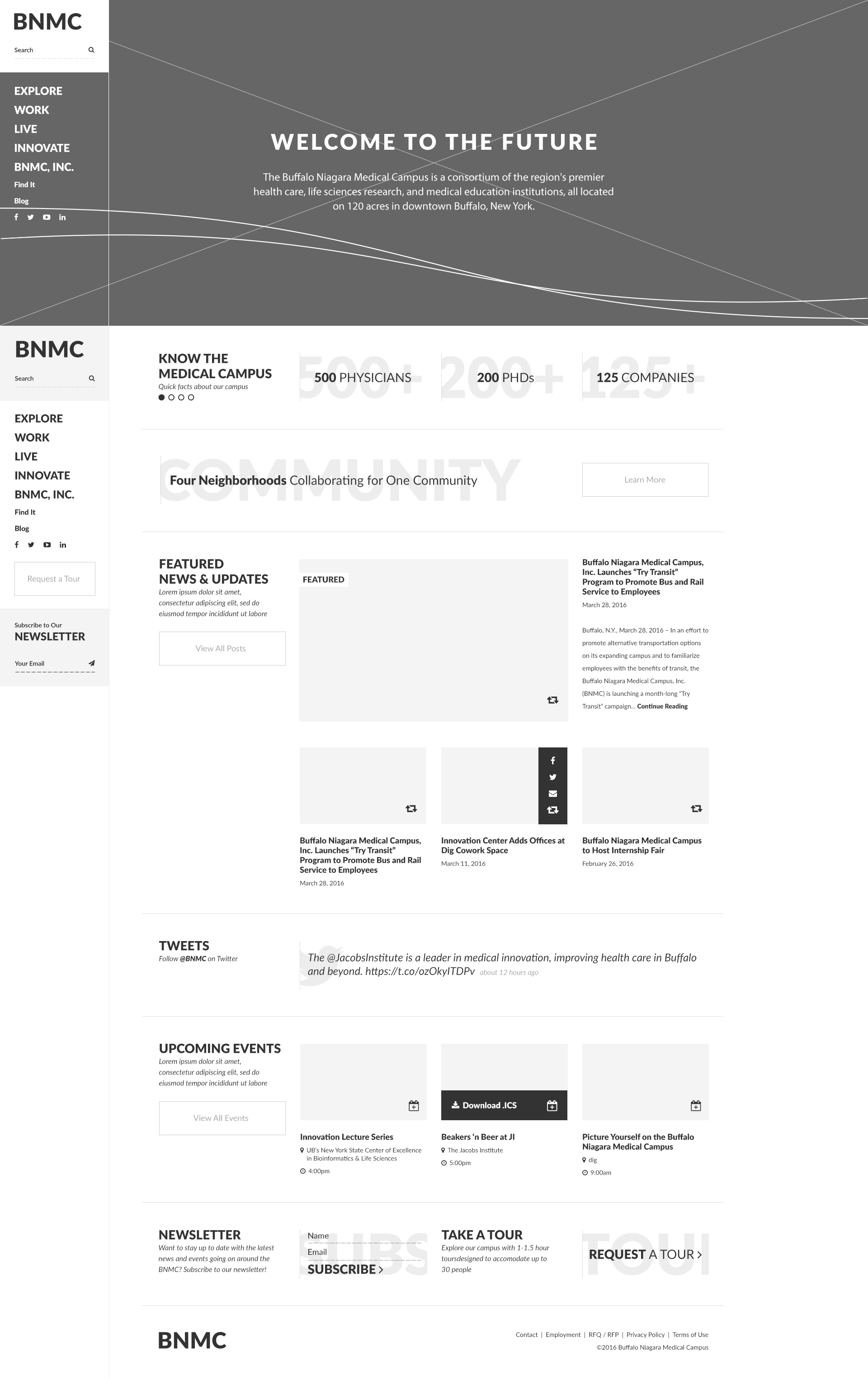
Homepage Pattern.
The homepage leads with a video that communicates the campus vision, followed by impact stats that build credibility quickly. From there, the experience supports discovery through six pillar focus areas, recent posts, and upcoming events. The page rounds out with live social content, a newsletter signup, and a call to schedule a campus tour.
To keep the broader community informed, the homepage and supporting pages surface construction updates, parking and commuter info, public events, and local news alongside the pillar content.
The b-roll below captures the homepage in motion, showing scroll and interaction patterns across the vision, impact, and discovery sections.
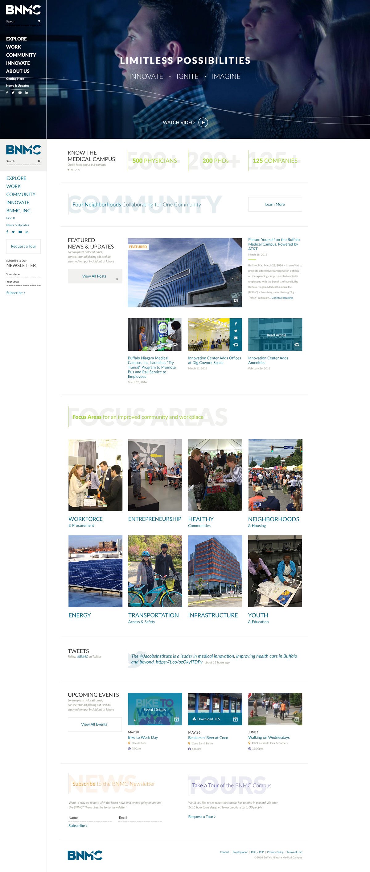
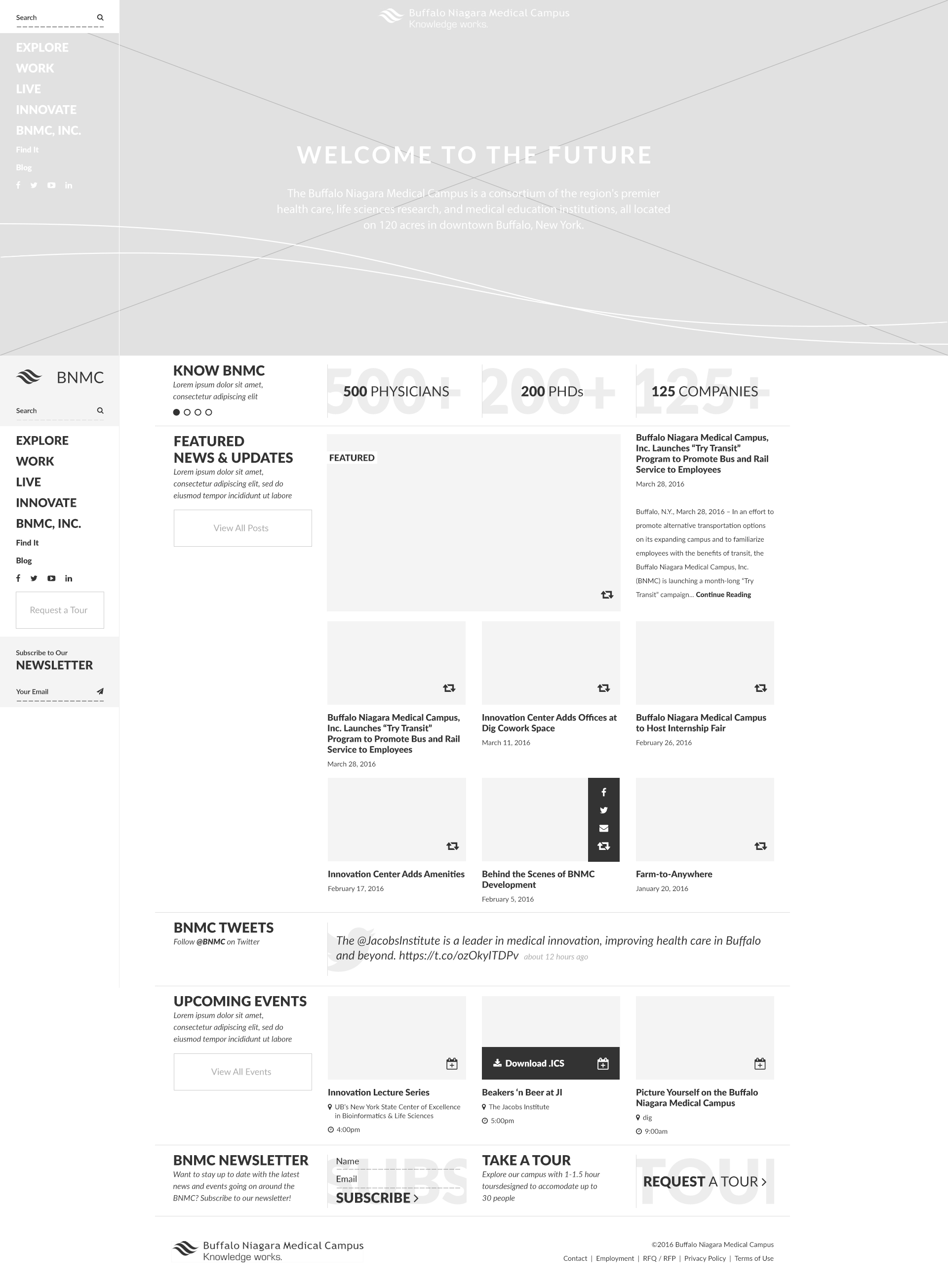
Homepage Depth and Storytelling.
The long-scroll homepage ties vision messaging to tangible impact, layering stats, campus highlights, and calls to action in a way that feels editorial rather than corporate.
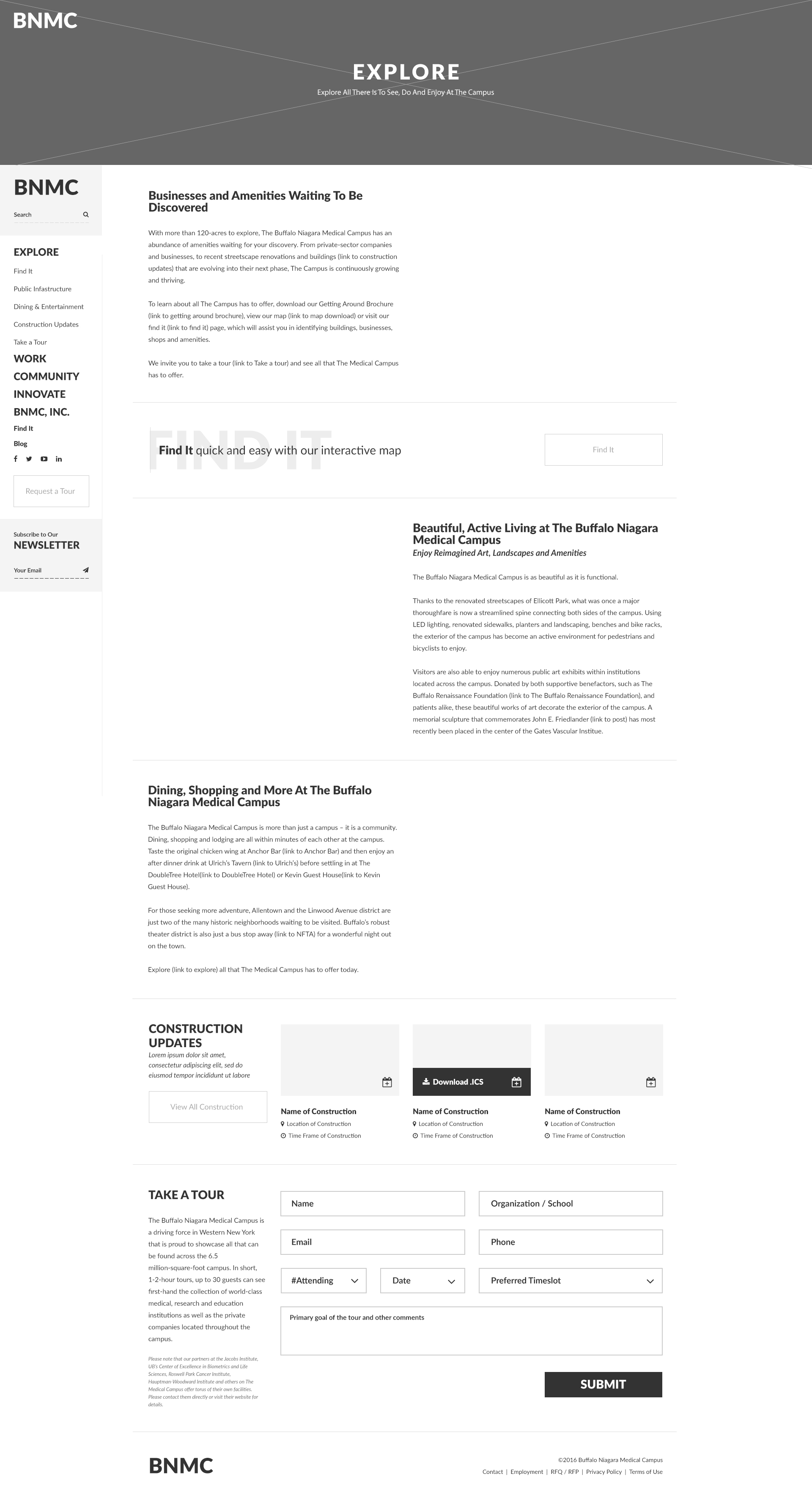
Pillar Exploration and Campus Navigation.
Dedicated pillar pages help visitors self-identify quickly, whether they are exploring innovation, community programs, or district development. Each page balances narrative with easy pathways to deeper content.
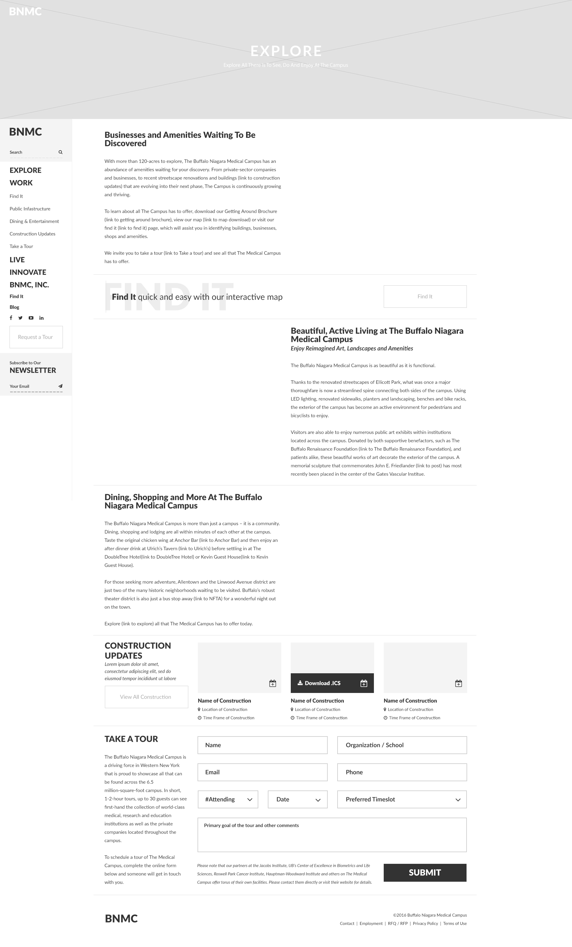
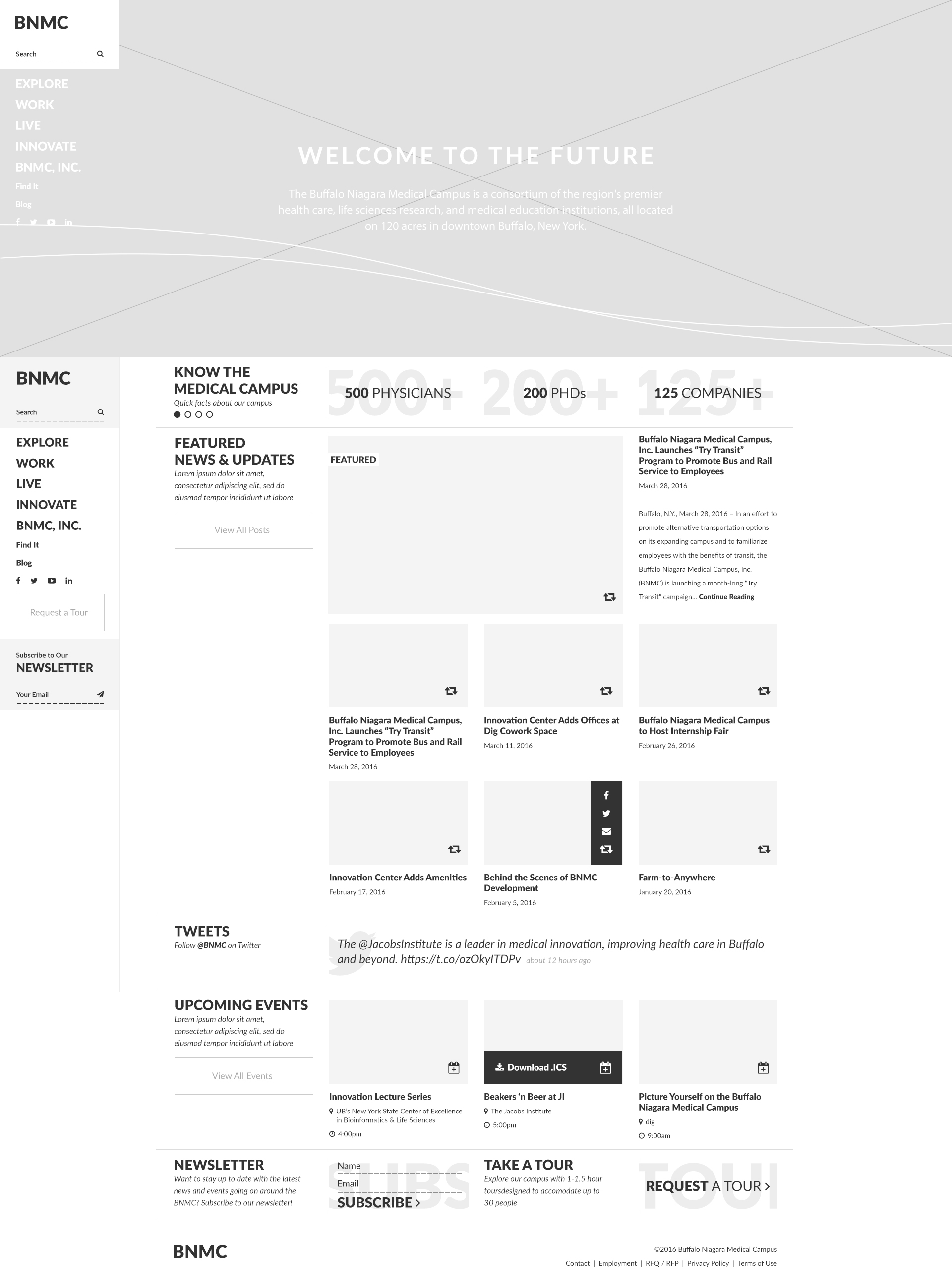
Wireframe Foundations.
Early wireframes mapped the content rhythm and hierarchy before visual styling, ensuring the experience stayed clear across long-form pages.
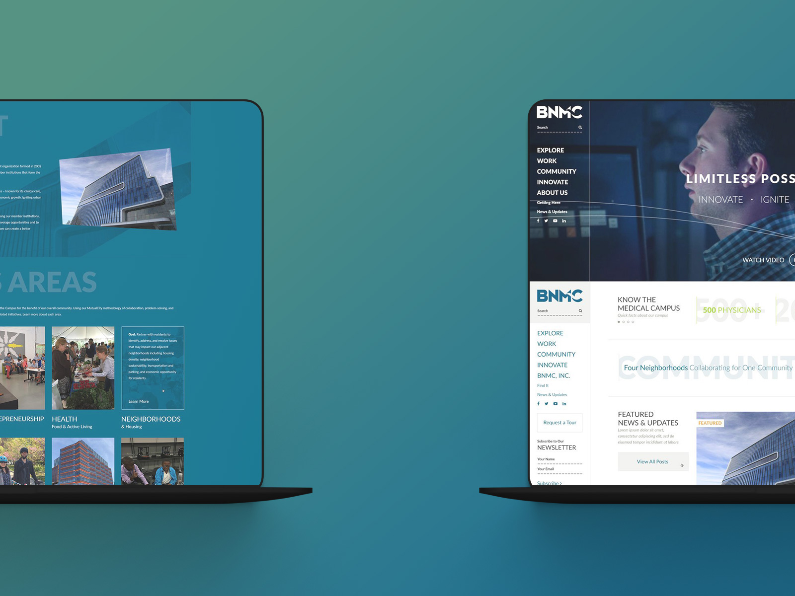
Full Site Overview.
A system-level view shows how the homepage, pillar content, and supporting sections work together to tell the BNMC story with consistency.
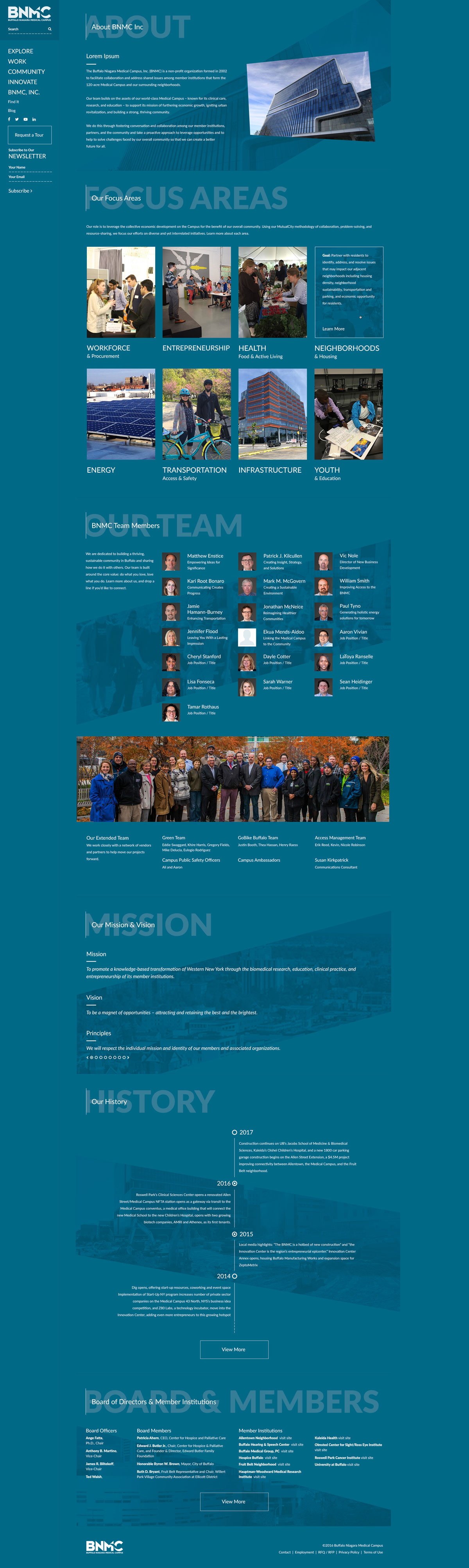
About the BNMC.
The About page uses an inverted brand blue theme to signal importance and create a clear sense of place. Angled background imagery and subtle color shifts reinforce the new brand direction while drawing attention to the refreshed content.
Still Curious?
Browse One of My Other Case Studies, Writings, Resources, Or Reach out for a Chat.
You can contact and connect with me through email, on Dribbble, or LinkedIn as well.