Getting the Word out About MBA Excellence.
- Design
- UI + UX

Framing the Work for UB School of Management.
At A Glance: Designed a cohesive set of recruitment and program-comparison assets to support updates across UB’s MBA offerings. The work focused on clarity, consistency, and lead generation across multiple channels, including program landing pages, email templates, infographics, charts, and interactive eBrochures (built and deployed by the 19 IDEAS team with UB stakeholders).
Role: UI + UX Designer (Campaign System + Multi-Channel Assets)
Partners: 19 IDEAS Strategy, Copy, And Development Teams. UB School Of Management Stakeholders.
Scope: 4 Landing Pages, 4 Email Templates, Infographics, Charts, And 2 Interactive EBrochures
Tools: Sketch, InVision, Illustrator, Photoshop, After Effects, HTML/CSS, And HubSpot
Constraints.
- Fast Timeline: deliver a lot of assets quickly in support of program updates.
- Consistency: keep messaging and visual hierarchy aligned across web, email, and PDFs.
- Lead Generation: ensure forms and CTAs were clear, low friction, and easy to maintain.
- Brand Alignment: match UB guidelines while modernizing layout and content structure.
What I Owned.
- Designed the landing page template and reusable patterns used across all programs.
- Designed four landing pages (three program pages plus one comparison page).
- Designed four email templates and a swappable hero system for easy rotation.
- Designed infographics and data visualizations to explain options quickly.
- Designed interactive eBrochures with alumni testimonials, curriculum, and links.
- Prepared production-ready assets and collaborated with developers for implementation.
Outcomes.
- A consistent multi-channel campaign system that improved program clarity and comparison.
- A reusable landing page template that supported faster content and messaging updates.
- Lead generation assets designed to help prospective students request and receive materials.
Designed for Decision-Making.
Prospective students are comparing programs, timelines, and outcomes. The deliverables were designed to reduce uncertainty, make differences easy to understand, and guide visitors toward requesting materials or taking the next step.
- Comparison Clarity: a dedicated comparison page and chart made tradeoffs easy to evaluate.
- Reusable System: consistent templates reduced friction for both design and content creation.
- Multi-Channel Consistency: web, email, and PDF assets were aligned so messaging stayed coherent.
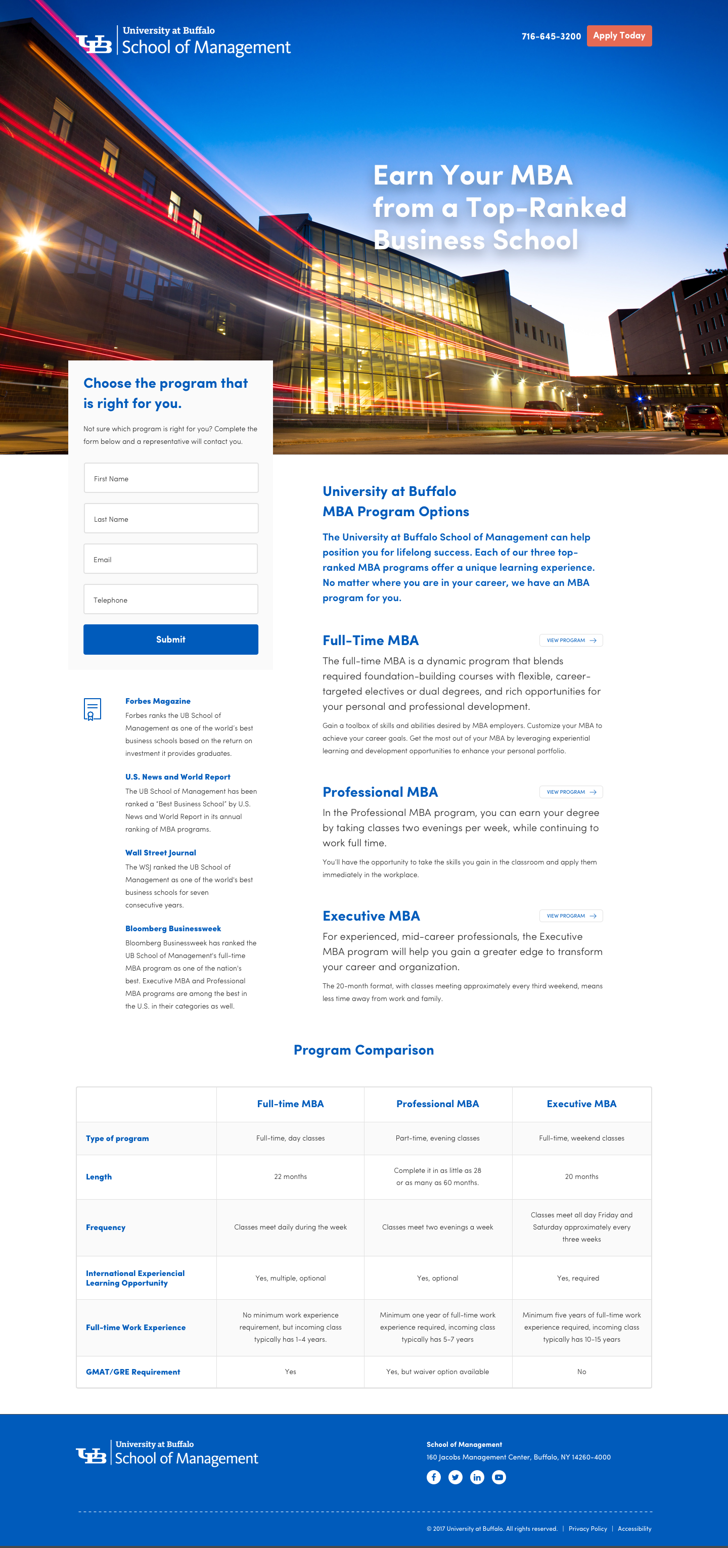
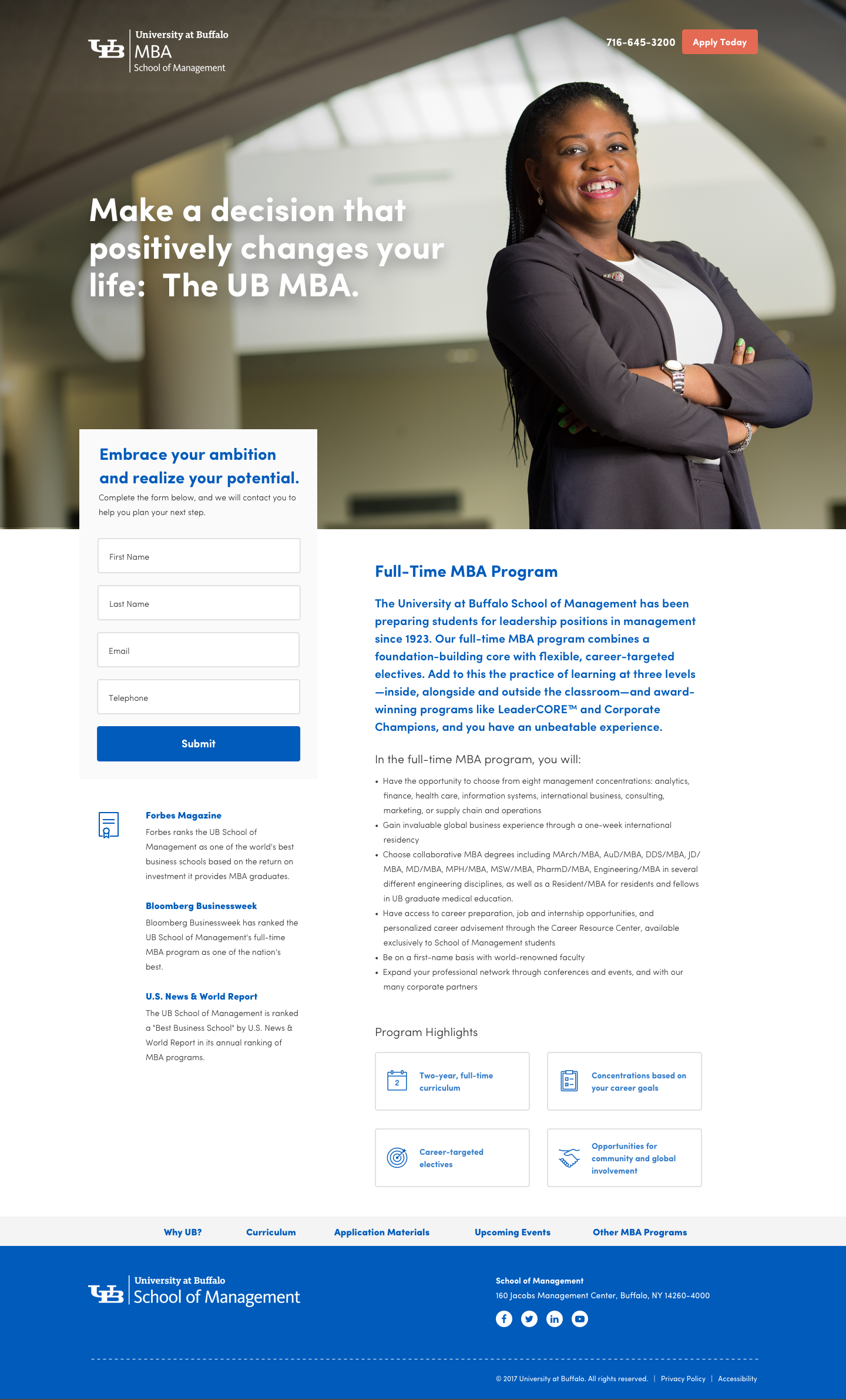
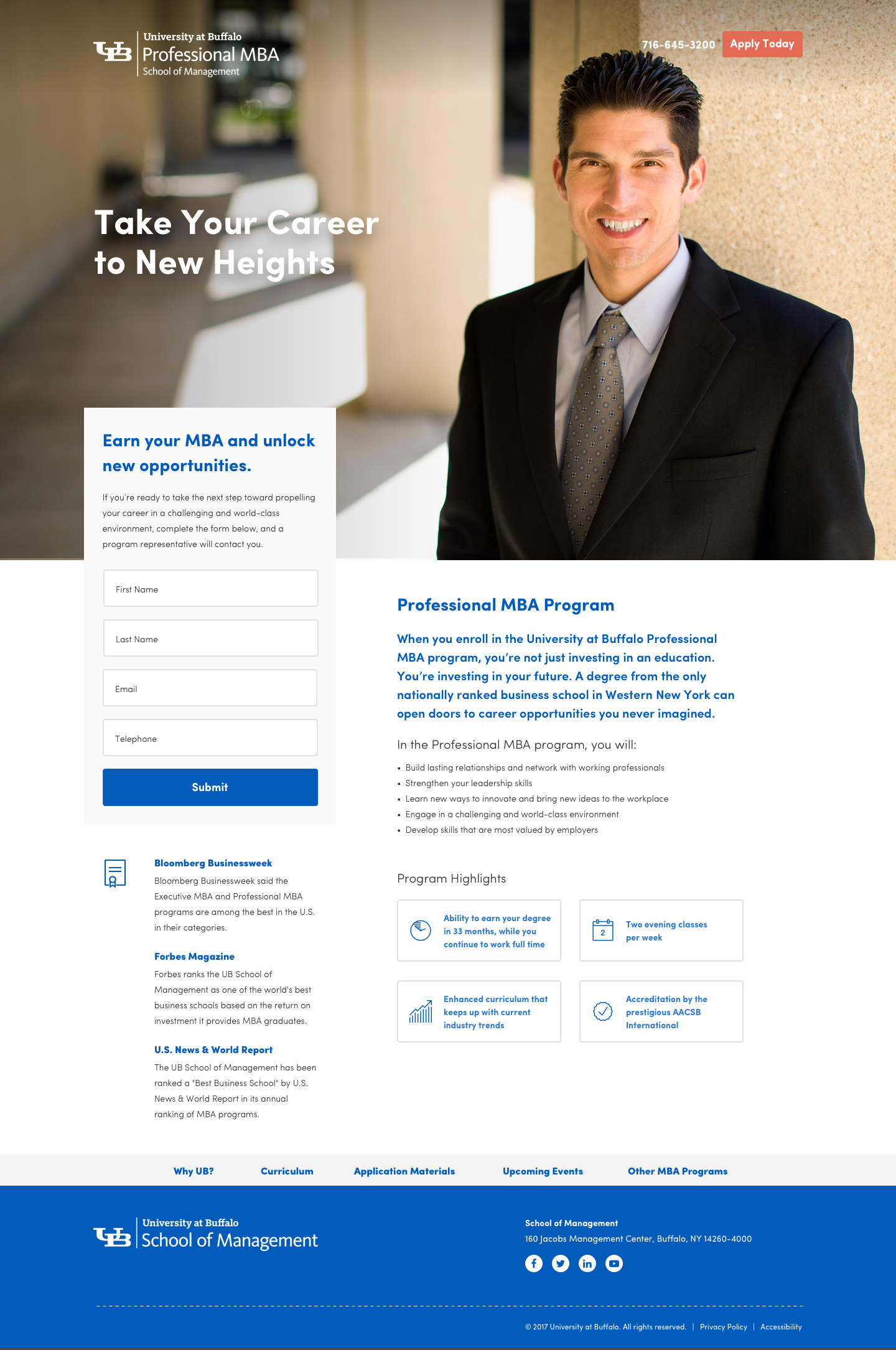
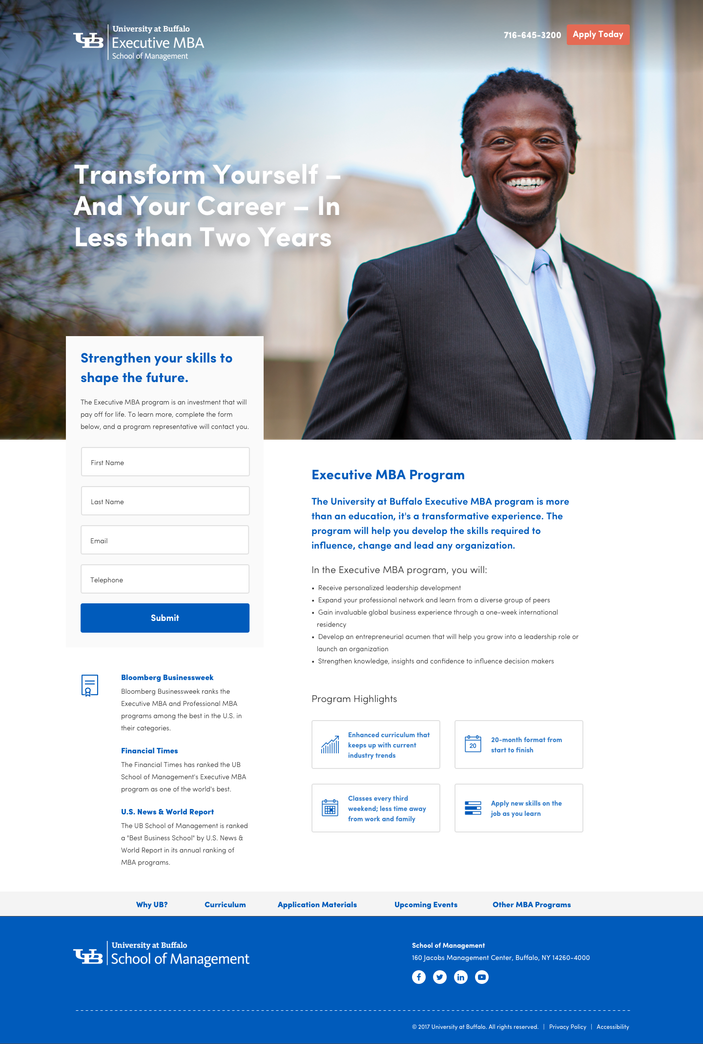
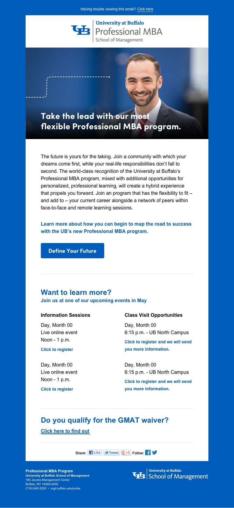
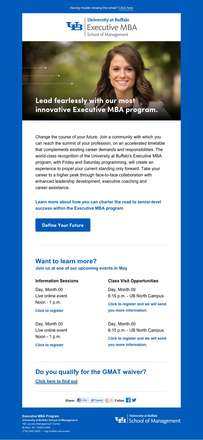
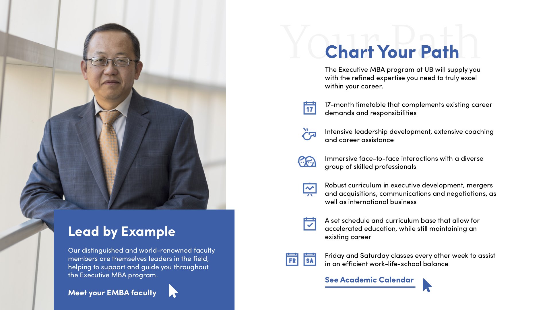
UB Landing Pages.
Four landing pages were designed and developed: one for each MBA program (Executive, Professional, and Full-Time), plus a dedicated comparison page that puts differences side by side. The goal was to inform, reduce confusion, and generate leads so prospective students could request the right materials quickly.

Lead generation forms to put information in the hands of prospective students
Detailed overview information for prospective MBA students
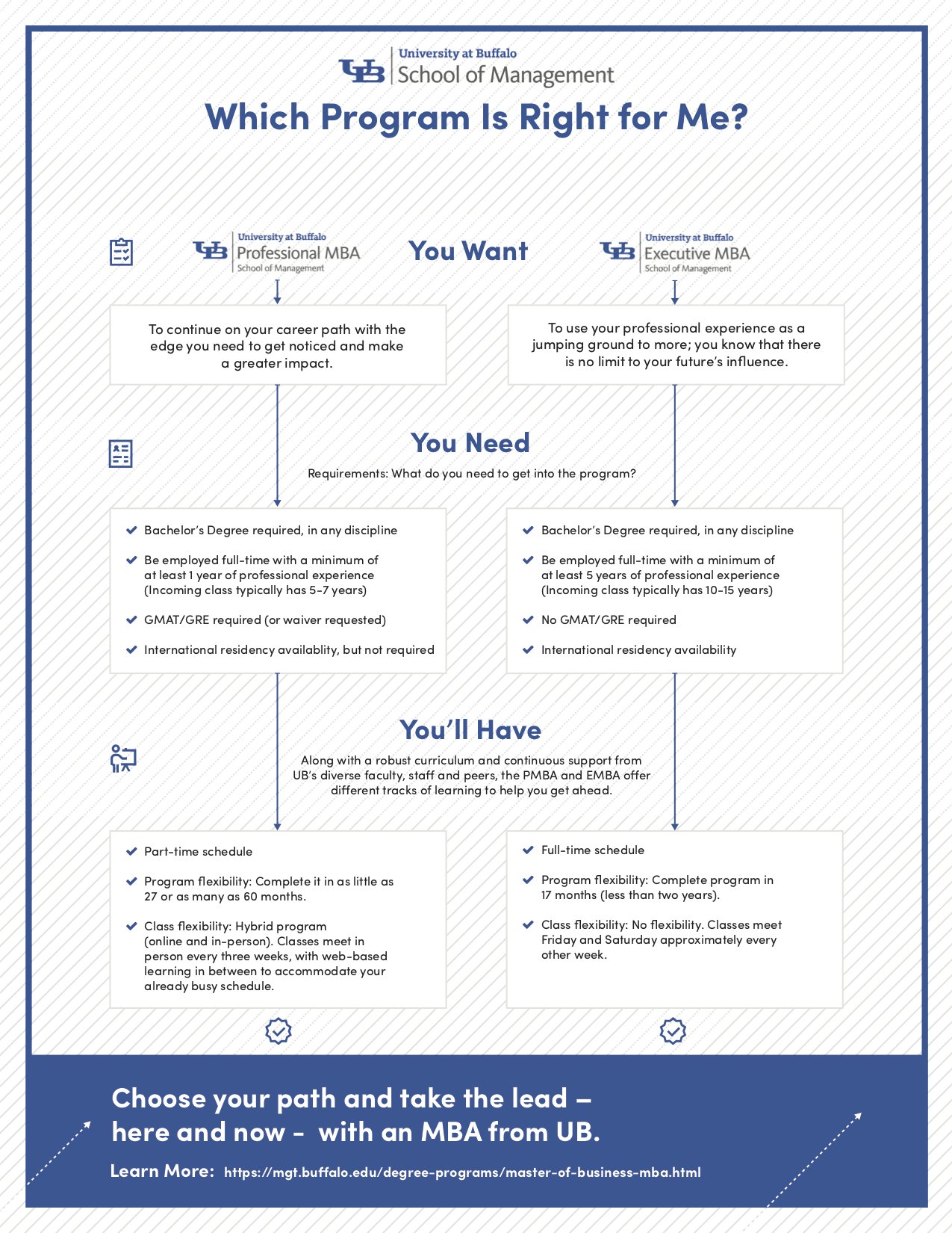
A comparison chart breaks down the differences between programs
Highlighting awards and accolades the management school has received
Overview & Choices.
I designed a shared landing page template so each program page and the comparison page followed the same structure. That consistency helped students compare options with less mental overhead and gave the team a reliable framework for copy and messaging.
Email Templates.
Four email templates were modernized from existing patterns, with a swappable hero system that allowed different students and taglines to rotate in without redesigning the full layout.
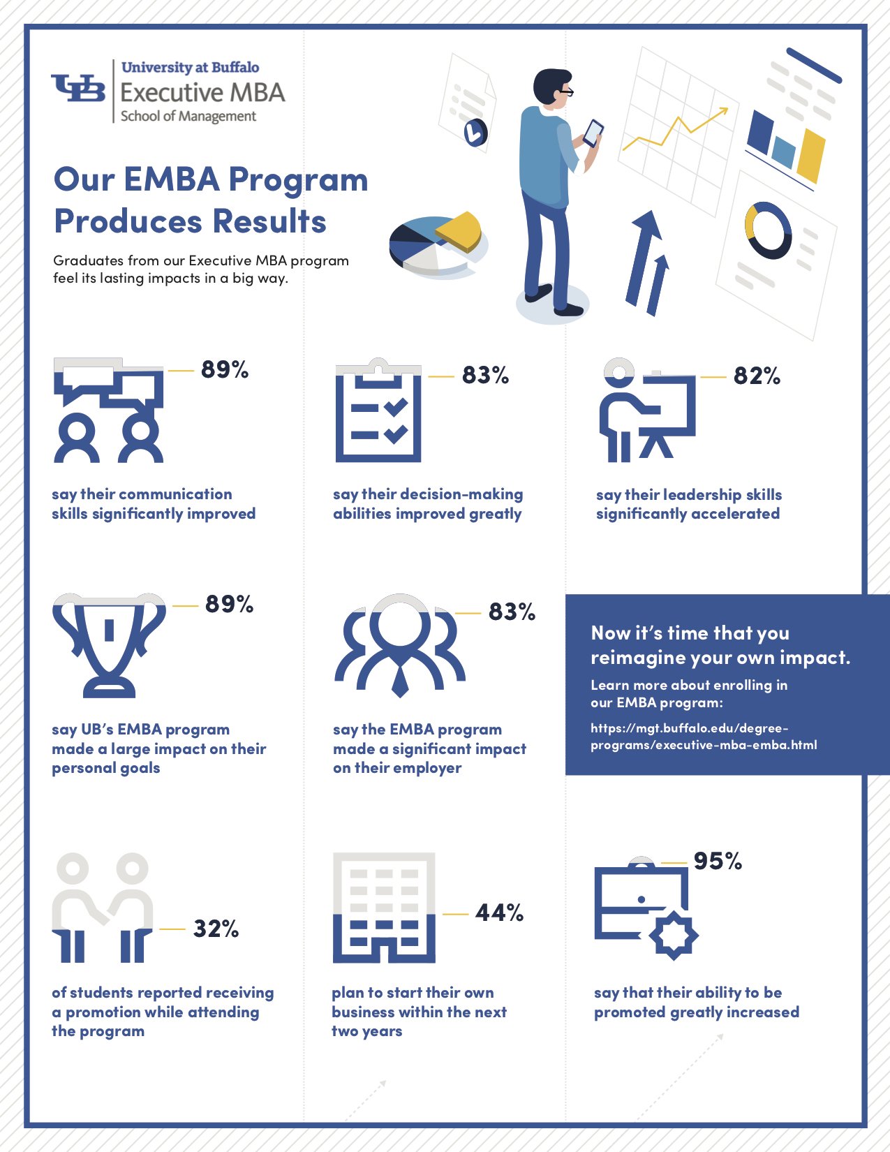
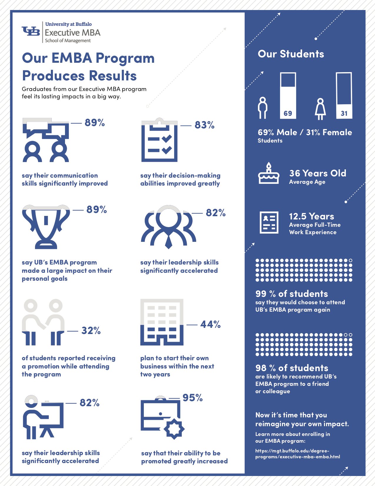
Infographics.
Infographics were designed to give prospective students a high-level introduction to UB’s MBA options. These visuals simplify program differences and summarize ROI-related information in a scannable format.
Charts & Tables.
Some of these charts were included in the eBrochures and others provided separately as updated versions of past charts they have used. The new charts were streamlined and rearranged as well as designed to match UB's recent brand guidelines rollout.
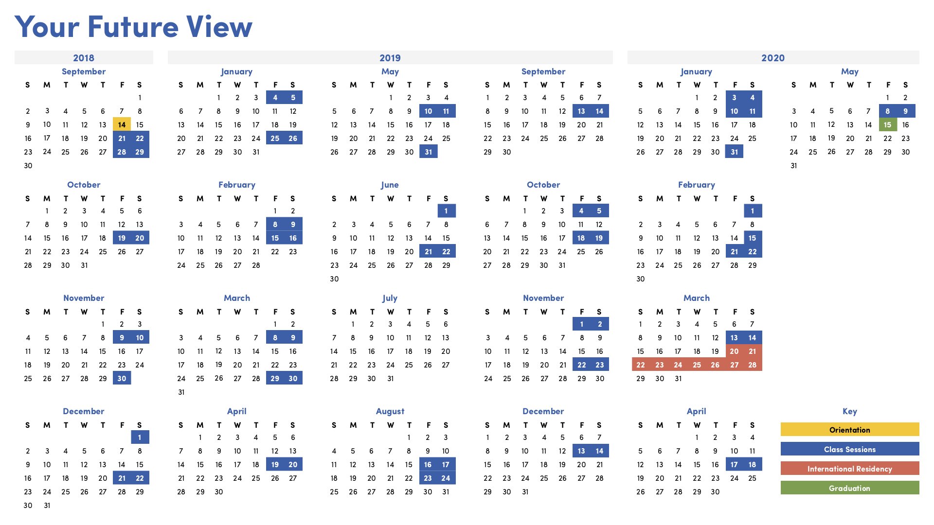
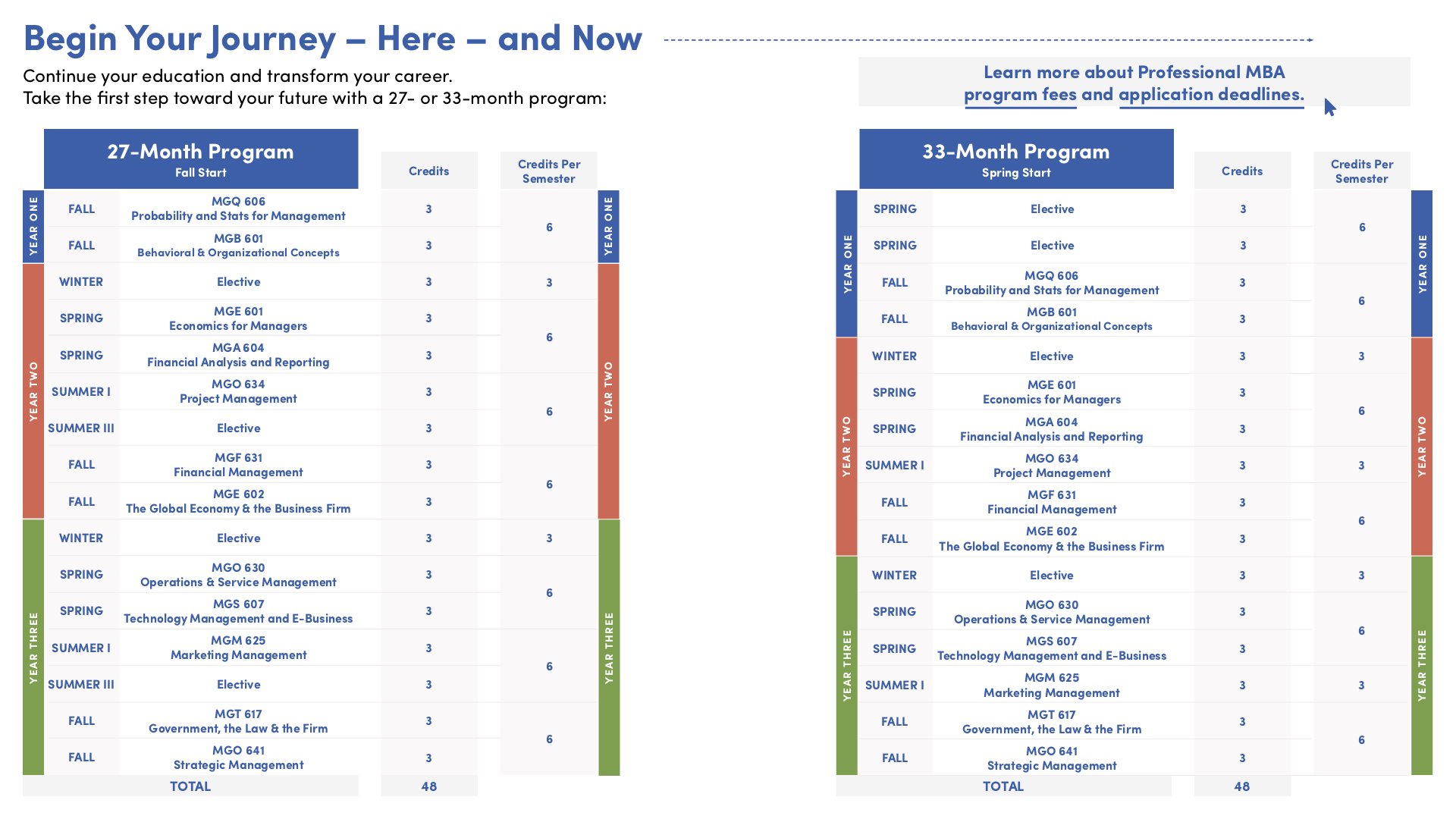
Scheduling & Curriculum.
I also used charts to layout the schedule and curriculum for each of the programs for an easy to view overview of what you would be learning as a student and how long it would take. Alternate charts also included the tuition costs as well.
MBA Roadmap.
An overview for when the program semesters occur.
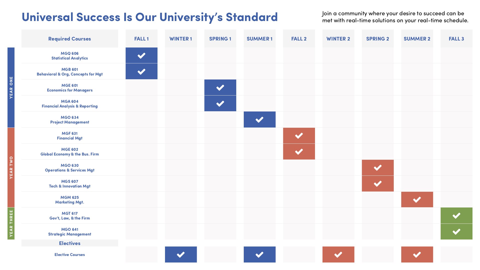
MBA Comparison.
A high level overview breakdown between the Executive and Professional MBA programs.
EBrochures.
An eBrochure for the Executive MBA and the Professional MBA were designed to help inform and promote the programs. Throughout each brochure testimonials of alumni, information about the program and staff members, charts and schedules, and links to further information were provided in this interactive PDF.
Executive MBA EBrochure.
eBrochure cover and an inner page.

Professional MBA EBrochure.
eBrochure cover and an inner page.


Still Curious?
Browse One of My Other Case Studies, Writings, Resources, Or Reach out for a Chat.
You can contact and connect with me through email, on Dribbble, or LinkedIn as well.