A Fresh Start for a New Transition.
- Branding
- Design
- UI + UX
- Development
Framing the Work for Person Centered Services.
At A Glance: Led the brand identity and UX/UI for a transition-focused website and supporting collateral as Person Centered Services launched as a Care Coordination Organization (CCO/HH). The work needed to build trust quickly, educate diverse audiences, and make it easy to stay informed through forums, resources, and ongoing updates.
Role: Lead Designer (Brand Identity, UX/UI, Collateral). Co-Developed Website.
Partners: 19 IDEAS Strategy + Writing + Development. Client Leadership And Partner Agencies.
Scope: Brand System + Guidelines, Website, Forms, Print Toolkit, Stationery, And Campaign Support.
Tools: Sketch, Illustrator, Photoshop, After Effects, HTML/CSS, And CMS-Oriented Patterns.
Context.
Person Centered Services launched as part of a New York State transition that moved from Medicaid Service Coordination (MSC) to a Care Coordination model (CCO/HH). They serve over 17,000 people with Intellectual and Developmental Disabilities (I/DD) across 18 counties in New York State, which meant the experience had to work for individuals and families, agency partners, and a growing provider network.
Constraints.
- High Change, High Stakes: content needed to be clear, calm, and trustworthy during a statewide transition.
- Diverse Audiences: support individuals and families, providers, and partner agencies without burying what matters.
- Ongoing Communication: the site needed to support updates, forms, and forum registration as the organization grew.
What I Owned.
- Brand identity concepting, logo system, palette expansion, and brand guidelines.
- UX and page patterns for an educational, transition-focused website.
- Messaging integration and content hierarchy to reduce jargon and confusion.
- Collateral system including stationery, business cards, tool kit materials, and templates.
- Website UI and front-end build collaboration (co-developed, with development support).
Outcomes.
- A cohesive identity system anchored by the tagline Reach Your Potential.
- A website designed as an educational resource for the transition, with clear pathways to key information and updates.
- Forms and signups that supported general inquiries, newsletter subscription, and forum registration.
- A print toolkit and collateral suite that helped reach audiences both online and in person.
Awards and Recognitions.
- Silver ADDY — American Advertising Federation (AAF)
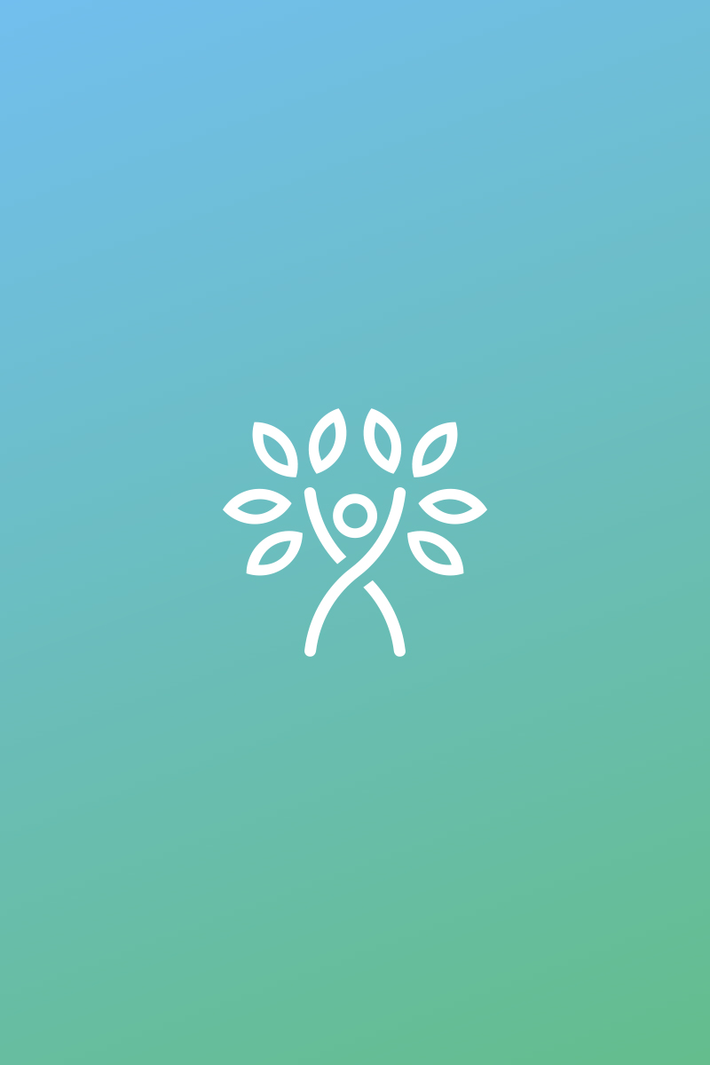
The Mark.
The mark for Person Centered Services combines elements of the up stretched arms of a hopeful and joyful person along with a flourishing tree of life. The blue and green color combination was inspired by their original branding to tie the two together. Along with refreshing the green and blue, the goal was also to introduce various complimentary accent colors that can pair well with the new mark.
In Motion: The animated mark was used as a simple way to bring warmth and energy into digital touchpoints, while keeping the identity calm and approachable.
A Responsive Brand.
When designing the logo it was intended from the start to be adaptable to various sizes and applications. Going from top to bottom we start with the full logo with tag line. This is used primarily in large applications and signage. Secondly is the primary full mark which will be used in the majority of applications. Thirdly, is the logo mark itself. This is intended for smaller applications or use scenarios where the brand name is already established. Therefore the mark will show up in social media profile photos, accents of print pieces, and small applications in the print and digital spaces. Lastly, there is a distilled mark to its bare essence of the outstretched arms. This is for only for use cases of extreme tiny-ness, i.e. the site's favicon.
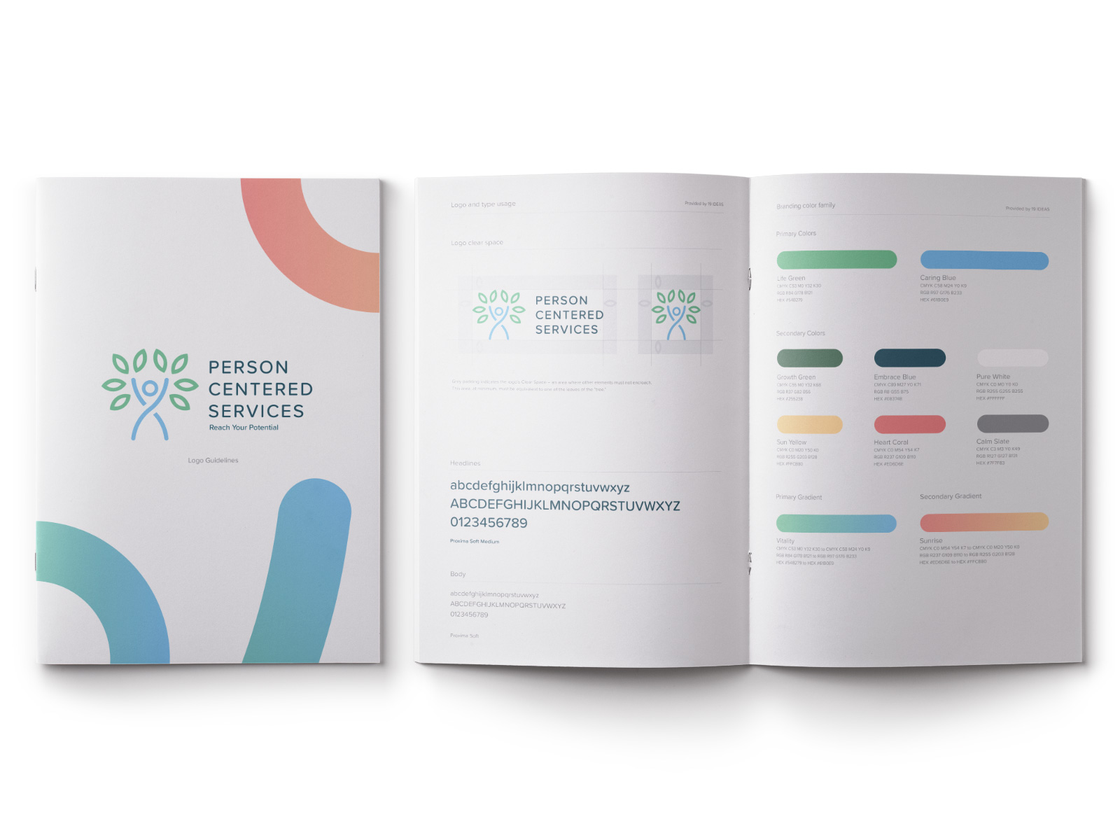
Brand Gradients.
To add some vibrancy and life to the brand that can be used in a variety of applications, two gradient swatches were designed combining the two primary colors of the mark and two of the new secondary brand colors. These are used for solid backgrounds, accents, and overlays to brighten up the work and subject matter.

Brand Guidelines.
Upon completion of the brand, one of the deliverables I provided is a detailed brand guide which provides logo usage, logo responsive breakdowns, color swatches and their codes, and the brand's typography.
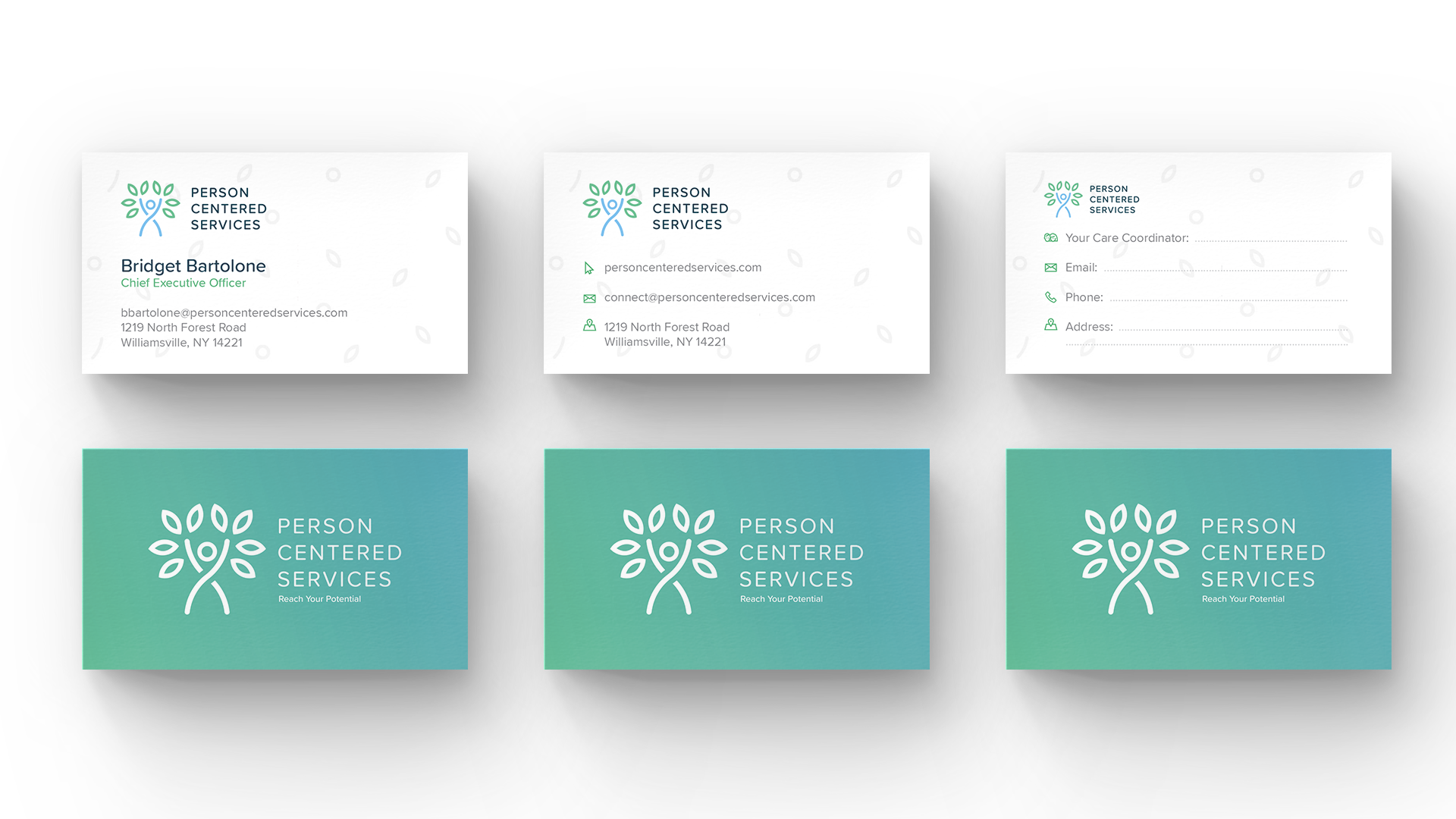
Print & Stationery.
During their transition, Person Centered Services had a couple use cases they needed to address that one business card wouldn't be able to clearly articulate. To solve this there are three business card designs that can be used. The first is the general staff card which contains all of that employee's necessary contact information. Secondly, is their general contact card. These were designed to be printed en masse to be handed out with collateral, at events, and so on for general awareness purposes. Lastly, the third card was designed to be filled in by newly transitioning care coordinators. Since these coordinators were located throughout the organization's service area and the transition was a swift one, this was a way to get branded materials in their hands quickly.
To extend the identity into large-format collateral, the tree illustration assets were built as a flexible brand element for print and environmental use.
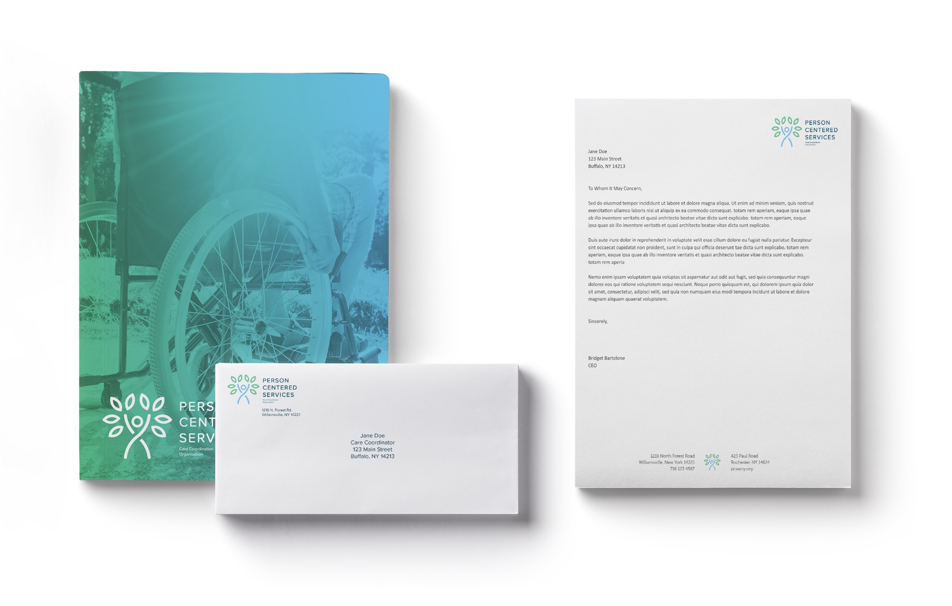
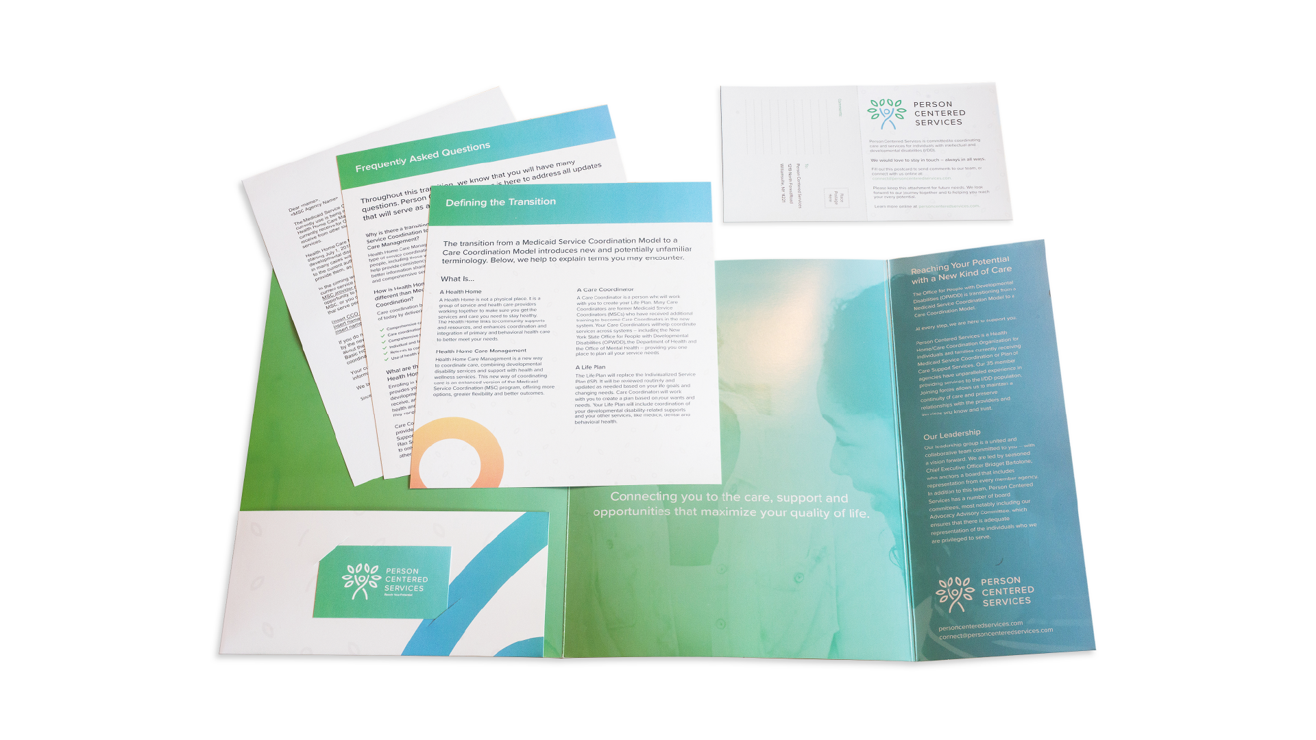
Folder Tool Kit.
To help address all the questions to the families receiving care that would now be falling under this new organization, a comprehensive folder toolkit was developed to help answer many of those questions. Included in the packet was information regarding what the transition entailed, a set of frequently asked questions, general information about Person Centered Services, and a postcard that can be filled out to indicate if they were going to continue with or opt-out of Person Centered Services after the transition.
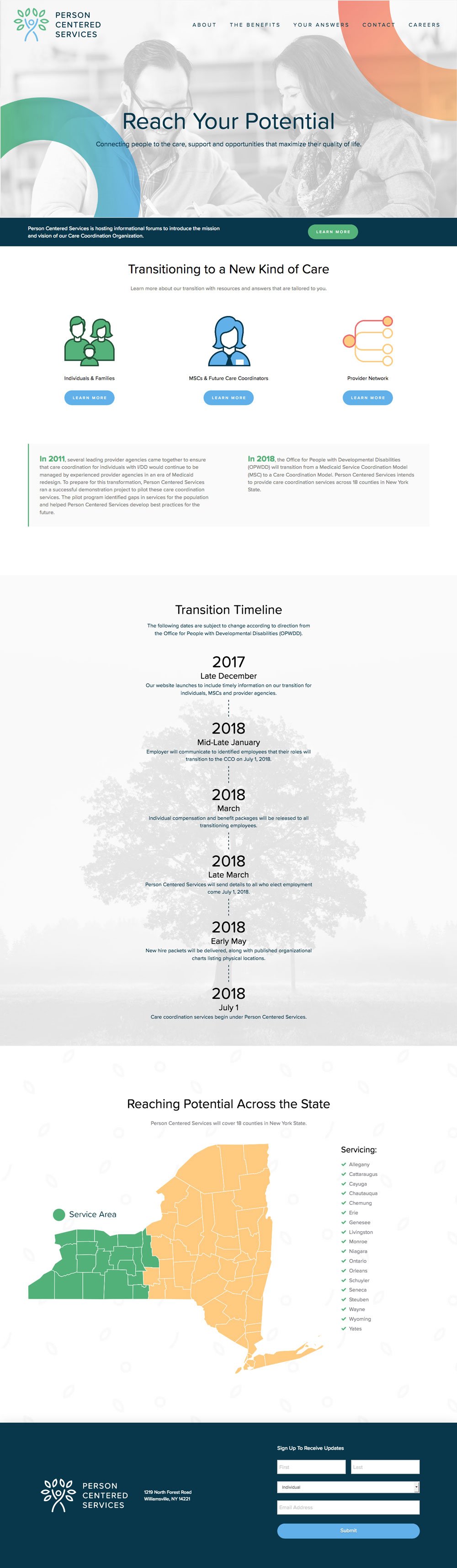
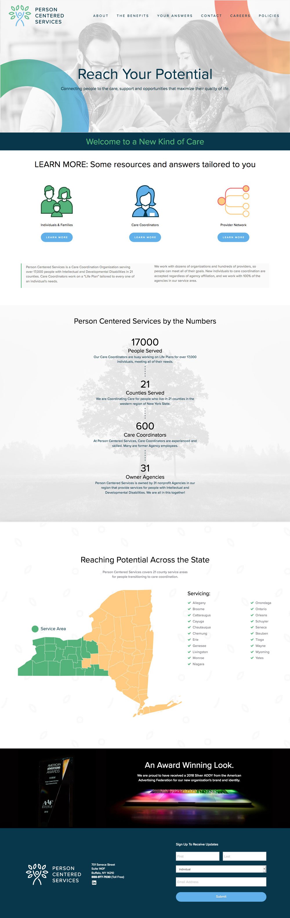
The Website.
The website was designed as an educational resource for a statewide transition. It explained what was changing, when it would happen, and how individuals and families could stay supported. The experience also created clear pathways to forums, benefits, answers to common questions, job postings for a rapidly growing workforce, and ongoing updates through newsletter sign-up and contact forms.
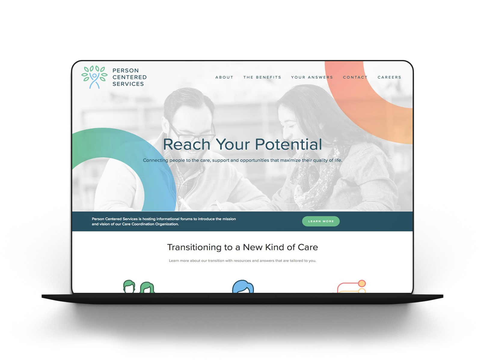
A timeline details the organization's transition
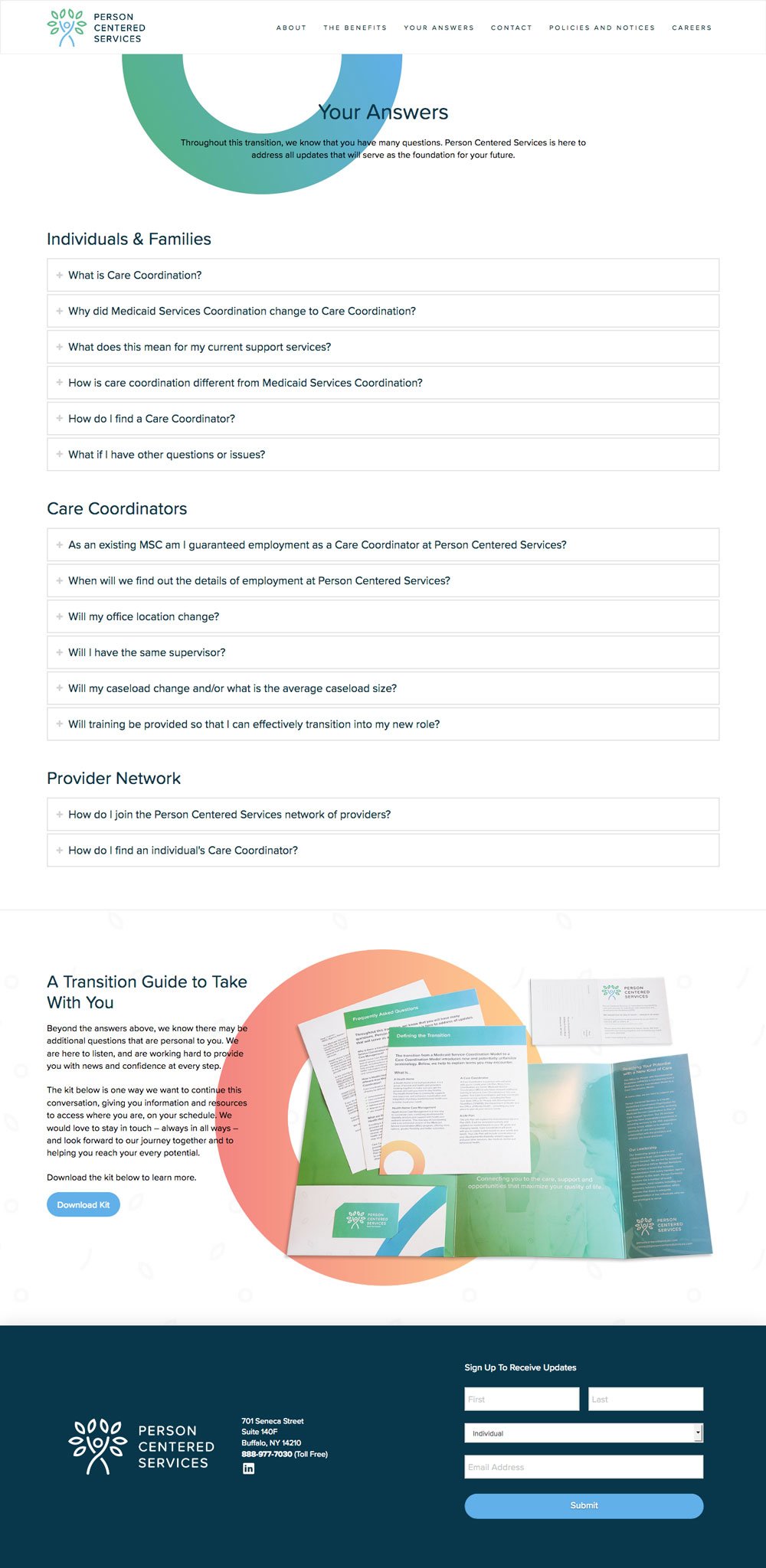
A clear FAQs hub answered common questions across audiences
Detailed overview information for employees and patients
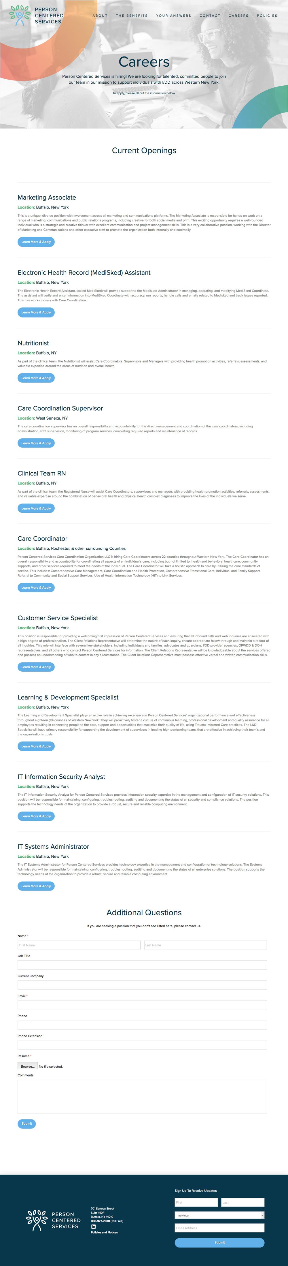
Housed a listing of expanding open career positions
Homepage Pattern.
Timeline.
For the initial launch of the homepage, we provided a timeline or roadmap of how and when the transition was going to take effect.
By the Numbers.
After the July first transition took place we changed around some of the homepage's information and focused on the organization's impact by the numbers.
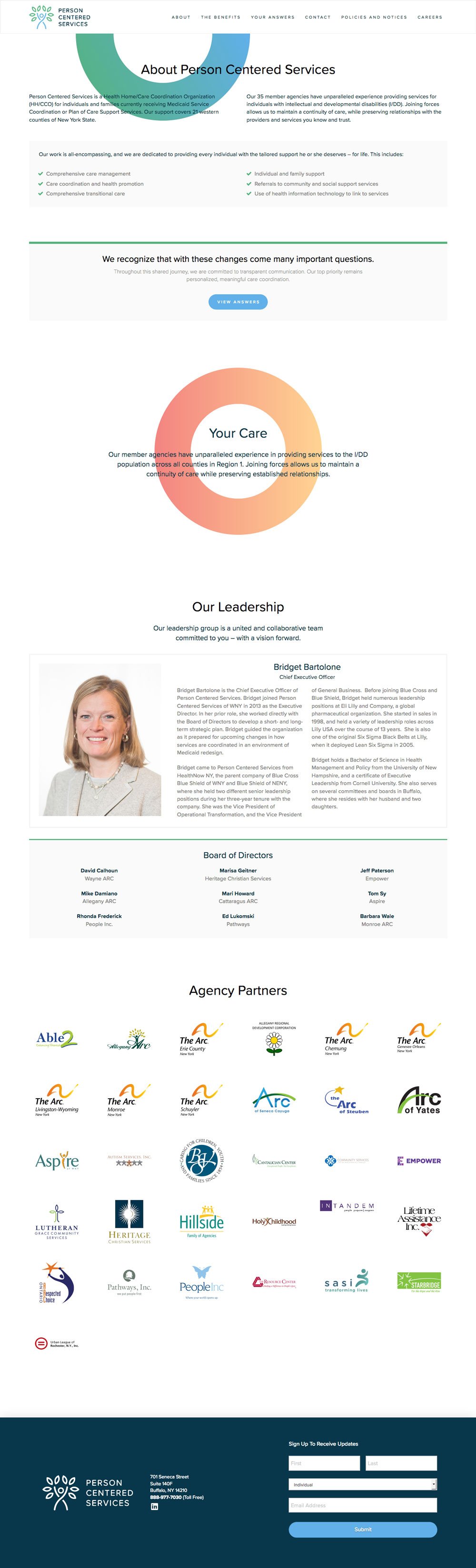
About Person Centered Services.
Once the transition information was in place, the site needed to feel human and credible. The About experience introduced the leadership team (photography produced by 19 IDEAS) and reinforced mission and values. In parallel, a Careers page supported rapid growth by housing open roles in one clear, easy-to-browse location.
Informational Patterns.
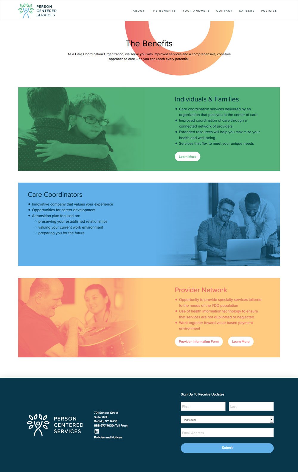
Since the transition was going to entail a lot of changes for both employees and patients of Person Centered Services we wanted to provide quick and easy access to documentation and answers to their questions. These were two of the internal pages developed to do just that by explaining the benefits of the organization and how the transition is going to be a step in the right direction and a breakdown of interactive FAQs.
Still Curious?
Browse One of My Other Case Studies, Writings, Resources, Or Reach out for a Chat.
You can contact and connect with me through email, on Dribbble, or LinkedIn as well.