Giving a Voice.
- Design
- UI + UX
Framing the Work for Hodgson Russ.
At A Glance: Designed two responsive landing pages that translate dense subject matter into clear, approachable stories and next steps. One page celebrated local nonprofits through an interactive story feed. The other simplified a sensitive whistleblower practice area with a compassionate tone and digestible structure.
Role: UI + UX Designer (Landing Page Experience + Interaction Design)
Partners: 19 IDEAS Team (Strategy, Writing, Development) + Client Stakeholders
Scope: 2 Landing Pages (Community Voices + Whistleblower Practice) + Supporting Ad Creative
Tools: Sketch, Illustrator, Photoshop, HTML/CSS Specs, And Motion/GIF Assets (As Needed)
Constraints.
- Complex And Sensitive Content: communicate legal topics with clarity and respect, without feeling cold or intimidating.
- Conversion Clarity: make “what to do next” obvious (contact, learn more, explore resources).
- Brand Alignment: keep both pages on-brand while giving each initiative its own voice and visual emphasis.
What I Owned.
- Information hierarchy and layout patterns to make dense content scannable.
- Interaction design for the Community Voices story feed and overlay reading experience.
- Visual system decisions (type, spacing, imagery, accent color) to support trust and approachability.
- Responsive behavior and handoff specs in collaboration with development.
- Banner ad design for targeted placements supporting the Whistleblower Practice campaign.
Outcomes.
- Community Voices: an interactive destination for nonprofit stories with sorting and shareable overlays.
- Whistleblower Practice: a more digestible, approachable overview with clear calls to action and supporting resources.
- Campaign Support: a set of banner ads designed for industry-targeted placements.
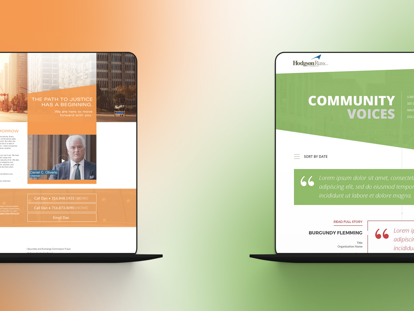
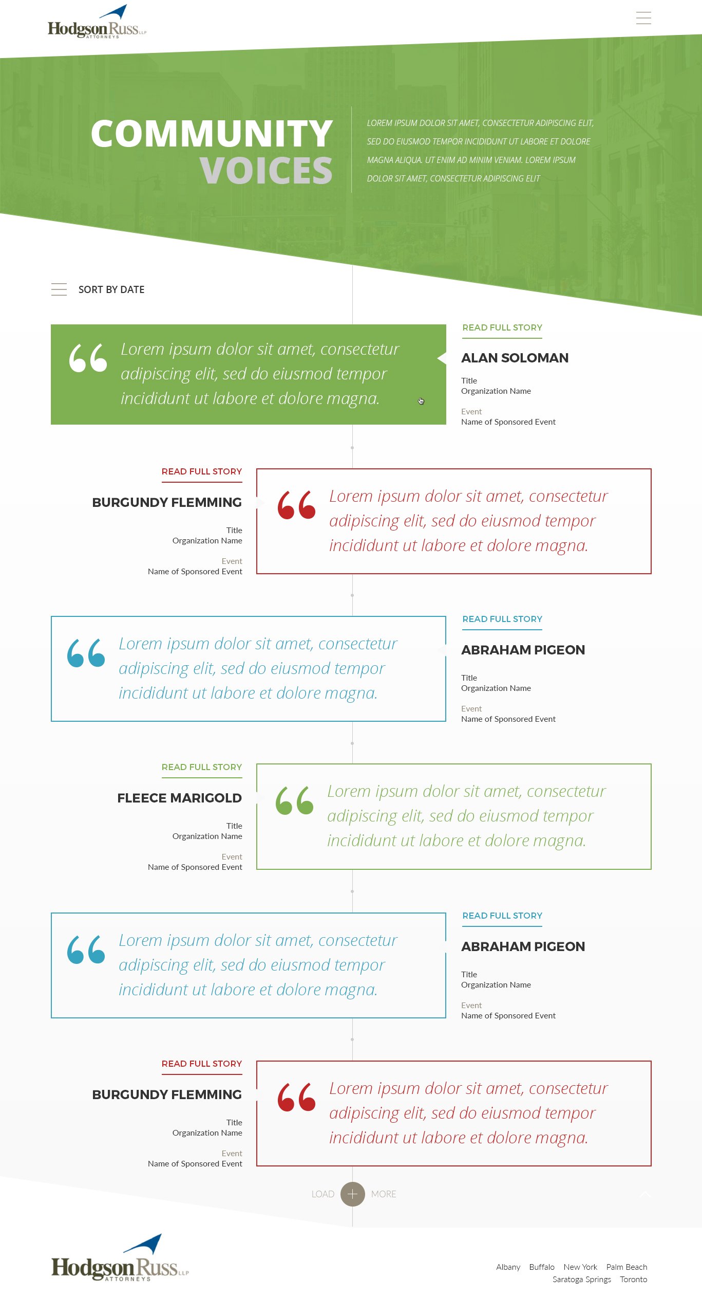
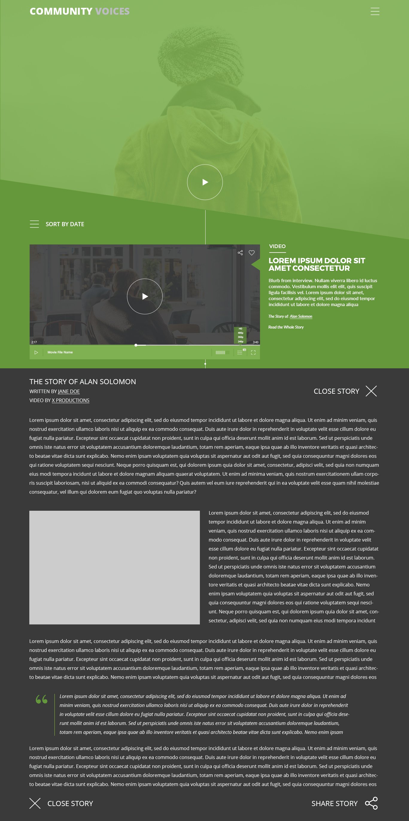
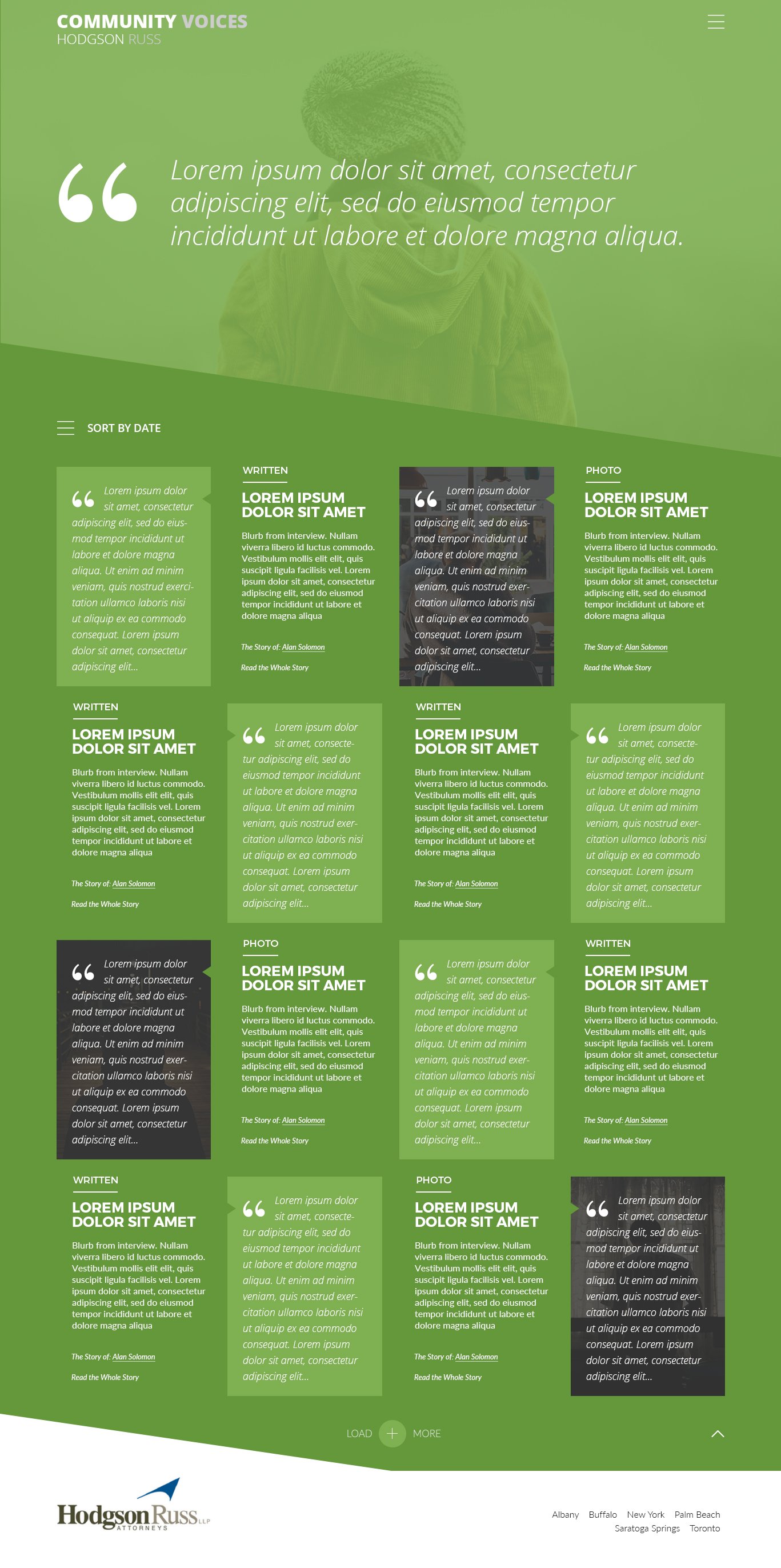
Community Voices.
The landing page was designed as an interactive, timeline-style story feed. Entries reveal more detail on hover and can be sorted to help readers explore nonprofits and initiatives.
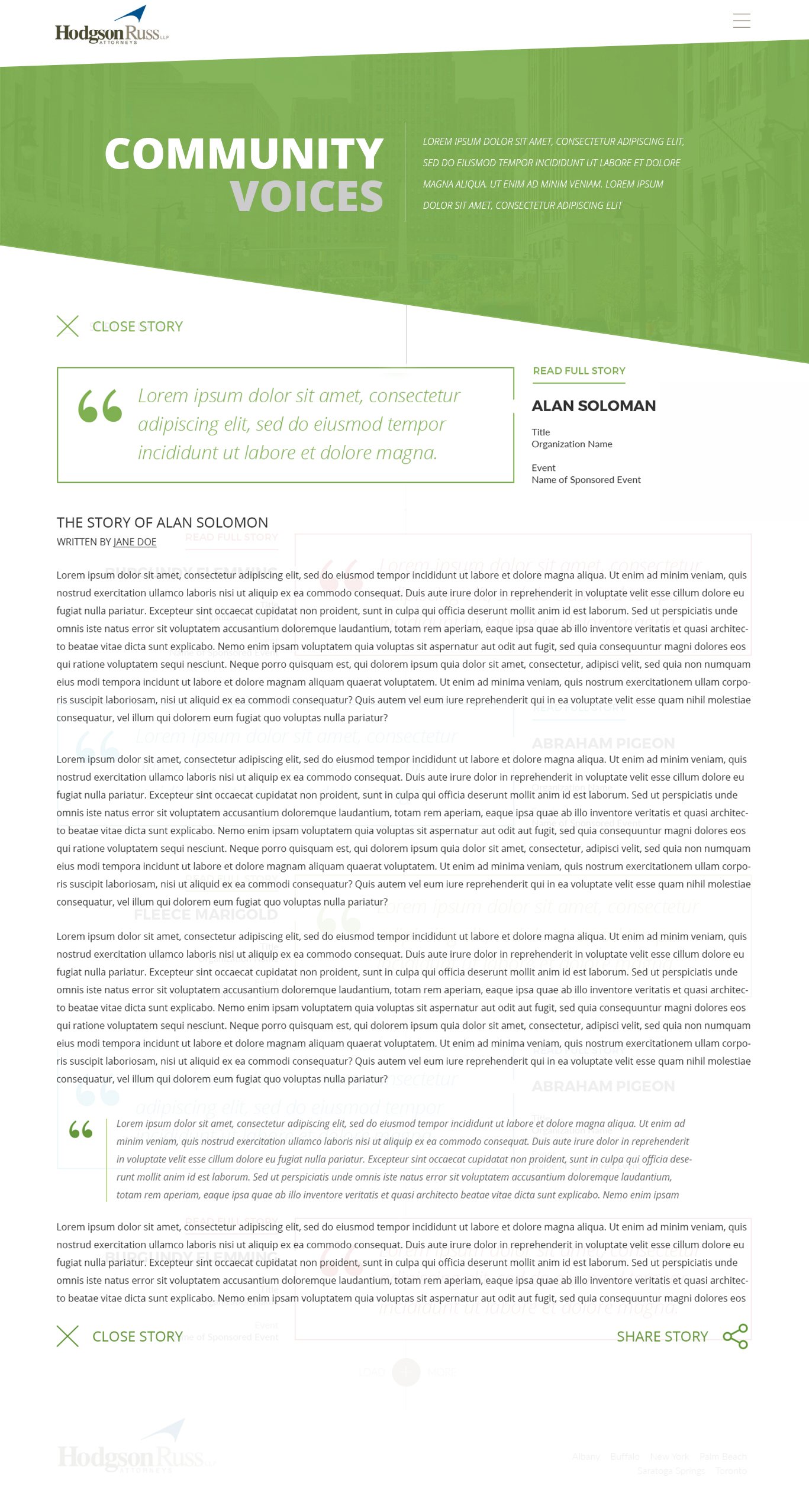
Getting the Story.
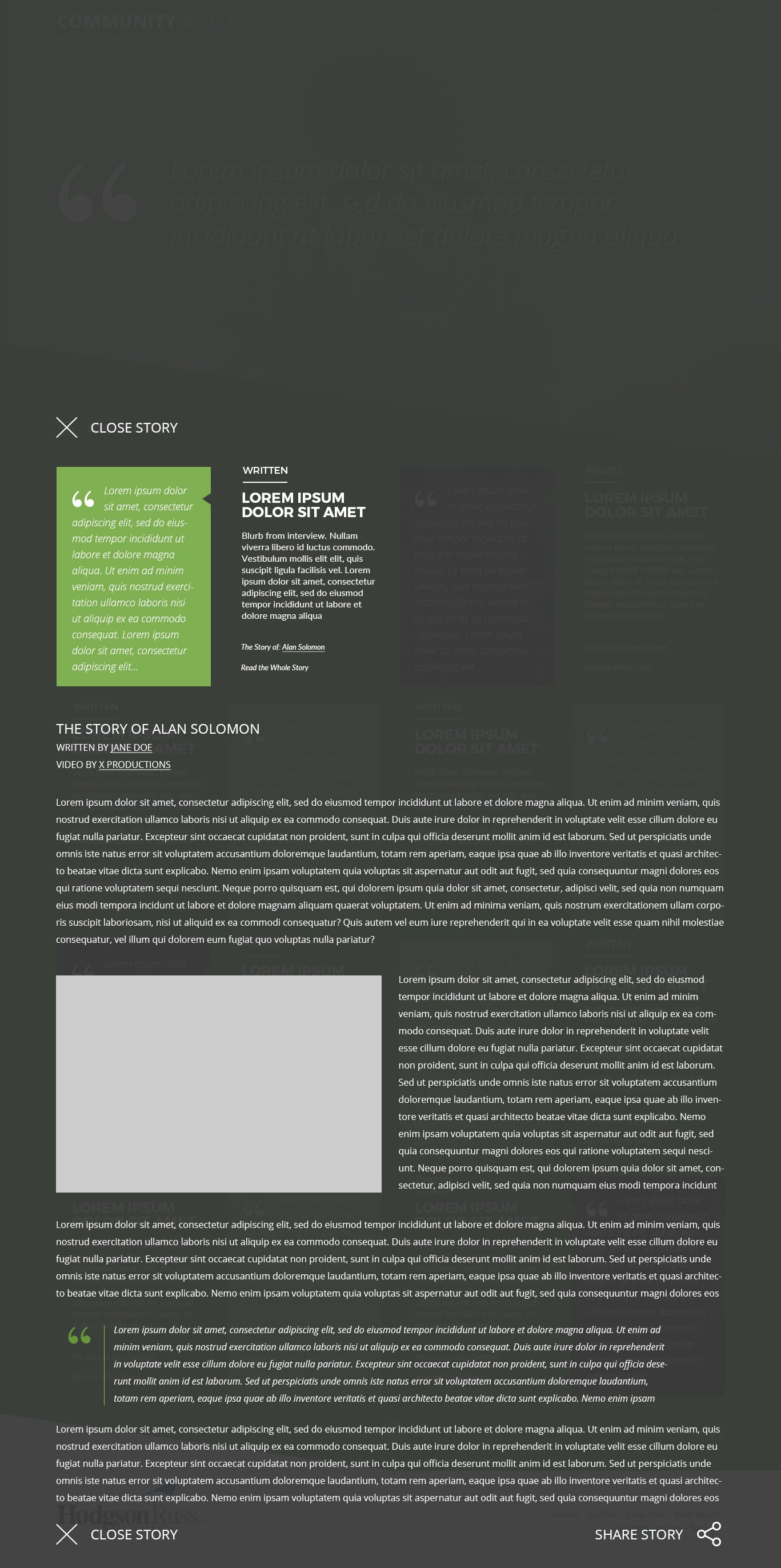
Selecting a quote opens a focused reading overlay so the story becomes the center of attention. After reading, the story can be shared to help amplify each nonprofit’s impact.
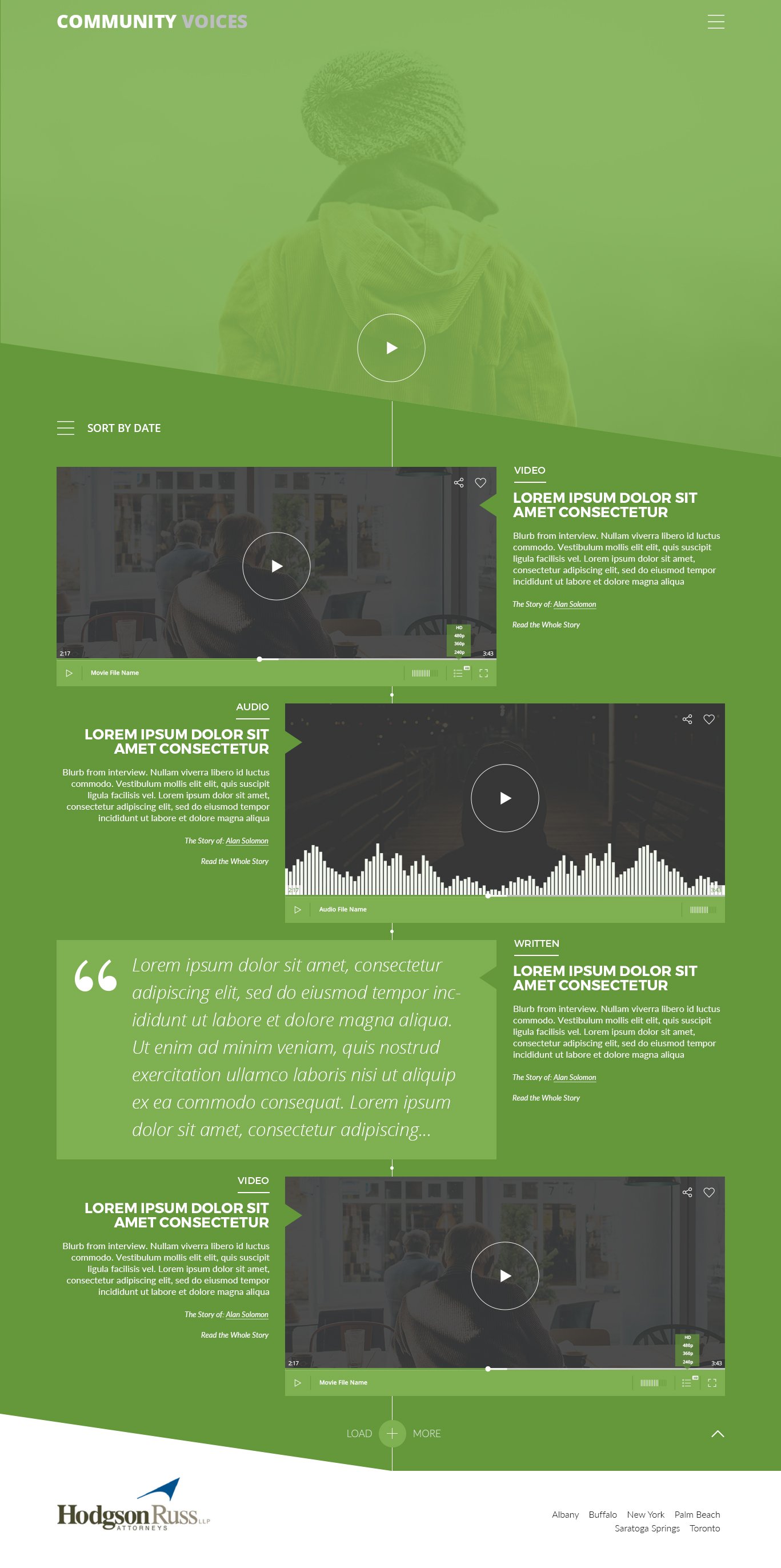
Early Concepts.
Early concepts explored optional multimedia (audio and video), alternate photography treatments, and a few color directions. The goal was to leave room for richer storytelling over time without losing clarity or performance.
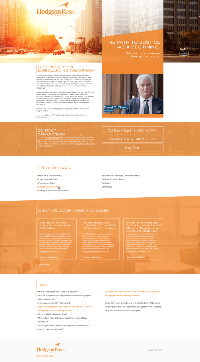
Whistleblower Landing Page.
One of the primary goals of the landing page was finding the right voice for the project and at 19 IDEAS we had great writing talent to accomplish that. Design-wise my approach was to incorporate the brand elements of modern angles and the vibrant friendly orange of the Whistleblower division. The page was lauded internally by the leadership.
Calls to Action.
Up from the highlighted information is Dan's contact information and informational video to straight to the point.
Backed Information.
Diving deeper we offer further information through a resourceful blog, types of fraud, and FAQs.
Experience in Motion.
The b-roll captures scrolling, story reveals, and the pacing of the Community Voices experience. It shows how the interaction model makes each nonprofit story feel focused and easy to absorb.
Whistleblower Advertisements.
I designed banner ads to be used by our digital marketing team to get the word out. Knowing the clients Hodgson Russ was hoping to attract wouldn't search for "whistleblower attorney," industry specific sites with high-traffic volume were identified to reach users in the government and pharmaceutical industries.

Still Curious?
Browse One of My Other Case Studies, Writings, Resources, Or Reach out for a Chat.
You can contact and connect with me through email, on Dribbble, or LinkedIn as well.