The Best Way to Explain Health Care Savings.
- Design
- UI + UX
Framing the Work for Independent Health.
At A Glance: Designed the Simple Ways To Save experience to help members understand their benefits and make more informed health care decisions. The work combined clear content structure, approachable illustration, and a responsive layout inside Independent Health’s My Health section.
Independent Health is an insurance provider that emphasizes award-winning customer service and keeping members first. The goal was to give the community a space to make the most of its health plans through a dedicated Simple Ways To Save resource.
Simple Ways To Save lives in the My Health section of independenthealth.com and is a key part of Independent Health’s member education strategy. Visit the My Health page to see how the resource supports members today.
Role: UI + UX Designer (Experience Strategy, Interaction Design, Content Clarity).
Partners: Independent Health Marketing, 19 IDEAS Strategy + Development, Illustration Contractor.
Scope: Member Education Experience, Responsive UI System, Illustration Integration, And Page Templates.
Tools: Sketch, Illustrator, Photoshop, HTML/CSS Handoff Specs, And Art Direction.
Constraints.
- Complex Health Topics: translate plan details and cost-saving guidance into clear, actionable language.
- Broad Audience: support members with different levels of health literacy and device usage.
- Brand Trust: keep the experience modern and friendly while staying consistent with Independent Health’s visual system.
What I Owned.
- Information architecture and content framing for the Simple Ways To Save experience.
- UX flow and UI layout across the core educational modules.
- Art direction for illustration style, color usage, and animation moments.
- Responsive behavior and handoff specs for development.
- Collaboration with the illustration contractor and internal marketing stakeholders.
Outcomes.
- A friendly, approachable member education hub anchored in clear visual storytelling.
- Content modules designed for scanning, comparison, and quick next steps.
- A responsive experience that keeps health guidance consistent across devices.
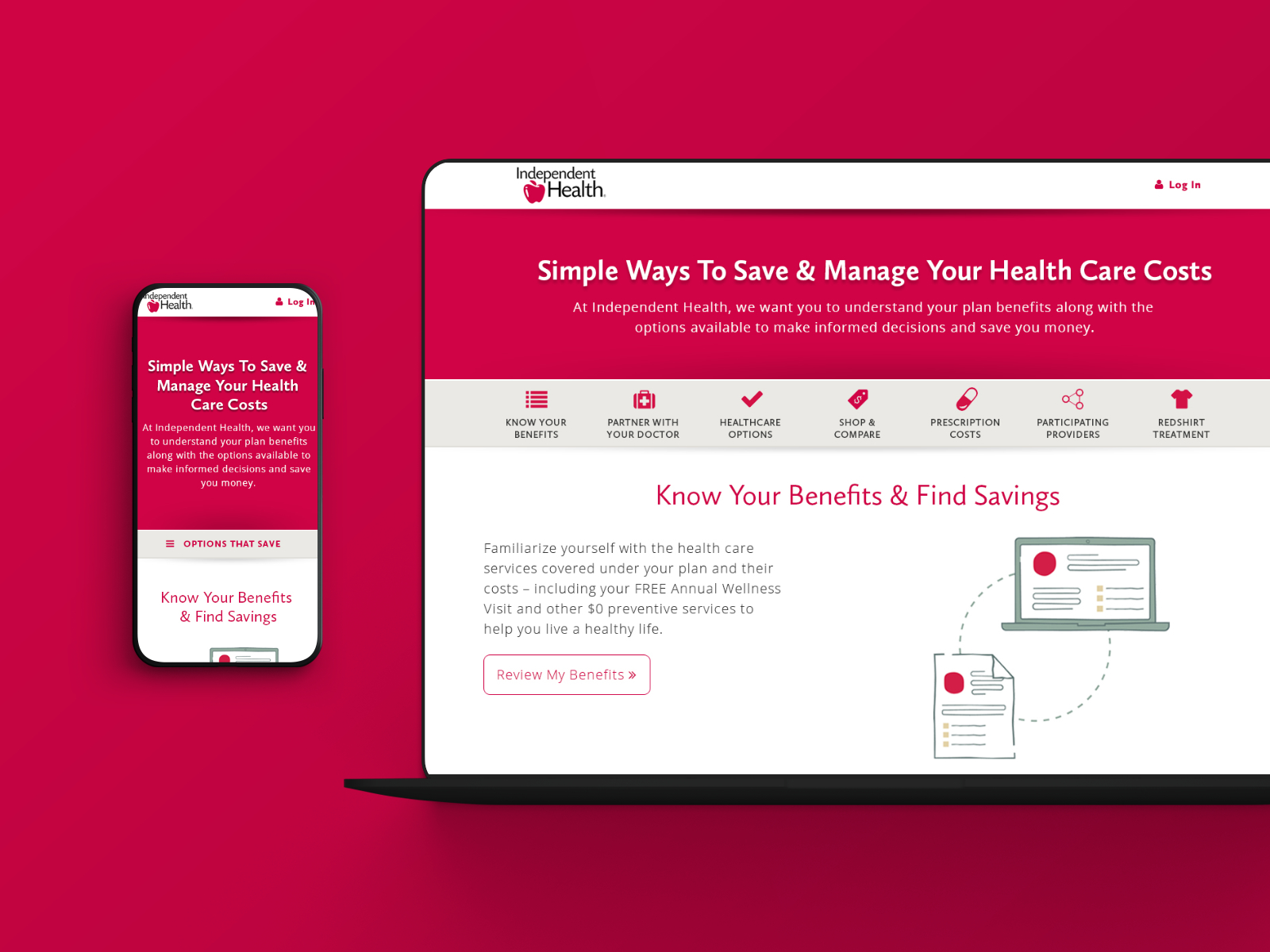
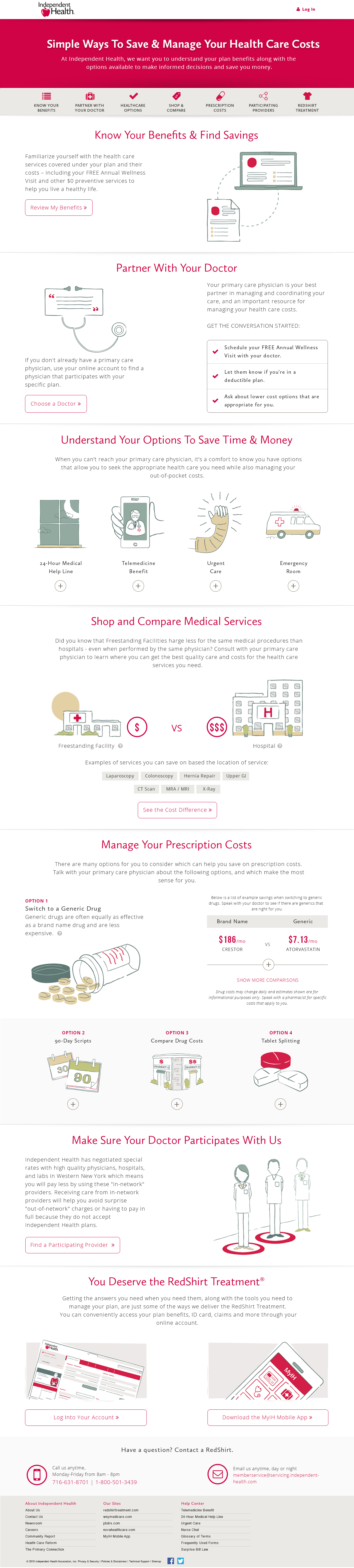
Health Education Front and Center.
Independent Health’s new web tool needed to capture attention, connect, and make the user want to stay a while. In the Simple Ways To Save section, users can access content quickly, and more importantly, it is simple to understand. The page uses strong interface design to simplify complicated health care information so consumers can quickly view straightforward benefit details.
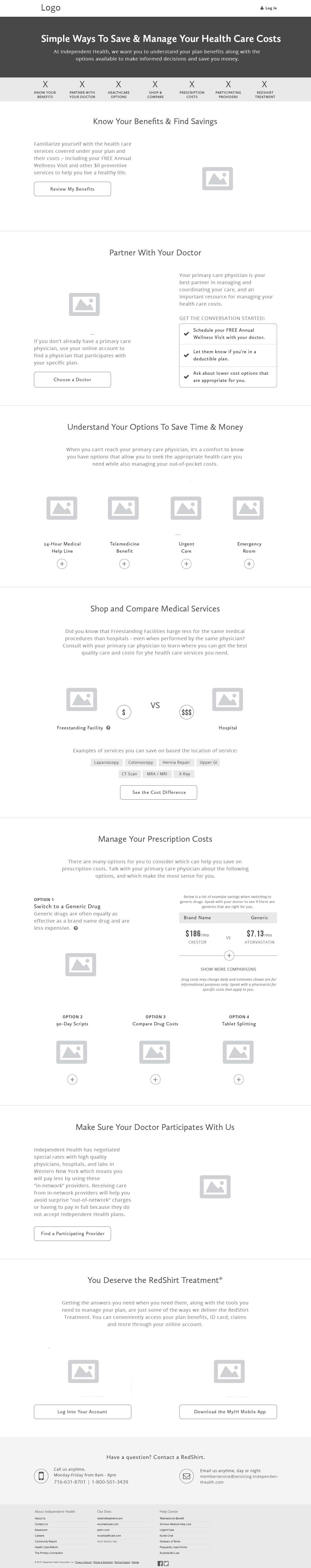
Wireframing the Landing Page.
Before visual design, I mapped the content hierarchy and interaction flow so members could scan, compare, and act without getting lost. The wireframe shows how each module stacks, where navigation anchors land, and how the page stays readable even with dense benefit content.
Designed for Every Device.
Members compare coverage options on phones, tablets, and desktops, so the design system needed to scale without losing clarity. The responsive layout keeps key actions, illustrations, and benefits content readable at every size.

Teamwork Makes the Dream Work.
Distilling complicated information into short, organized action items required real-time collaboration between Independent Health’s marketing team, 19 IDEAS UI designers, illustrators, and programmers.
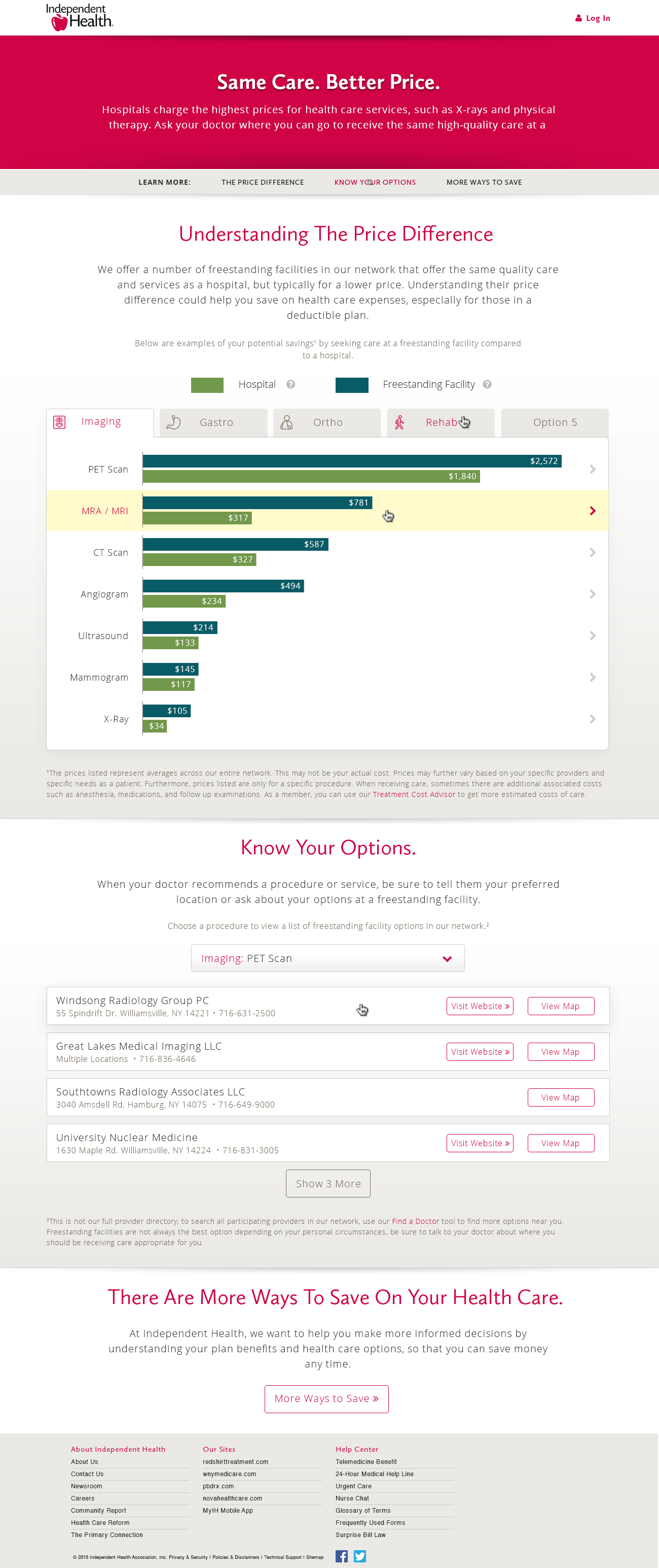
Price Comparisons Made Clear.
The shoppable procedures experience focuses on helping members compare costs without anxiety. Data visualizations, plain-language explanations, and progressive detail make it easier to understand tradeoffs before booking care.
A Fresh Outlook.
The illustration system marked a departure from traditional health care branding. Custom illustrations added texture and authenticity to the experience, while colorways pulled from Independent Health’s secondary palette kept everything cohesive. Subtle animations were designed to bring the illustrations to life and make each section feel more engaging.
Interaction Details That Build Trust.
Every interaction was tuned to make complex information feel approachable. Motion and hover states were used to guide attention without adding friction or visual noise.
Hero Banner.
White text buttons shift to bold on hover, and a soft shadow lifts the button to reinforce that it is interactive.
Scrolling Navigation.
The section navigation animates into place only after the hero background clears the top of the screen. Icons default to grey, then turn bold and red for the active section and on hover.
Review Plan Benefits.
The layout is designed to support the upcoming My Health Year module. Current illustrations and CTA content occupy half the grid, leaving room for a future side-by-side panel with matching styling.
The CTA button uses a neutral white background with a grey stroke and red label, then fills red with a subtle shadow on hover to signal action without feeling abrupt.
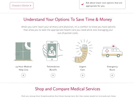
Talk to Your Doctor.
This module mirrors the same half-width layout to support My Health Year expansion. The hover state shown in the mock demonstrates the red fill and lift used across the experience.
Understand Health Care Options Cards.
Cards begin flat with illustration, title, and cost. On hover, a shadow introduces depth. On click, the card expands to reveal more details, and the row grows to preserve spacing. When open, the shadow softens but returns to a stronger state on hover.
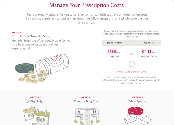
Managing Prescriptions.
A “?” icon indicates optional helper content. In the mock, one version shows a tooltip on hover (tap on mobile), and it dismisses on scroll.
View More buttons use red strokes by default and fill red on hover. When expanded, tables accordion open, content shifts downward, and the View More button hides in the open state.
Prescription cards follow the same hover and expand behavior as the health care options cards.
Shop and Compare.
Additional details slide in from the bottom as an overlay that can be dismissed with a click. Expanded tables mirror the prescription behavior, and buttons use the same hover states for consistency.
Redshirt.
No special development constraints beyond matching the shared button hover and lift treatments.
Experience in Motion.
The b-roll below captures the experience in action, showing scrolling, module transitions, and how illustrations support the content flow.
The Experience, End to End.
The Simple Ways To Save layout walks members through savings topics with clear headers, short explanations, and illustrated callouts. The long-form structure balances depth with scannability so members can jump to what matters most.
Still Curious?
Browse One of My Other Case Studies, Writings, Resources, Or Reach out for a Chat.
You can contact and connect with me through email, on Dribbble, or LinkedIn as well.