Making Healthcare Search Understandable for Infrequent, Stressed Users.
- Accessibility
- Design Systems
- Development
- UI + UX
- UX Research
Redesigned a white-labeled healthcare provider search platform to make search context visible, adjustable, and trustworthy without breaking an existing material-based design system or white-label constraints.
Key improvements included a contextual search system tying network, location, radius, and dependents directly to search and browsing, address-based location search to fix inaccurate results near geographic borders, and a new modular dialog system that enabled browsing, filtering, and adjustments without breaking user flow.
Through iterative design, four rounds of usability testing, and close collaboration with engineering, the experience became easier to understand, faster to use, and significantly more confidence-inspiring. Users consistently completed tasks more quickly, noticed and adjusted search context without prompting, and reported higher trust in results.
Framing the Work.
What This Was: An enterprise redesign of a white-labeled provider search platform where users infrequently search for care, often under stress, and need to trust results quickly.
Role
Lead UX And UI Designer (Design Systems + Pattern Ownership)
Collaboration
Product, Engineering, Research, And Partner Stakeholders
Scope
Contextual Search System, Modular Dialog Framework, Location + Radius Controls, Network + Dependent Selection, Content And Discoverability
Validation
4 Rounds Of Usability Testing With Unfamiliar Users
The Core Move: I reframed the problem as context visibility. Network, location, radius, and dependents became first-class, visible, and adjustable inputs tied directly to searching and browsing.
How We Made Decisions: We combined qualitative usability findings with quantitative behavioral data. Pendo reports helped identify where users dropped off, where they backtracked, and which entry points were underused. We also reviewed conversion and funnel data to prioritize fixes that improved clarity without increasing friction.
Testing Cadence: We ran four rounds of usability testing and refinement. I co-moderated rotating sessions (trading on-and-off) so we could keep facilitation sharp, capture consistent notes, and iterate quickly between rounds.
Key Outcomes.
- Users consistently noticed and understood search context without prompting.
- Adjustments to location, radius, and dependents became intuitive during browsing and results review.
- Task completion improved across primary workflows (search, browse categories, and refine results).
- Trust in results increased because the system explained itself.
Why This Matters For Enterprise Work.
- White-label safe: solved clarity problems without relying on a header redesign or fragile global layout changes.
- Design system compatible: introduced new patterns by extending existing components and states, not replacing them.
- Rollout-ready: designed progressive configurations so the system could ship in phases without rework.
Design System And Pattern Contribution.
This project was not just a UI refresh. It required rebuilding how search context, browsing, and adjustments work as reusable patterns inside an enterprise design system that multiple partners rely on.
- Contextual Search Pattern: a responsive search system that binds state (network, location, radius, dependents) to every entry point.
- Modular Dialog Framework: a consistent dialog anatomy with header, action ribbon, content area, and conditional footer, designed to support complex tasks without breaking flow.
- State + Accessibility: documented focus/active states, touch targets, responsive rules, and do/don’t guidance to keep implementations consistent.
- Phased Configurations: designed MVP through advanced configurations so features could ship safely without rework.
Overview.
This project focused on improving the usability, clarity, and flexibility of a white-labeled healthcare provider search platform used to find in-network care.
Most users interacted with the product infrequently, often when starting a new health plan or searching for care under stressful circumstances. Many were unfamiliar with how healthcare networks, locations, dependents, and distance affected results.
Despite this, the interface required users to manage multiple layers of invisible context while searching. The goal of this work was to make that context visible, understandable, and easy to change without disrupting an established design system or breaking white-label requirements.
The result was a modular, accessible search experience that significantly improved discoverability, task success, and confidence in results.
The Problem.
Usability testing revealed a consistent pattern. Users could complete searches, but they were often unsure whether the results were correct.
On the homepage, users frequently overlooked which network, location, or dependent they were searching under. Those parameters existed, but they felt disconnected from the search input itself.
Once users did notice them, they did not realize those selections applied globally to the search input, common searches, and featured categories. As a result, users treated those shortcuts as separate systems rather than filtered entry points into the same search experience.
Browsing was also constrained. Only a handful of categories were visible on the homepage, and users could not browse all categories without performing a search first. If a user did not know what to search for, they were effectively blocked.
After a search was completed, users could no longer change dependents from the results page. Adjusting required returning to the homepage, breaking flow and increasing frustration.
Location controls added further confusion. Search radius was buried in filters, making it difficult to see what radius was active, how distance was calculated, or how to change it quickly.
The system worked, but it did not explain itself.
Constraints.
This was not a greenfield redesign.
The platform relied on an existing material-based component library. Major visual or structural changes were out of scope and budget.
Because the product was white-labeled, the header needed to accommodate unpredictable branding. Some partners required extremely wide logos or multiple logos grouped together. Adding more controls to the header risked breaking layouts across clients.
Any solution needed to improve clarity without introducing instability.
Expanding Scope.
Midway through the project, address-based location search was added to the requirements.
Previously, users could only enter a zip code, city, or state. Distance was calculated from the centroid of those areas, which produced inaccurate results for users near geographic borders. Users could live minutes from a provider and still see no nearby results.
This surfaced a deeper issue. Because radius controls were buried, users had no way to understand why results looked wrong or how to fix them without trial and error.
Address search alone was not enough. Location and distance needed to become first-class, visible elements of the experience.
Reframing the Problem.
The issue was not data quality or search performance. It was context visibility.
Users needed to always understand:
- What they were searching for
- Who the search applied to
- Where results were anchored
When that context was visible and adjustable, confusion dropped immediately.
The Approach.
I benchmarked healthcare and non-healthcare search experiences across mobile and desktop, focusing on how systems communicate state and scope.
I explored modular wireframes that could scale across breakpoints while remaining compatible with the existing component library. These ranged from low-risk refinements to more progressive patterns designed for incremental rollout.
I then developed multiple high-fidelity directions, intentionally spanning conservative through forward-looking solutions so stakeholders could evaluate tradeoffs concretely.
To validate decisions, I co-moderated four rounds of usability testing with participants unfamiliar with the platform. This ensured fresh mental models and surfaced real confusion points.
The Solution.
Contextual Search.
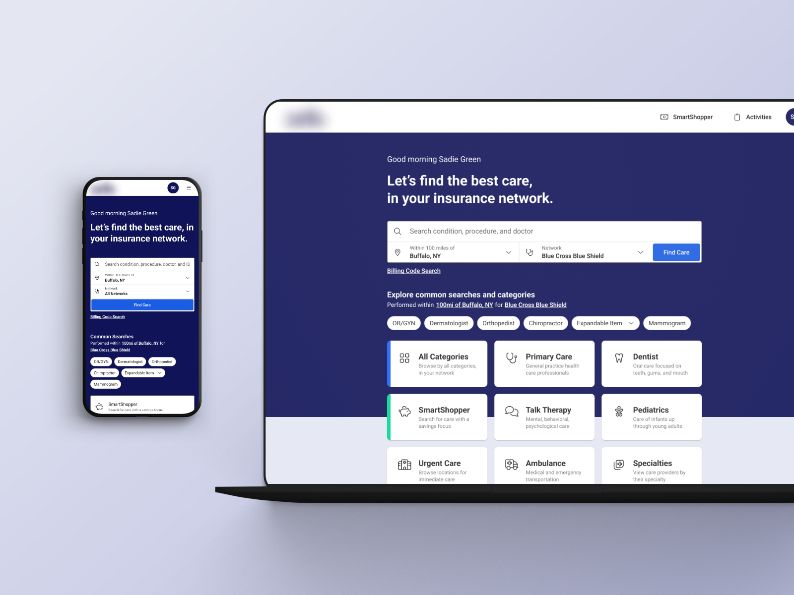
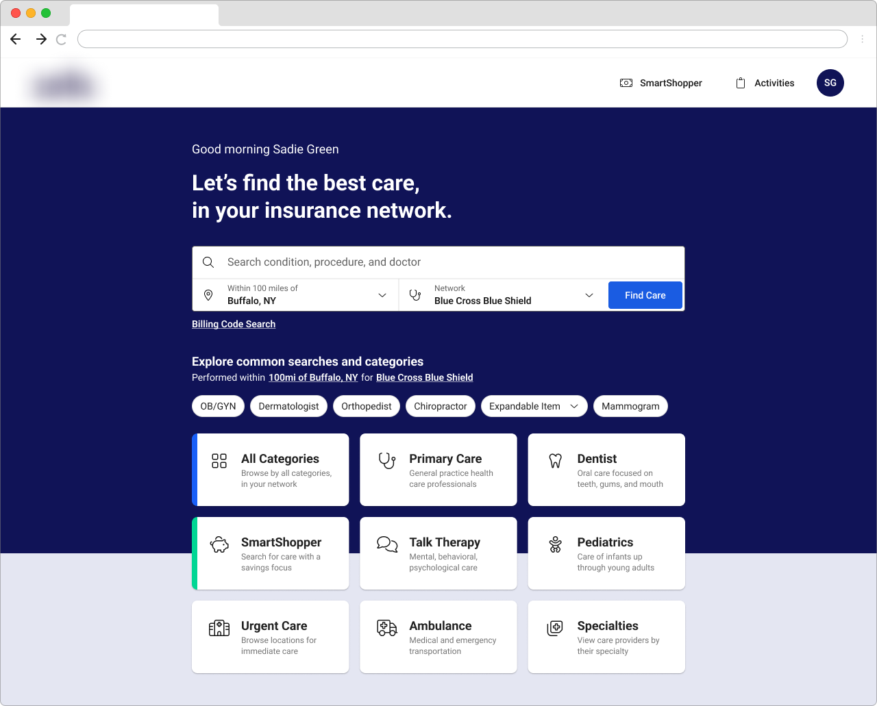
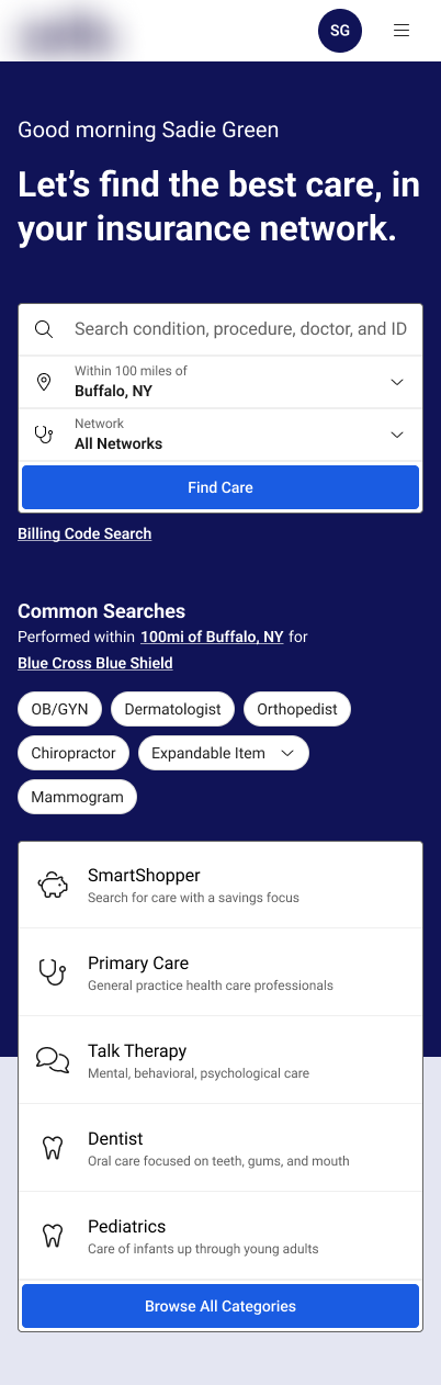
A new search component grouped all parameters with the search input itself. Network, location, radius, and dependents were visually and behaviorally connected, making it clear that all entry points shared the same rules.
The component was responsive by design, adapting from a full-width desktop ribbon to stacked and single-column layouts for tablet and mobile. Dependents were accessible on all screen sizes.
The logged-in hero pairs the new contextual search with clear state indicators, so users understand what they’re searching for, who it applies to, and where results are anchored at a glance.
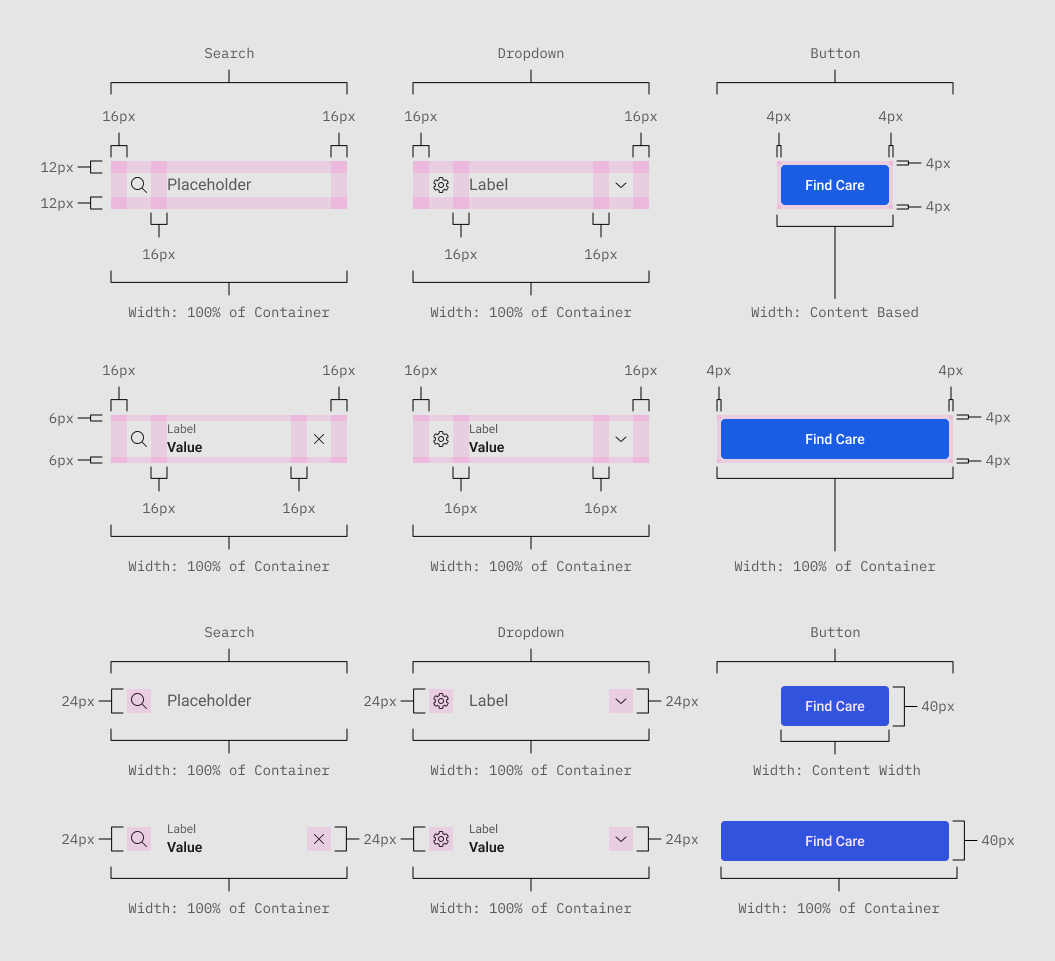
Component Atom Anatomy, Showing Sizing and Spacing Specifications.
Component Anatomy, Showing Parameters Are Organized.
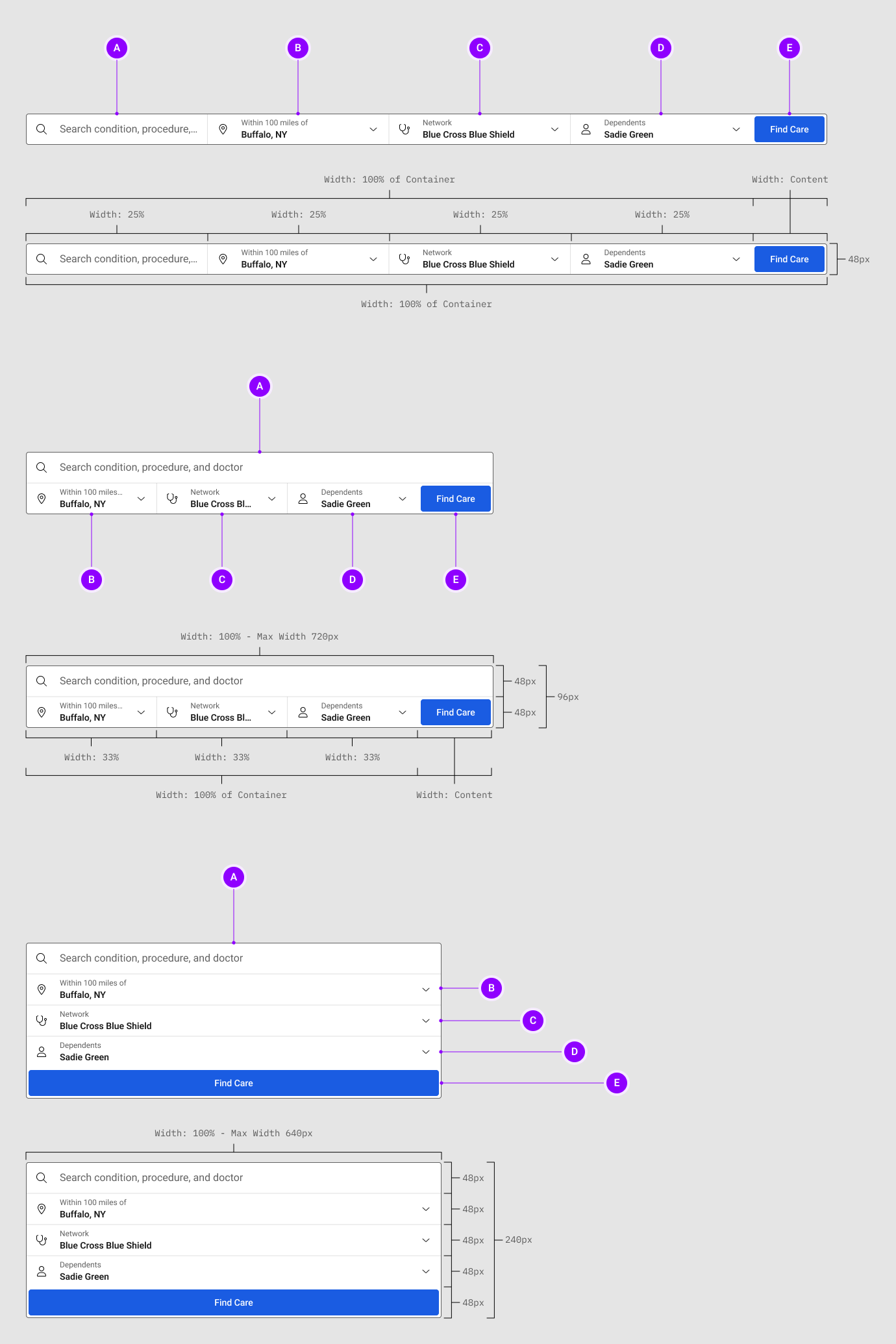
Search Component Anatomy:
| A |
Search Input. Searching with Auto Suggestions. The search field will be for searching keywords for care, doctors names, locations, etc... to narrow down search results for the type of care the user is looking for. When it’s active, it will also open up the auto suggestions panel that will populate with suggested search criteria based on what the user is entering. |
|---|---|
| B |
Location Parameter. Location and Range Data Dialog Launcher. Activating the location parameter will open up the location parameter dialog that will allow users to search by location and adjust the search range / radius of their search. |
| C |
Network Parameter. Network Selection Dialog Launcher. Activating the network parameter will open up the network parameter dialog that will allow users to browse network offerings for supported providers. |
| D |
Dependents Parameter. Dependents Selection Dialog Launcher. Activating the dependent parameter will open up the dependent parameter dialog that will allow users to select those on their health plans to browse for care with more accurate pricing and supported providers. |
| E |
Find Care Button. An Option and Visual Anchor. When filling out the search parameters, you can still hit “Enter” when typing in the search field. The find care button is there for an alternate route option for accessibility, clarity, and to draw the eye over the search parameter input selections. |
Putting it All Together:
Now we take the search input and parameter controls and combine them into a cohesive search experience that is both accessible and intuitive for the homepage hero. The next two images diagram the sizing and spacing documentation for the tablet and larger devices, narrow, mobile devices.
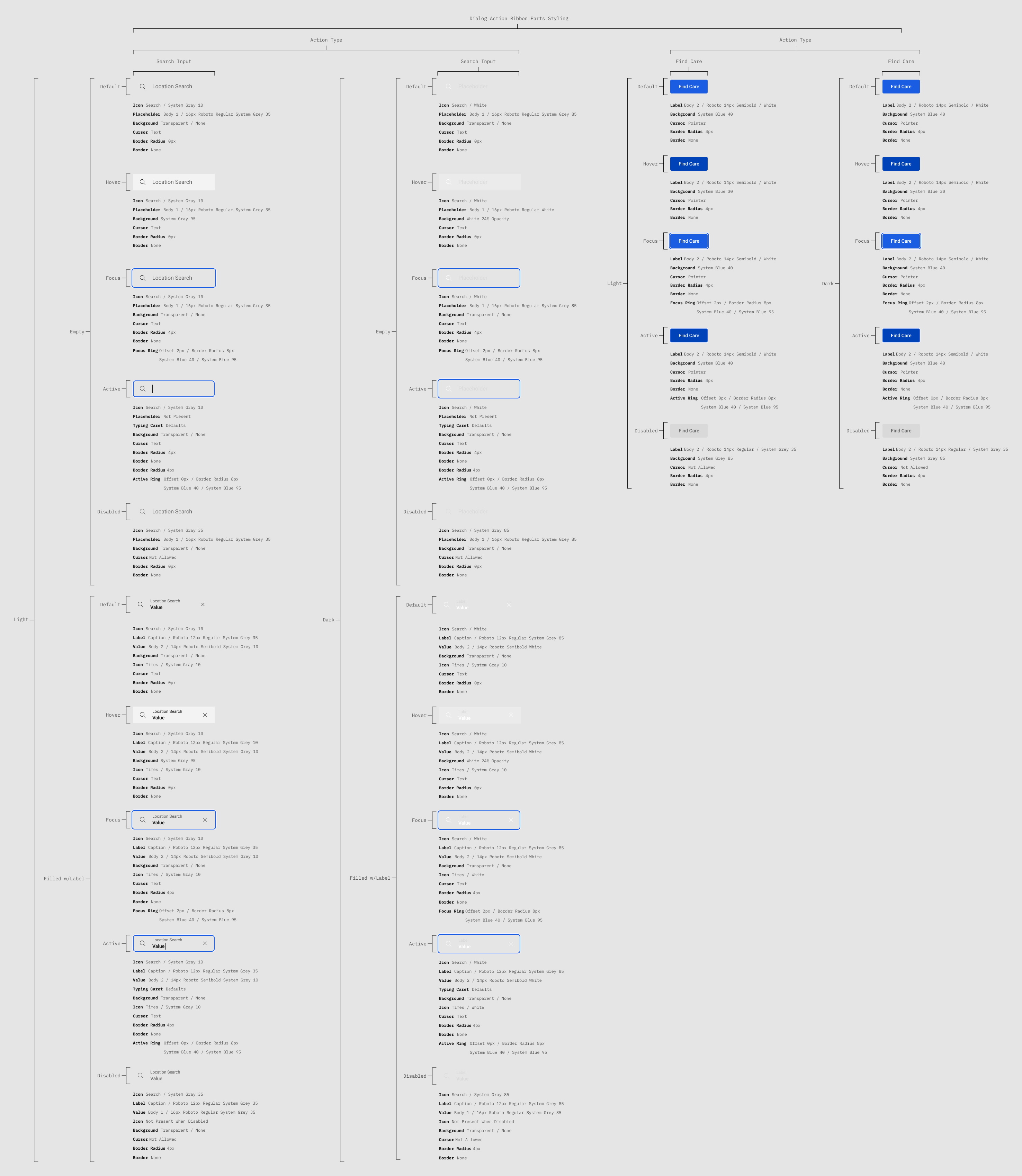
The Dialog Anatomy. Showing Sections by Letter and Component Details by Number.
| A |
Dialog Header. Required. The dialog header will always be present since the dialog title is a required item to always be present. |
|---|---|
| B |
Dialog Action Ribbon. Optional. The action ribbon is an optional, intractable area for more complex actions in a dialog such as search and select/filter. Responsive. In the dialog’s “little” configuration, or when screen sizes compress to mobile sizes, the ribbon elements will stack in a single column with the exception of the back button, which will remain on the top row with the first, or only actionable element. |
| C |
Dialog Content Area. Required & Dynamic. This is where you would insert any content into a dialog to allow the user to complete their task or gain information. |
| D |
Dialog Footer. Conditional. The footer only displays when one of it’s internal elements is needed such as, the footer checkbox and label, primary, and secondary buttons. Responsive. In the dialog’s “little” configuration, or when screen sizes compress to mobile sizes, the footer elements will stack in a single column. Along with the buttons becoming full-width for easier touch targets on mobile devices.. |
| E |
Default vs Fullscreen. The styling will change on the dialog depending on if it’s in it’s default overlay layout or fullscreen layout. Default. The default use will have the dialog overlay the page with a scrim and have rounded corners with a box shadow. Fullscreen. When in fullscreen, the dialog goes full-width and height, so there will not be rounded corners or box shadows since the dialog is intended to cover up all of the page content beneath it. This style is used on smaller mobile breakpoints. |
| 1 |
Dialog Title. Required. The dialog title will always be present, giving a short and concise title for context. The title should be short and only a couple words max (ideally a single line) for easy readability. |
|---|---|
| 2 |
Dialog Description. Optional. When you need to give further context, description, and or instructions, that would not otherwise go in the dialog’s content itself. You can use the optional dialog description. It should be kept as short as possible for readability, however, it can wrap and grow in height for longer descriptions. |
| 3 |
Dialog Close. Required Conditionally. If your dialog does not use a “cancel” button that would close the dialog, then you must use the close “X” button which uses the “text” style icon button. |
| 4 |
Dialog Back. Appears Conditionally. The back button appears conditionally when navigating from one dialog to another to give a way of back tracking. Conditional Locations. Depending on the use case the button may appear in the header, inline with the title, description, and close button, or it may appear in the action ribbon on the far left if in use. |
| 5 |
Dialog Ribbon Search. Optional. The action ribbon can contain a search with auto-suggest when needed. This can be used for searching (address search), as well as filtering (browsing categories). |
| 6 |
Dialog Ribbon Select. Optional. Select (Angle Down). The angle down select is used when a dropdown menu will appear. Navigational (Angle Right). The angle right select is used when you are going to be taken to a new dialog or page as a result of interacting with it. This is demonstrated when adjusting the location when browsing categories since you will be accessing the locations dialog in order to be able to utilize the search and range adjustments. |
| 7 |
Dialog Content Area. Required & Dynamic. This is where you would insert any content into a dialog to allow the user to complete their task or gain information. |
| 8 |
Dialog Checkbox. Optional. The checkbox and label can be used optionally for a variety of user inputs. Examples may include “don’t show again” for prompts they want to dismiss permanently, along with checking and opting in/out of disclosures such as privacy policies, newsletter sign ups, and more. |
| 9 |
Dialog Secondary Action. Optional. When more than one action is present in a dialog, you may need use of the secondary button. Examples of secondary actions would be a “reset” button seen in the search parameters’ dialogs and filters, or a “cancel” button that would be paired with a primary action and would close the dialog. |
| 10 |
Dialog Primary Action. Optional. When your dialog has an action to complete, the primary button will be used to do so. Examples would be submitting forms filled out in a dialog, confirming and acknowledging messages, applying search parameters and filters, etc... |
| 11 |
Type to Filter. Optional. When you need to browse long lists, the type to filter, paired with the anchor links component, can quickly navigate users to what they are looking for. |
| 12 |
Anchor Links. Optional. Activated with the type to filter, anchor links will jump you down to specific points in an alphabetical list. Style. Sections that have items to navigate to will have a bold link version of their letter, where-is sections that are not present, will have their letter regular weight and disabled. Responsiveness. Since the touch target size on the smallest dialog crams the letters together too tight, even when made caption size, they are replaced by a dropdown select in order to still be accessible. |
| 13 |
Navigational. Optional. You’ll notice when the type to filter with anchor links element is active, we will no longer have a search input in the top ribbon, since the type to filter accomplishes this task. Navigational inputs would navigate you to new pages or dialogs, as opposed to dropdown menus. This may be used in instances a dropdown doesn’t present enough functionality, such as the location selection when browsing by category. |
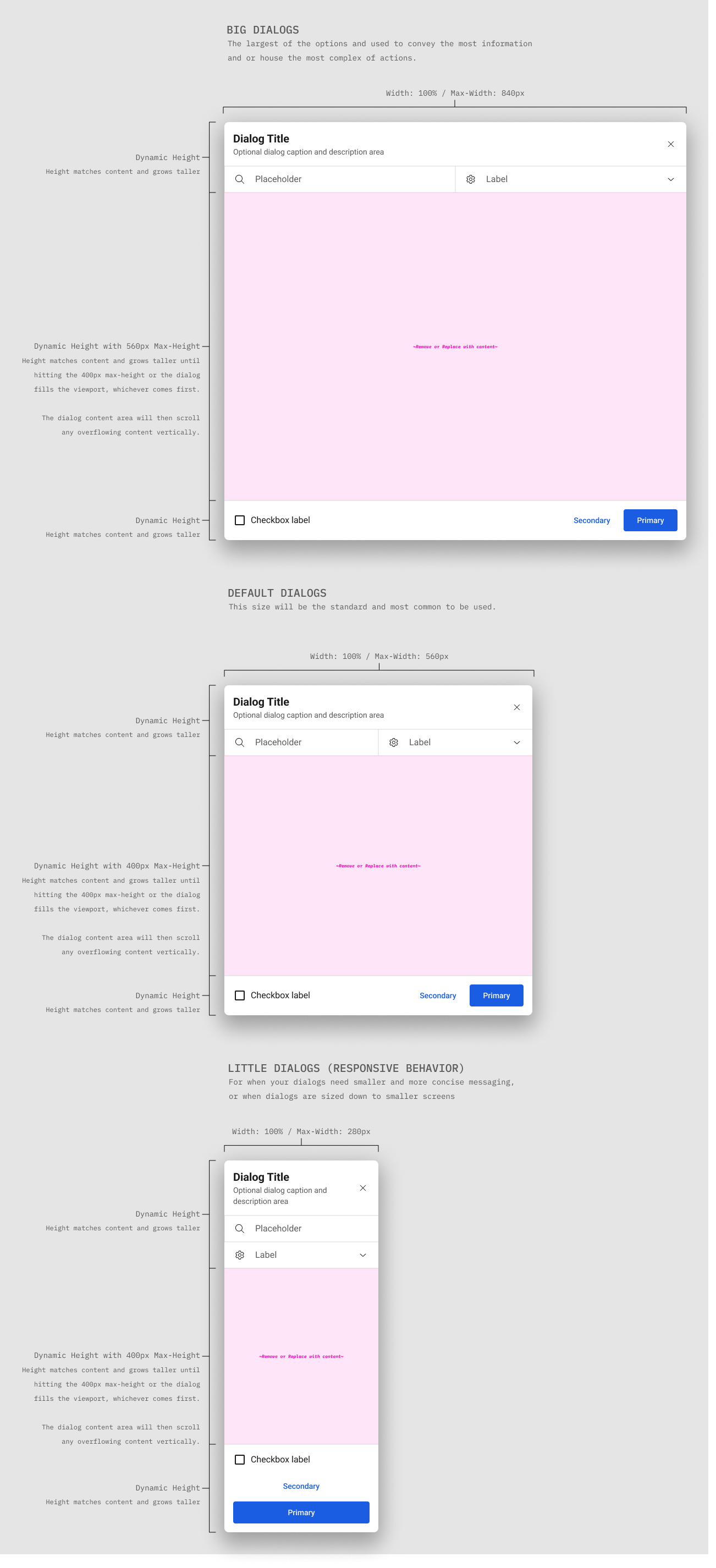
Spacing and Sizing.
Spacing and sizing rules keep the dialog system consistent across screen sizes, making it easier to scan, easier to use, and easier to maintain. These specs document padding, type scale, touch targets, and alignment so every configuration stays readable and accessible.
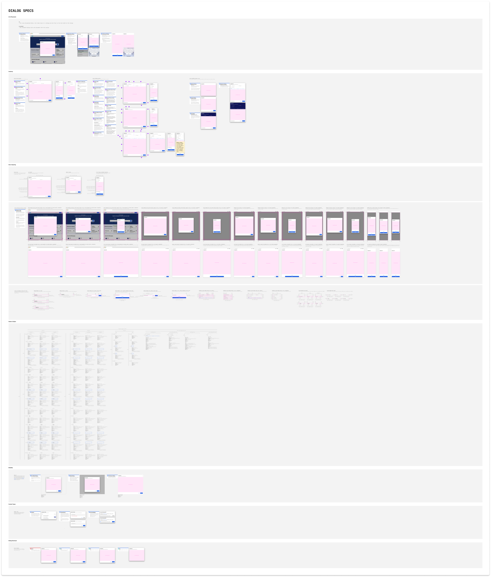
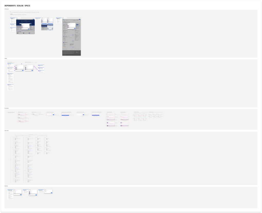
Dialog Documentation Overview.
This is a zoomed-out view of the full dialog documentation set. It’s not meant to be read line-by-line here, but to show how the system comes together across anatomy, sizing, spacing, positioning, display types, configuration states, and clear do/don’t guidance.
Navigation Simplification.
Rarely used settings were moved into the user profile menu. This reduced clutter, preserved space for unpredictable branding, and created room for future navigation without reworking the header.
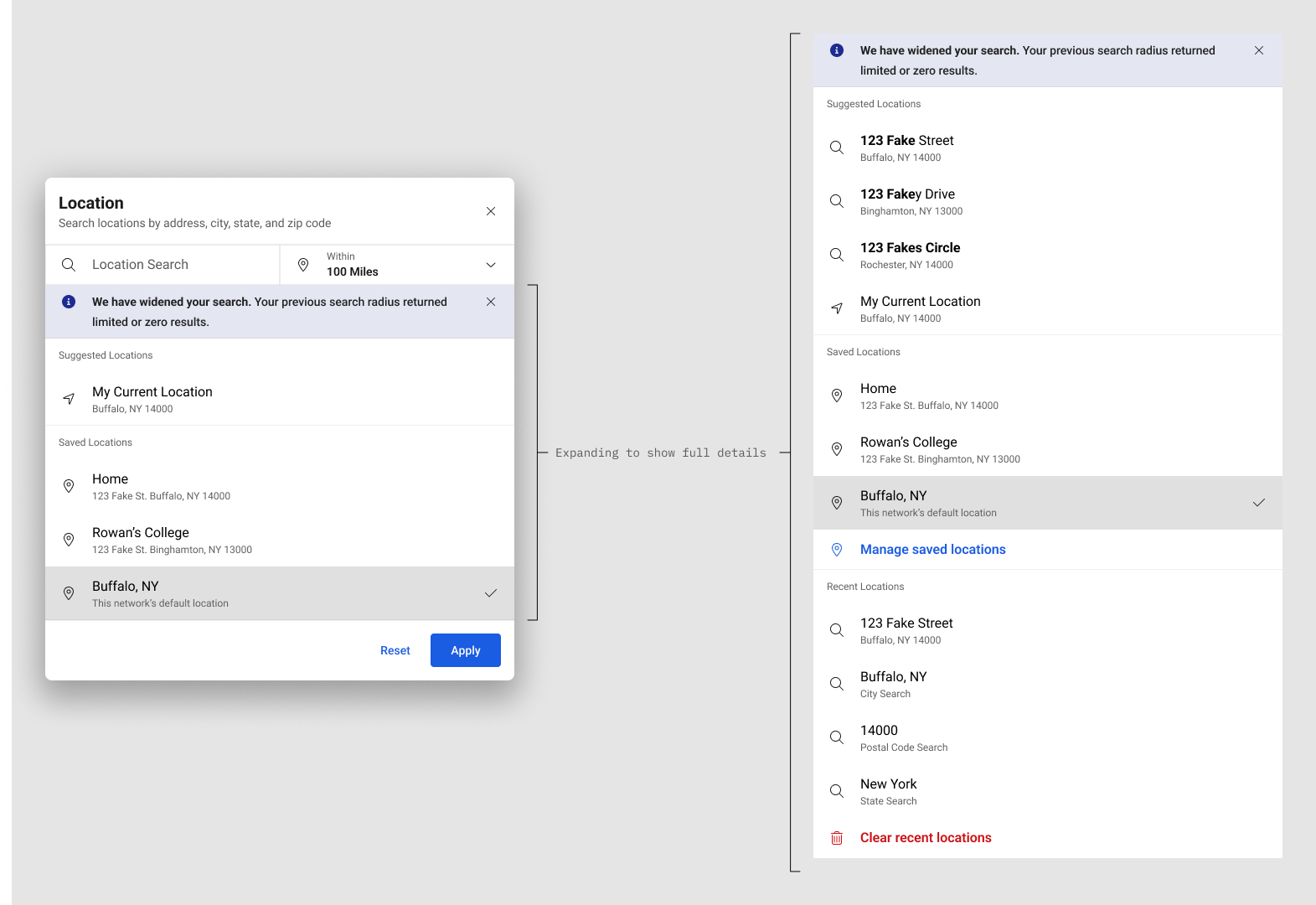
Location and Radius.
Location dialogs clearly displayed the active radius and allowed immediate updates. Address autocomplete supported street address, city, state, and zip.
Logged-out users were given sensible defaults to ensure results always had a location anchor. Logged-in users could save multiple addresses, supporting scenarios like searching near work, for dependents away at college, or for loved ones in other cities.
The location dialog also followed a phased rollout to manage added complexity: first the new dialog system, then address support, and later recent search history and saved addresses.
This view shows the location dialog with every available configuration turned on. The left image shows how content scrolls within the dialog, while the right shows all options visible at once.
Networks and Dependents.
Network selection gained search, visual scanning aids, pinned enrolled networks, and support for saving additional networks.
Dependents were elevated to first-class entities. Dialogs supported search, clear labeling, tier indicators, and avatars, reducing errors and increasing confidence when searching for someone else.
This network view contrasts the MVP and advanced configurations. The left shows the icon-only list with enrolled networks pinned to the top for logged-in users. The right adds provider logos and the ability to manage saved networks, including pinning plans for family members you support.
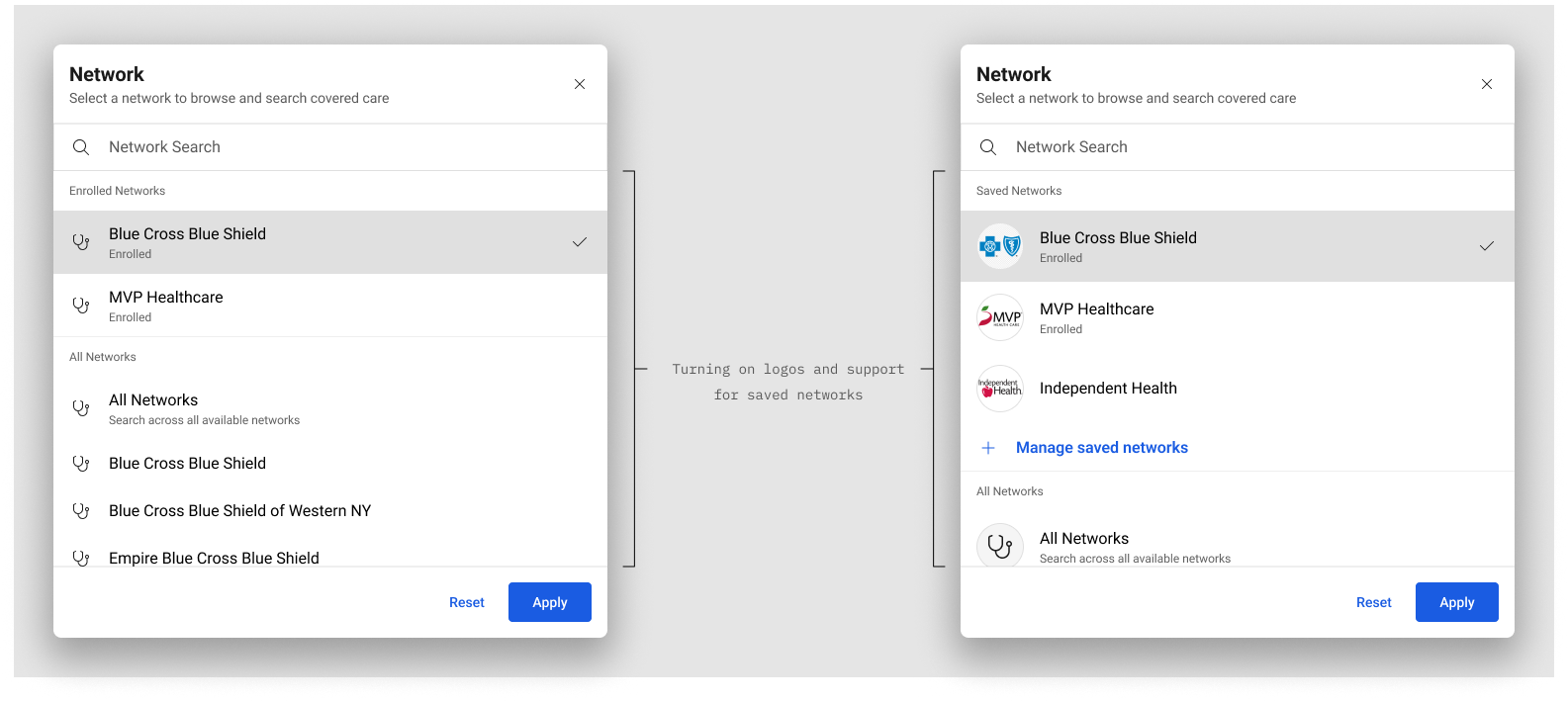
Network dialogs supported logo images via the avatar component or icons next to networks, configurable to each provider’s preference. The imagery improved recognition and scanability, with search appearing conditionally for longer network lists.
This dependents view shows the dialog and the live search state. The left illustrates the default list, and the right shows filtering in action with matched text highlighted in bold.
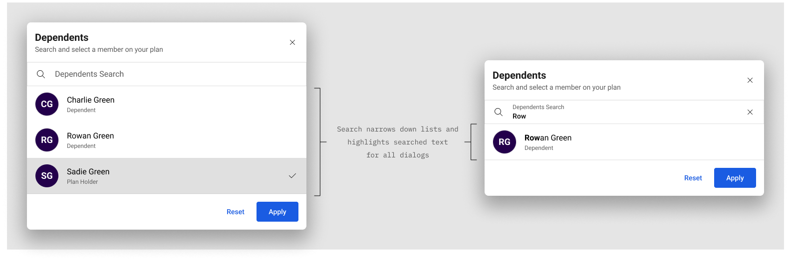
Dependents dialogs supported avatars or icons beside plan members, configurable to provider preference. Search and the dialog system were applied conditionally for longer member lists.
Content and Discoverability.
Copy was rewritten to clarify functionality and relationships. Common searches and categories were aligned under a shared mental model. The “All categories” entry point was moved into context, eliminating the need to search simply to browse.
Space reclaimed on the results page allowed dependents to be adjusted without leaving results.
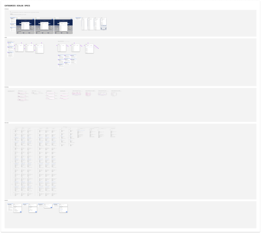
The categories dialog allows users to browse from high-level groupings down to niche services. The first page supports featured, provider-configurable lists, then drills into child categories and items. Long lists include search with alphabetical anchor links and grouping for faster navigation.
Accessibility and Delivery.
Accessibility improvements were integrated from the start. New focus and active states were designed, including offset focus outlines for improved visibility. I collaborated directly with engineering, providing example code and detailed documentation covering states, spacing, color usage, and responsive behavior.
Leadership Notes And Tradeoffs.
This work balanced clarity improvements with enterprise constraints. The key tradeoff was resisting a header-first solution and instead making context visible where users actually make decisions: at the search input, while browsing, and while reviewing results.
- Stability over novelty: extended existing components and states to reduce implementation risk.
- Progressive complexity: advanced features (saved addresses, recent searches, richer logos) were designed as optional configurations.
- Trust as a feature: clarity and explainability were treated as product functionality, not polish.
Results and Impact.
Task Success
33% (tracking baseline) to 100% (usability testing)
Validation
4 Rounds Of Testing And Refinement
Signals Used
Pendo Behavior Reports + Conversion And Funnel Data
Enterprise Fit
White-Label Safe, Design System Compatible
- Users consistently noticed and understood search context without prompting.
- Adjustments to location, radius, dependents, and networks became intuitive during browsing and results review.
- Task success improved from 33% (tracking baseline) to 100% in testing scenarios.
- Confidence in results increased because scope and state were visible and explainable.
We paired qualitative testing insights with quantitative signals. Pendo reports helped us identify drop-off points, backtracking behavior, and underused entry points. Conversion and funnel data helped prioritize improvements that increased clarity without adding friction.
Participants frequently commented that the redesigned experience felt clearer and easier than their own healthcare tools. The platform became more understandable, more flexible, and more trustworthy without disrupting existing systems.
Still Curious?
Browse One of My Other Case Studies, Writings, Resources, Or Reach out for a Chat.
You can contact and connect with me through email, on Dribbble, or LinkedIn as well.