Building My Brand: A Case Study in Minimalism, Modularity, and Meaning.
- Branding
- Development
- Graphic Design
- UI + UX
Most of my professional work sits under NDA, which limits what I can show publicly. So I built this — a case study that demonstrates how I think and work through design challenges.
This project isn't just about a logo or website. It's about applying design systems, accessibility, and UX principles to create a cohesive, performant, and extensible identity — one that could evolve just like a product.
Are you interested in working together? Let's talk about how I can help you build a better product or experience.
My Work Centers on Clarity, Empathy, and Structure.
Every decision has purpose — whether that's a color choice improving contrast or a system pattern reducing cognitive load.
I design with three guiding principles:
- Simplicity: Remove what doesn't add value.
- Scalability: Systems should evolve, not reset.
- Accessibility: Design is only successful when everyone can use it.
Framing the Problem.
Challenge
Most of my UX and design system work is protected by NDAs, leaving me without visual case studies to share.
Solution
Build a living system that showcases the same strategy, process, and craft I bring to client projects — through my own brand and website.
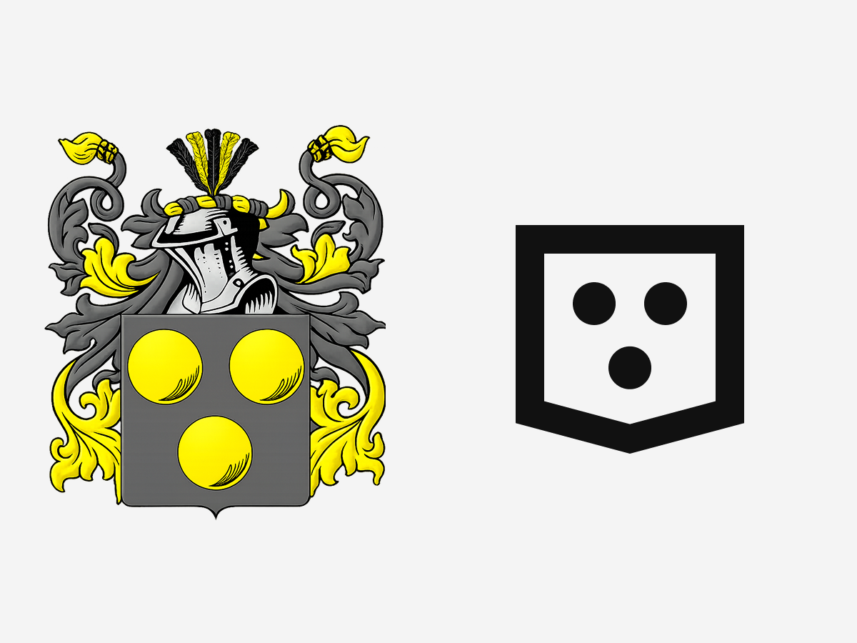
From Family Crest to Modular Mark.
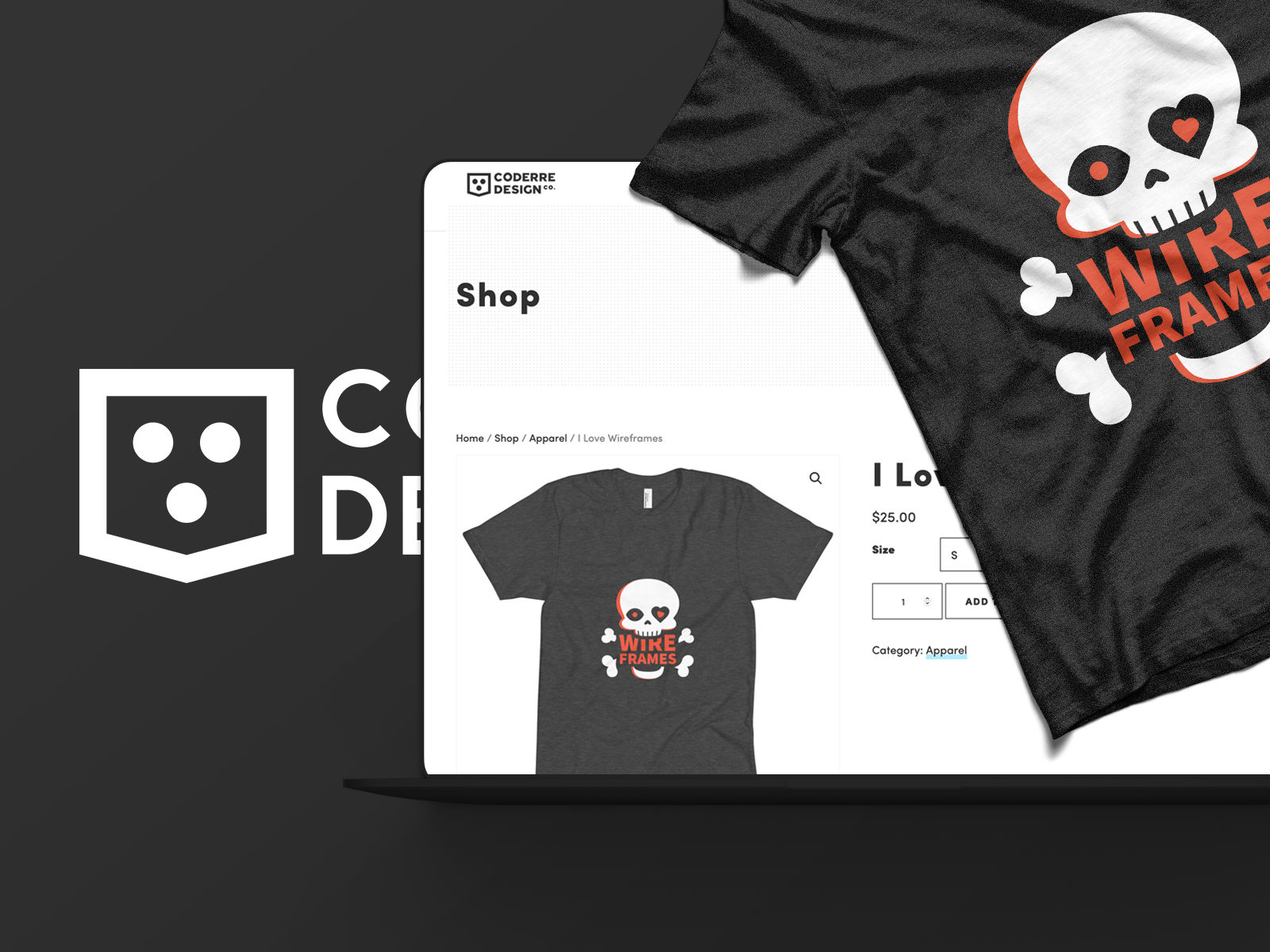
This project began as a design exercise: simplifying my family crest into something timeless and functional.
I explored how far I could distill a complex, symbolic form into a modern, modular identity. The result became more than an experiment — it evolved into my personal and freelance brand, now used across print, digital, and even on the cornhole boards at my wedding.
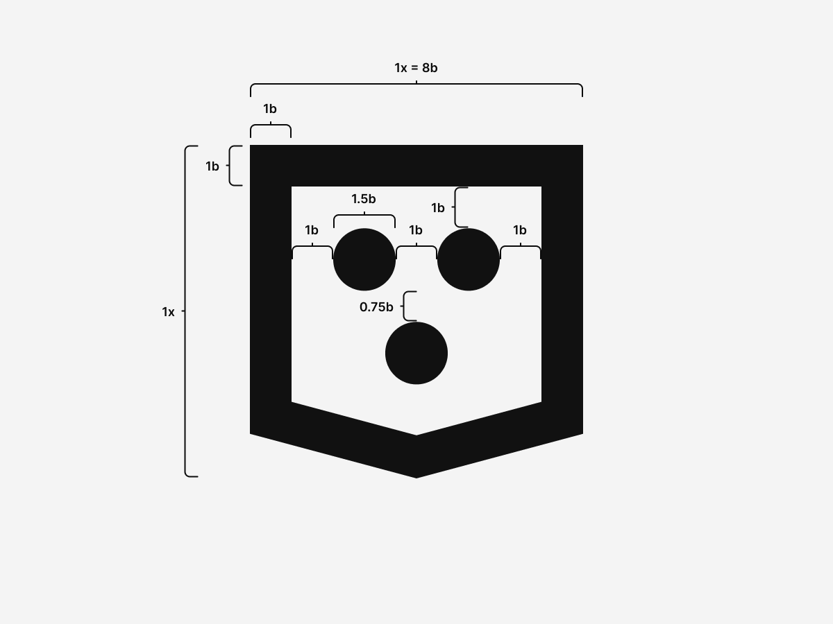
Process and Proportions.
Each stroke and space follows a consistent modular ratio. The underlying grid supports not just the logo, but future assets like icons and patterns.
Versatility and Extensibility.
The mark works in monochrome, print, web, and motion. Its simplicity keeps it recognizable in any format — a key UX principle for brand trust and recall.
A Minimalist Brand System.
Two colors, infinite flexibility. Ink and paper cover every surface and UI state, then invert their usage for dark mode to keep contrast consistent across environments.
Light Mode.
Text, links, borders, actions, icons.
HSL 0 0% 8%
Backgrounds, surfaces, negative space.
HSL 0 0% 96%
Dark Mode.
Text, links, borders, actions, icons.
HSL 0 0% 96%
Backgrounds, surfaces, negative space.
HSL 0 0% 8%
Halftone Patterns.
Inspired by classic computing screens and printed dithering, these patterns add texture with a strict two-color palette. Each halftone stays legible in both modes because it only mixes ink and paper.
Halftone 100 --tc-halftone-100
Solid paper base for clean surfaces.
Halftone 200 --tc-halftone-200
Light dot grid for quiet texture.
Halftone 300 --tc-halftone-300
Denser dots for subtle emphasis.
Halftone 400 --tc-halftone-400
Micro grid for fine texture.
Halftone 500 --tc-halftone-500
Micro grid doubled for stronger texture.
Halftone 600 --tc-halftone-600
Inverse micro dots over ink.
Halftone 700 --tc-halftone-700
Inverse dots, denser for depth.
Halftone 800 --tc-halftone-800
Inverse dots at mid density.
Halftone 900 --tc-halftone-900
Solid ink base for bold panels.
Typography.
Two fonts run the system: Hyperlegible Sans for interface copy and a precision mono for technical detail.
Aa Bb Cc Dd Ee Ff Gg Hh Ii Jj Kk Ll Mm
Nn Oo Pp Qq Rr Ss Tt Uu Vv Ww Xx Yy Zz
0123456789 • ! ? & @ # ( ) [ ]
The quick brown fox jumps over the lazy dog.
Hyperlegible Sans improves character differentiation and overall legibility for people reading quickly or under stress, making it a strong fit for accessibility-first UI. Why Hyperlegible Sans works and latest releases.
Inter is still a great font, and it remains the fallback in the stack. Inter documentation.
abcdefghijklmnopqrstuvwxyz 0123456789
{ } ( ) [ ] ; : , . / * + - =
const theme = 'dark'; // small but readable
JetBrains Mono keeps code and technical labels crisp at small sizes thanks to its consistent widths and clear punctuation. JetBrains Mono download.
Iconography.
Using Font Awesome Pro gives me a scalable, accessible foundation for icons while enabling custom illustration integration. Because it's font-based, it inherits accessibility, weight control, and adaptability across contexts.
- Idea
- Compare
- Accessibility
- Checklist
- Performance
- Systems
Accessibility as UX.
Accessibility drives every decision.
As a CPACC-certified designer, I see accessibility not as a checklist but as good UX — improving clarity, predictability, and comfort for everyone.
I maintain a Figma Accessibility Checklist that guides contrast, motion, labeling, and focus behavior. It's a living document used to test and iterate on design decisions before they reach production.
The Website: Lightweight, Static, and Dependable.
This website is the latest evolution of years of experimentation — from static HTML, to multiple WordPress iterations, experimentation with Hugo, Jekyll, and many others — now distilled into a fully self-contained, dependency-free system that's back-to-basics.
Architecture.
- Structure: custom class-based CSS framework
- Markup: semantic HTML5 for clarity and SEO
- JS: minimal and purposeful — toggles, progress indicators, accessibility helpers
- Hosting: portable via GitHub Pages or Netlify, no build steps required
Light & Dark Modes.
The theme toggle uses CSS variables and localStorage to persist user preference — small script, high UX impact.
HTML
Drop a single script in the head and the toggle button in the nav. The icons swap based on theme state so the action is always clear.
<head>
  <script src="assets/scripts/scripts.js"></script>
  <link rel="stylesheet" href="assets/styles/style.css">
</head>

<header id="Top">
  <a href="index.html" aria-label="Home">
    Tyler Coderre
  </a>
  <nav aria-label="Primary">
    <ul>
      <li><a href="about.html">About</a></li>
      <li><a href="index.html#work">Work</a></li>
      <li><a href="index.html#contact">Contact</a></li>
    </ul>
    <button type="button" data-theme-toggle aria-label="Switch to dark mode" aria-pressed="false">
      <i class="fa-sharp fa-regular fa-lightbulb-slash" data-theme-icon="light" aria-hidden="true"></i>
      <i class="fa-sharp fa-regular fa-lightbulb-on" data-theme-icon="dark" aria-hidden="true"></i>
    </button>
  </nav>
</header>
CSS
The palette is inverted by swapping ink and paper, while halftones are built from the same two colors. A soft transition smooths the mode change with a reduced-motion fallback.
:root {
  --tc-root-ink: hsl(0, 0%, 8%);
  --tc-root-paper: hsl(0, 0%, 96%);

  --tc-halftone-100: var(--tc-root-paper);
  --tc-halftone-200: radial-gradient(circle 1px at 0 0, var(--tc-root-ink) 1px, transparent 0) 0 0 / 4px 4px, var(--tc-root-paper);
  --tc-halftone-300: radial-gradient(circle 1px at 0 0, var(--tc-root-ink) 1px, transparent 0) 0 0 / 4px 4px, radial-gradient(circle 1px at 0 0, var(--tc-root-ink) 1px, transparent 0) 2px 2px / 4px 4px, var(--tc-root-paper);
  --tc-halftone-400: radial-gradient(circle 1px at 0 0, var(--tc-root-ink) 1px, transparent 0) 0 0 / 2px 2px, var(--tc-root-paper);
  --tc-halftone-500: radial-gradient(circle 1px at 0 0, var(--tc-root-ink) 1px, transparent 0) 0 0 / 2px 2px, radial-gradient(circle 1px at 0 0, var(--tc-root-ink) 1px, transparent 0) 1px 1px / 2px 2px, var(--tc-root-paper);
  --tc-halftone-600: radial-gradient(circle 1px at 0 0, var(--tc-root-paper) 1px, transparent 0) 0 0 / 2px 2px, var(--tc-root-ink);
  --tc-halftone-700: radial-gradient(circle 1px at 0 0, var(--tc-root-paper) 1px, transparent 0) 0 0 / 4px 4px, radial-gradient(circle 1px at 0 0, var(--tc-root-paper) 1px, transparent 0) 2px 2px / 4px 4px, var(--tc-root-ink);
  --tc-halftone-800: radial-gradient(circle 1px at 0 0, var(--tc-root-paper) 1px, transparent 0) 0 0 / 4px 4px, var(--tc-root-ink);
  --tc-halftone-900: var(--tc-root-ink);

  --tc-text: var(--tc-root-ink);
  --tc-link: var(--tc-root-ink);
  --tc-action: var(--tc-root-ink);
  --tc-background: var(--tc-root-paper);
  --tc-border: var(--tc-root-ink);

  color-scheme: light;
}

@media (prefers-color-scheme: dark) {
  html:not([data-theme]) {
    --tc-text: var(--tc-root-paper);
    --tc-link: var(--tc-root-paper);
    --tc-action: var(--tc-root-paper);
    --tc-background: var(--tc-root-ink);
    --tc-border: var(--tc-root-paper);
    color-scheme: dark;
  }
}

html[data-theme="dark"] {
  --tc-text: var(--tc-root-paper);
  --tc-link: var(--tc-root-paper);
  --tc-action: var(--tc-root-paper);
  --tc-background: var(--tc-root-ink);
  --tc-border: var(--tc-root-paper);
  color-scheme: dark;
}

html,
body {
  transition: background-color 0.4s ease, color 0.4s ease;
}

@media (prefers-reduced-motion: reduce) {
  html,
  body {
    transition: none;
  }
}

body > header button[data-theme-toggle] {
  border: 1px solid transparent;
  background: transparent;
  padding: 0;
  width: 1.875rem;
  height: 1.875rem;
  margin: 0;
  line-height: 1;
  display: inline-grid;
  place-items: center;
  font-size: 0.875rem;
  border-radius: 2rem;
  margin-left: auto;
  overflow: visible;
  position: relative;
  transition: background-color 0.25s ease, color 0.25s ease;
}

html:not([data-theme]) body > header button[data-theme-toggle] {
  display: none;
}

body > header button[data-theme-toggle]::after {
  content: none;
}

body > header button[data-theme-toggle] i {
  font-size: 0.95rem;
  line-height: 1;
}

body > header button[data-theme-toggle]:hover,
body > header button[data-theme-toggle]:focus,
body > header button[data-theme-toggle]:focus-visible {
  background: transparent;
  color: var(--tc-text);
  border-color: transparent;
}

nav button[data-theme-toggle] [data-theme-icon] {
  grid-area: 1 / 1;
  display: inline-flex;
  align-items: center;
  justify-content: center;
  opacity: 0;
  transform: rotate(0deg);
  transition: opacity 0.25s ease-in-out, transform 0.25s ease-in-out;
}

html[data-theme="dark"] nav button[data-theme-toggle] [data-theme-icon="light"] {
  opacity: 1;
}

html:not([data-theme="dark"]) nav button[data-theme-toggle] [data-theme-icon="dark"] {
  opacity: 1;
}

@media (prefers-color-scheme: dark) {
  html:not([data-theme]) nav button[data-theme-toggle] [data-theme-icon="light"] {
    opacity: 1;
  }

  html:not([data-theme]) nav button[data-theme-toggle] [data-theme-icon="dark"] {
    opacity: 0;
  }

}

@media (prefers-color-scheme: light) {
  html:not([data-theme]) nav button[data-theme-toggle] [data-theme-icon="dark"] {
    opacity: 1;
  }

  html:not([data-theme]) nav button[data-theme-toggle] [data-theme-icon="light"] {
    opacity: 0;
  }

}

@media (hover: hover) {
  html[data-theme="dark"] nav button[data-theme-toggle]:is(:hover, :focus-visible) [data-theme-icon="light"] {
    opacity: 0;
  }

  html[data-theme="dark"] nav button[data-theme-toggle]:is(:hover, :focus-visible) [data-theme-icon="dark"] {
    opacity: 1;
  }

  html:not([data-theme="dark"]) nav button[data-theme-toggle]:is(:hover, :focus-visible) [data-theme-icon="dark"] {
    opacity: 0;
  }

  html:not([data-theme="dark"]) nav button[data-theme-toggle]:is(:hover, :focus-visible) [data-theme-icon="light"] {
    opacity: 1;
  }

  body > header button[data-theme-toggle]:is(:hover, :focus-visible) [data-theme-icon] {
    transform: rotate(15deg);
  }
}

@media (hover: hover) and (prefers-color-scheme: dark) {
  html:not([data-theme]) nav button[data-theme-toggle]:is(:hover, :focus-visible) [data-theme-icon="light"] {
    opacity: 0;
  }

  html:not([data-theme]) nav button[data-theme-toggle]:is(:hover, :focus-visible) [data-theme-icon="dark"] {
    opacity: 1;
  }
}

@media (hover: hover) and (prefers-color-scheme: light) {
  html:not([data-theme]) nav button[data-theme-toggle]:is(:hover, :focus-visible) [data-theme-icon="dark"] {
    opacity: 0;
  }

  html:not([data-theme]) nav button[data-theme-toggle]:is(:hover, :focus-visible) [data-theme-icon="light"] {
    opacity: 1;
  }
}
JavaScript
The script resolves theme from user preference first, falls back to system, and persists the choice across pages with no extra markup.
const root = document.documentElement;
const storageKey = 'tc-theme';
const mediaQuery = window.matchMedia('(prefers-color-scheme: dark)');
const isFileProtocol = window.location.protocol === 'file:';
const canPersistStorage = (() => {
  try {
    localStorage.setItem('__tc_theme_test__', '1');
    localStorage.removeItem('__tc_theme_test__');
    return true;
  } catch (error) {
    return false;
  }
})();
const shouldUseLinkTheme = isFileProtocol || !canPersistStorage;

const getStoredTheme = () => {
  try {
    return localStorage.getItem(storageKey);
  } catch (error) {
    return null;
  }
};

const getNameTheme = () => {
  if (!window.name) {
    return null;
  }

  if (window.name === 'dark' || window.name === 'light') {
    return window.name;
  }

  try {
    const data = JSON.parse(window.name);
    if (data && (data[storageKey] === 'dark' || data[storageKey] === 'light')) {
      return data[storageKey];
    }
  } catch (error) {
    return null;
  }

  return null;
};

const getUrlTheme = () => {
  const params = new URLSearchParams(window.location.search);
  const theme = params.get('theme');
  if (theme === 'dark' || theme === 'light') {
    return theme;
  }
  return null;
};

const setStoredTheme = (theme) => {
  try {
    localStorage.setItem(storageKey, theme);
  } catch (error) {
    // Ignore storage errors (private mode, disabled storage, etc.)
  }
};

const setNameTheme = (theme) => {
  try {
    let data = {};

    if (window.name && window.name !== 'dark' && window.name !== 'light') {
      try {
        data = JSON.parse(window.name) || {};
      } catch (error) {
        data = {};
      }
    }

    data[storageKey] = theme;
    window.name = JSON.stringify(data);
  } catch (error) {
    window.name = theme;
  }
};

const getUserTheme = () => {
  const storedTheme = canPersistStorage ? getStoredTheme() : null;
  if (storedTheme === 'dark' || storedTheme === 'light') {
    return storedTheme;
  }

  const nameTheme = getNameTheme();
  if (nameTheme === 'dark' || nameTheme === 'light') {
    return nameTheme;
  }

  return null;
};

const resolveTheme = () => {
  const urlTheme = getUrlTheme();
  if (urlTheme) {
    return urlTheme;
  }

  const userTheme = getUserTheme();
  if (userTheme) {
    return userTheme;
  }

  return mediaQuery.matches ? 'dark' : 'light';
};

const applyTheme = (theme) => {
  const nextTheme = theme === 'dark' ? 'dark' : 'light';
  root.setAttribute('data-theme', nextTheme);
  updateThemeColor();
};

const meta = document.querySelector('meta[name="theme-color"]');

const updateThemeColor = () => {
  if (!meta) {
    return;
  }

  const value = getComputedStyle(root).getPropertyValue('--tc-background').trim();
  if (value) {
    meta.setAttribute('content', value);
  }
};

const updateThemeLinks = (theme) => {
  if (!shouldUseLinkTheme) {
    return;
  }

  const links = document.querySelectorAll('a[href]');
  const currentTheme = theme === 'dark' ? 'dark' : 'light';

  links.forEach((link) => {
    const href = link.getAttribute('href');
    if (!href || href.startsWith('#') || href.startsWith('//')) {
      return;
    }

    if (/^[a-z][a-z0-9+.-]*:/i.test(href)) {
      return;
    }

    const [base, hash] = href.split('#');
    const [path, queryString] = base.split('?');
    const params = new URLSearchParams(queryString || '');
    params.set('theme', currentTheme);

    const nextHref = `${path}?${params.toString()}${hash ? `#${hash}` : ''}`;
    link.setAttribute('href', nextHref);
  });
};

const initialTheme = resolveTheme();
if (getUrlTheme() === initialTheme) {
  if (canPersistStorage) {
    setStoredTheme(initialTheme);
  }
  setNameTheme(initialTheme);
}
applyTheme(initialTheme);

const initThemeToggle = () => {
  const toggle = document.querySelector('[data-theme-toggle]');

  const setTheme = (theme, persist = false) => {
    const nextTheme = theme === 'dark' ? 'dark' : 'light';
    applyTheme(nextTheme);

    if (toggle) {
      const isDark = nextTheme === 'dark';
      toggle.setAttribute('aria-pressed', isDark ? 'true' : 'false');
      toggle.setAttribute('aria-label', isDark ? 'Switch to light mode' : 'Switch to dark mode');
      toggle.setAttribute('title', isDark ? 'Switch to light mode' : 'Switch to dark mode');
    }

    if (persist) {
      if (canPersistStorage) {
        setStoredTheme(nextTheme);
      }
      setNameTheme(nextTheme);
    }

    updateThemeLinks(nextTheme);
  };

  const userTheme = getUserTheme();
  const systemTheme = mediaQuery.matches ? 'dark' : 'light';
  setTheme(userTheme || systemTheme);

  if (!userTheme) {
    mediaQuery.addEventListener('change', (event) => {
      const latestTheme = getUserTheme();
      if (latestTheme) {
        return;
      }
      setTheme(event.matches ? 'dark' : 'light');
    });
  }

  if (toggle) {
    toggle.addEventListener('click', () => {
      const currentTheme = root.getAttribute('data-theme') === 'dark' ? 'dark' : 'light';
      const nextTheme = currentTheme === 'dark' ? 'light' : 'dark';
      setTheme(nextTheme, true);
    });
  }
};

const initPage = () => {
  updateThemeLinks(root.getAttribute('data-theme'));
  updateThemeColor();
  initClock();
  initFormValidation();
  initThemeToggle();
  initDialogs();
};

if (document.readyState === 'loading') {
  document.addEventListener('DOMContentLoaded', initPage);
} else {
  initPage();
}
Preference remembered, instantly applied.
UX Process & Design Thinking.
I approached this like any product design challenge — define, test, refine, document.
- Define: Identify goals (clarity, accessibility, scalability) and constraints (no frameworks, self-contained build).
- Design: Prototype in Figma, refine visual hierarchy and interaction states.
- Test: Run Lighthouse and WAVE audits, keyboard navigation checks, and visual stress tests.
- Iterate: Optimize file structure, reduce CSS size, and fine-tune focus indicators.
- Document: Maintain tokens, patterns, and accessibility notes for reuse.
UX Principles Behind the System.
This system is built on universal UX principles:
| Principle | Application |
|---|---|
| Clarity | Simple forms, high contrast, clear typography. |
| Consistency | Predictable patterns build user trust and reduce learning curves. |
| Feedback | Accessible focus and hover states reassure users their input matters. |
| Performance | Fast load times and reduced dependencies improve experience and confidence. |
| Scalability | Tokenized structure makes it easy to grow without redesigning. |
Process & Workflow.
Tools evolve, but the mindset stays the same.
I used Illustrator and Affinity Designer for vector and logo work, Photoshop and Affinity Photo for images, Figma for systems and page design, and VS Code + GitHub for build and version control.
I'm always exploring new tools — though it's come a long way from the days of editing CSS in Sublime Text with no syntax highlighting and pure faith.
Extending the Brand.
The system scales naturally into templates, social media assets, and printed materials — all using the same grid, type, and contrast tokens.
That consistency reinforces trust and familiarity across mediums.
Learnings & Next Iterations.
Every iteration teaches refinement. Constraints created focus, and simplicity led to flexibility.
Next steps include exploring lightweight micro interactions, adding user preference storage for accessibility options, and expanding the design system for multi-theme applications.
Reflection.
Minimalism isn't about removing — it's about revealing what matters. This project became proof that accessibility, performance, and UX all strengthen each other when treated as one discipline.
It's a live case study that continues to evolve, just like the work I create for clients.
Next Steps.
This case study will keep growing with new experiments and refinements. It's not a snapshot — it's a living document of how I approach design problems.
If you're looking for a designer who blends design systems, accessibility, and UX strategy with the precision of a developer — you're already seeing the results.
Still Curious?
Browse One of My Other Case Studies, Writings, Resources, Or Reach out for a Chat.
You can contact and connect with me through email, on Dribbble, or LinkedIn as well.