Foundations.
Color, typography, iconography, radius, shadows, patterns, and focus rings.
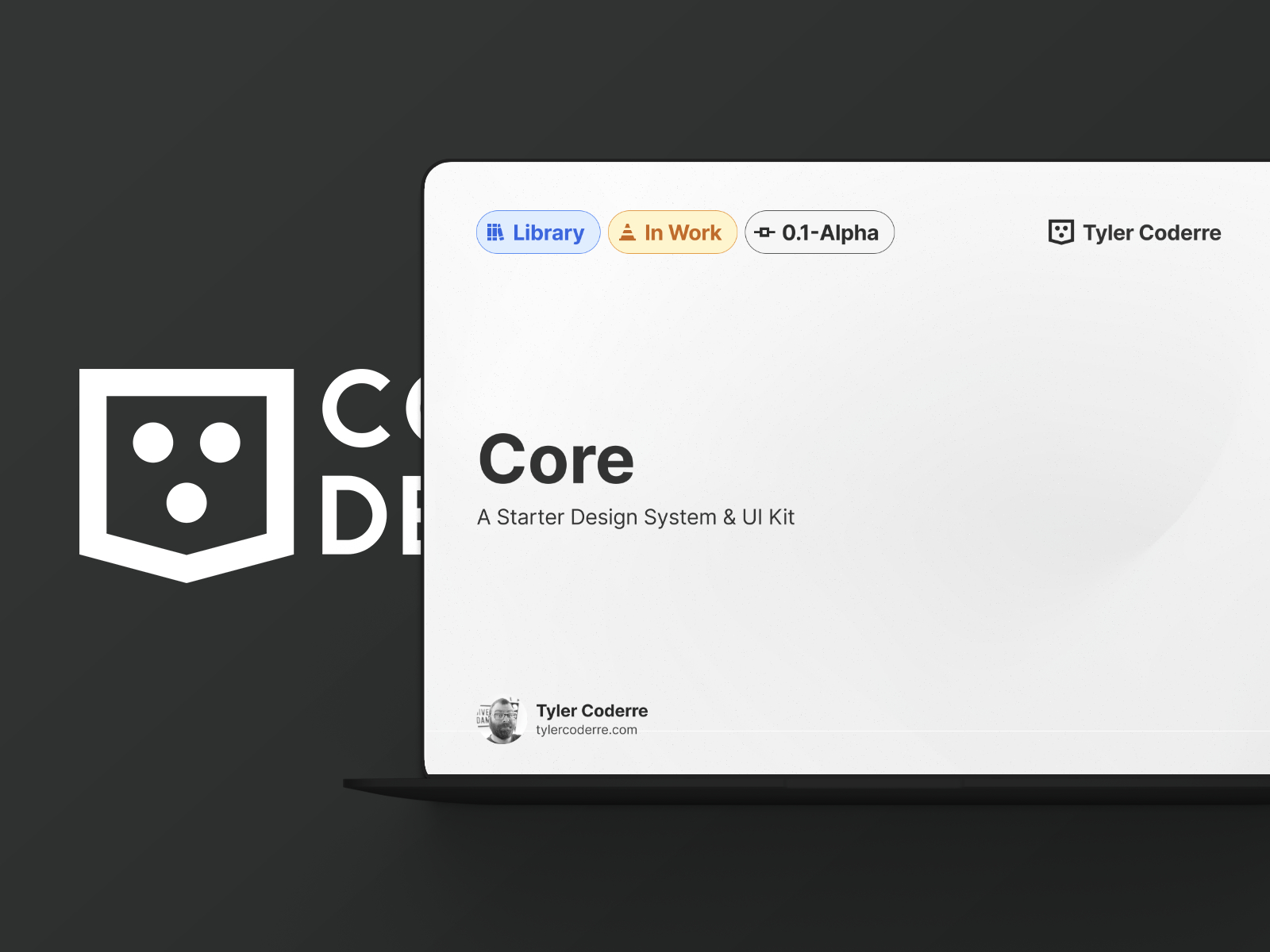
This design library is a growing, living experiment. I'll keep updating this case study as the system evolves.
Over the past several years, I have led and contributed to the creation, evolution, and governance of multiple enterprise-scale design systems. These systems supported complex products used by large organizations, internal teams, and external customers, often across multiple brands and white-label implementations.
In parallel, I built and maintained a personal design library to continuously practice and refine system thinking. This library acts as a proving ground for accessibility-first decisions, scalable token structures, component APIs, and documentation patterns that translate directly into enterprise environments.
This case study highlights how I approach design systems holistically. From visual foundations and components to documentation, file organization, accessibility checks, and developer handoff.
Challenge
Across multiple enterprise projects, design systems were fragmented, inconsistently documented, and difficult to scale, with accessibility, file organization, and hand-off practices varying widely between teams.
Solution
I led and contributed to building standardized, accessible design systems supported by clear component structures, Figma organization, documentation, and repeatable processes, validated through real enterprise work and my own evolving design library.
I have worked on multiple enterprise design libraries across ITX and client engagements. These systems varied in maturity and scale, from early foundational efforts to large, legacy ecosystems requiring standardization and cleanup.
Common challenges included:
My role often involved setting standards, creating shared libraries, improving documentation, and aligning design and engineering workflows.
Alongside client work, I created a personal design system to intentionally stress-test ideas that are difficult to explore inside production environments.
This library was designed with:
Many patterns refined here later informed real enterprise systems.
This system currently includes coverage for:
Color, typography, iconography, radius, shadows, patterns, and focus rings.
Grid systems, spacing, skeletons, slots, and responsive sizing.
Menus, tabs, breadcrumbs, pagination, steps, carousels, and overflow patterns.
Buttons, links, labels, dividers, captions, and segmented controls.
Tables, lists, metrics, timelines, avatars, badges, tags, tooltips, and more.
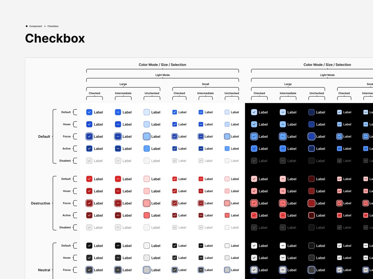
Inputs, checkboxes, radios, selects, pickers, forms, sliders, toggles, and upload patterns.
Modals, banners, notifications, progress indicators, loading states, and confirmations.
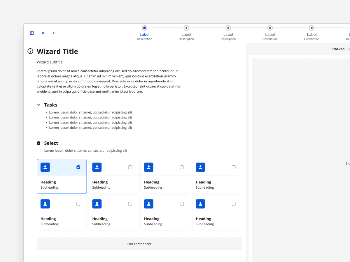
Headers, footers, cards, drawers, panels, sidebars, wizards, and results.
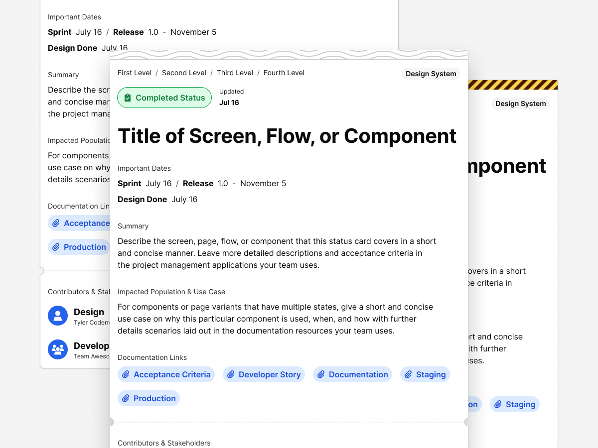
Change logs, feature documentation, specifications, handoff notes, and decision records.
This structure allows designers, developers, and stakeholders to quickly understand what exists, how it is used, and where to contribute.
A core focus of my work has been clear, scalable Figma file structure. The goal is consistency, discoverability, and ease of contribution across large teams.
The design system is organized into logical page groupings, including:
This structure allows designers, developers, and stakeholders to quickly understand what exists, how it is used, and where to contribute.
I approached this like any product design challenge — define, test, refine, document.
This system is built on universal UX principles:
| Principle | Application |
|---|---|
| Clarity | Simple forms, high contrast, clear typography. |
| Consistency | Predictable patterns build user trust and reduce learning curves. |
| Feedback | Accessible focus and hover states reassure users their input matters. |
| Performance | Fast load times and reduced dependencies improve experience and confidence. |
| Scalability | Tokenized structure makes it easy to grow without redesigning. |
Tools evolve, but the mindset stays the same.
I used Illustrator and Affinity Designer for vector and logo work, Photoshop and Affinity Photo for images, Figma for systems and page design, and VS Code + GitHub for build and version control.
I'm always exploring new tools — though it's come a long way from the days of editing CSS in Sublime Text with no syntax highlighting and pure faith.
Every iteration teaches refinement. Constraints created focus, and simplicity led to flexibility.
Next steps include exploring lightweight micro-interactions, adding user preference storage for accessibility options, and expanding the design system for multi-theme applications.
Minimalism isn't about removing — it's about revealing what matters. This project became proof that accessibility, performance, and UX all strengthen each other when treated as one discipline.
It's a live case study that continues to evolve, just like the work I create for clients.
This case study will keep growing with new experiments and refinements. It's not a snapshot — it's a living document of how I approach design problems.
If you're looking for a designer who blends design systems, accessibility, and UX strategy with the precision of a developer — you're already seeing the results.
You can contact and connect with me through email, on Dribbble, or LinkedIn as well.