A Higher Educated Web Presence.
- Design
- UI + UX
Framing the Work for Trocaire College.
At A Glance: A recruitment-focused website redesign and digital refresh to strengthen Trocaire College’s story, improve admissions conversion, and make next steps (apply, visit, request info) easier to find and complete.
Role: UI + UX Designer (Website Experience + Key Marketing Touchpoints).
Partners: Admissions, Marketing, And Internal Stakeholders. Supported By A Development Team.
Scope: Website Redesign, Messaging Integration, Program And Directory Templates, Admissions Forms, And Digital Campaign Assets.
Tools: Sketch, InVision, Illustrator, Photoshop, After Effects, And Web-Ready Design Specs.
Constraints.
- Content Complexity: balancing academic detail with fast, confidence-building recruitment messaging.
- CMS Maintainability: patterns needed to work in WordPress so the team could keep content current.
- Clarity And Conversion: navigation and CTAs had to guide prospective students without friction.
What I Owned.
- Information Architecture And Page Patterns Designed Around Recruiting Journeys.
- Homepage Concepting And Interaction Design For The “Choose Your Path” Storytelling Grid.
- Core Templates For Programs, Directories, And Campaign Landing Pages.
- Multi-Step Form UX To Make Longer Admissions Forms Feel More Approachable.
- Visual Design And Campaign-Support Assets Used In Digital Marketing.
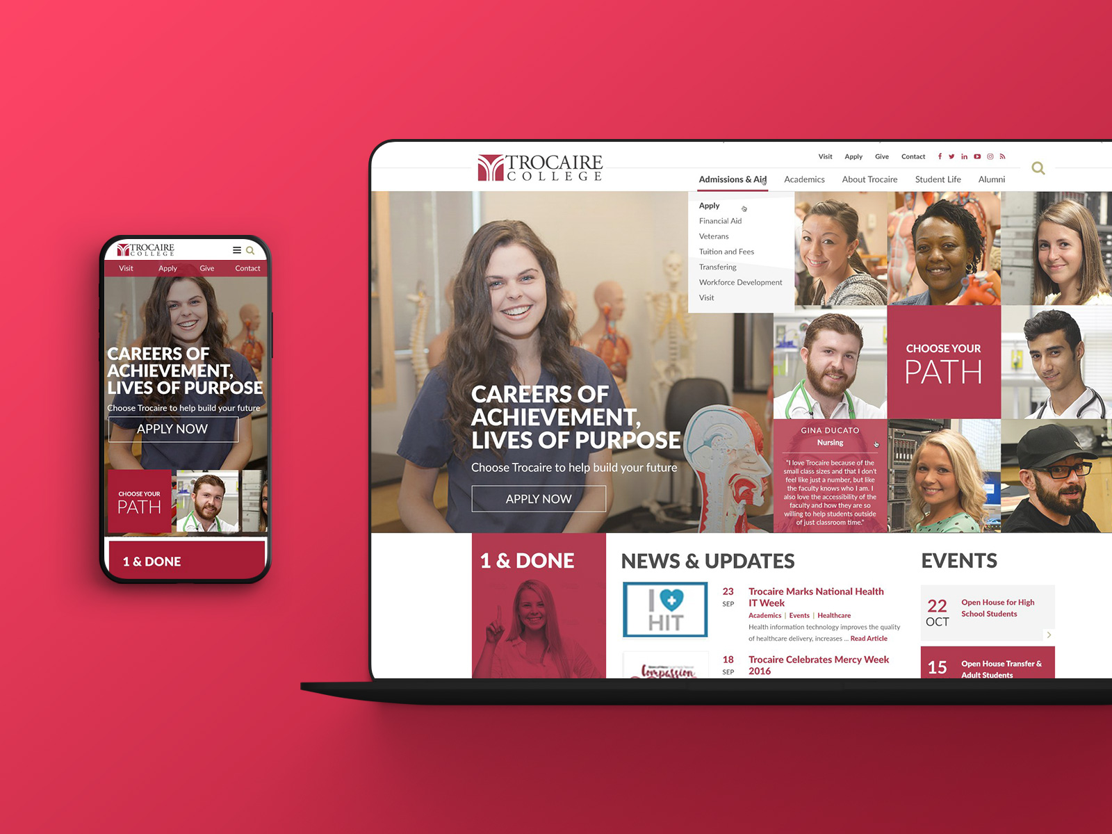
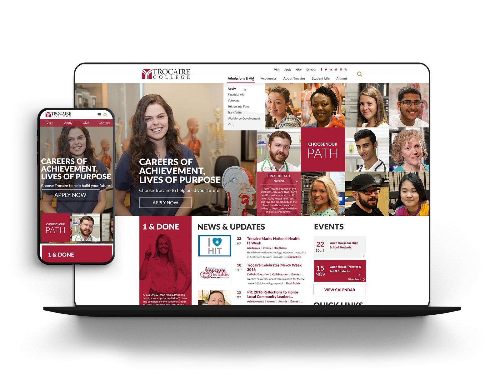
The Trocaire Website.
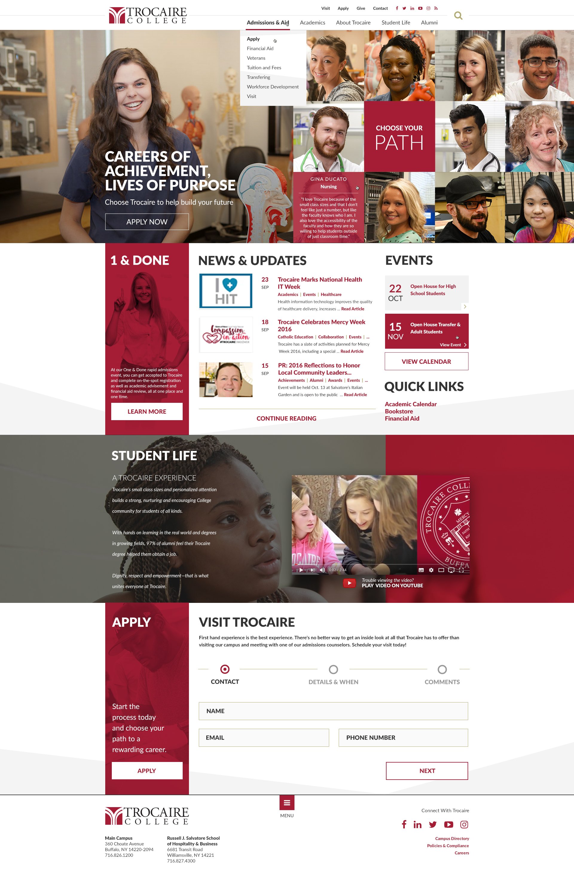
The responsive website experience reinforced Trocaire’s brand through the “Choose Your Path” message, brought to life with a custom homepage grid. The experience was designed to feel personal and student-centered, while keeping key actions like applying, visiting, and requesting info easy to find.
Results Highlights: The outcomes below reflect the impact of the new experience and supporting campaigns.
Nearly doubled conversion of prospects to applicants
Was recognized by an international college awards program
Increased application and acceptance rate
Exceeded enrollment goals by 17.5 percent year one
Awards and Recognitions.
- 2017 Best Use Of Digital Marketing — InfoTech BETAS 2017
- Silver Excalibur Award, Website Relaunch — Public Relations Society Of America (PRSA)
- Honorable Mention, Websites: Institutional Home Page — Council For Advancement And Support Of Education
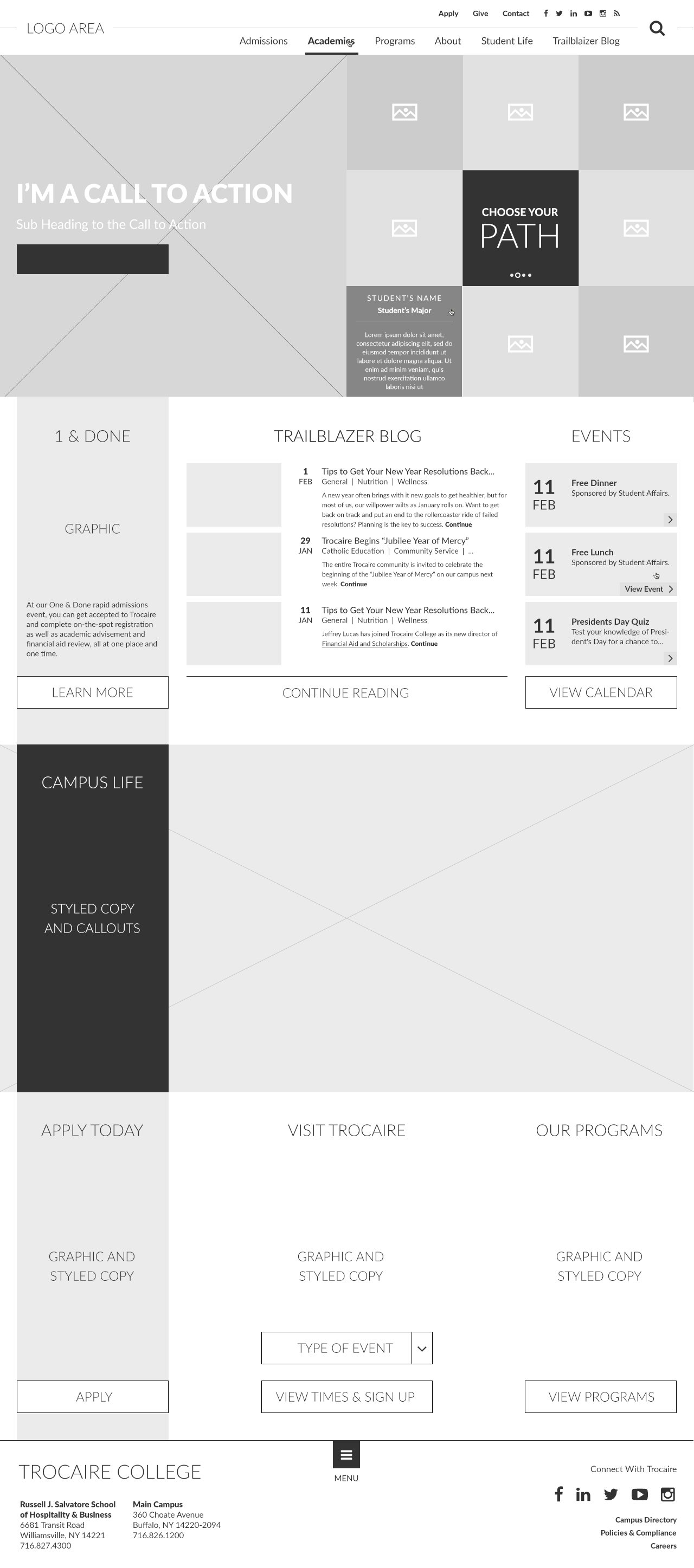
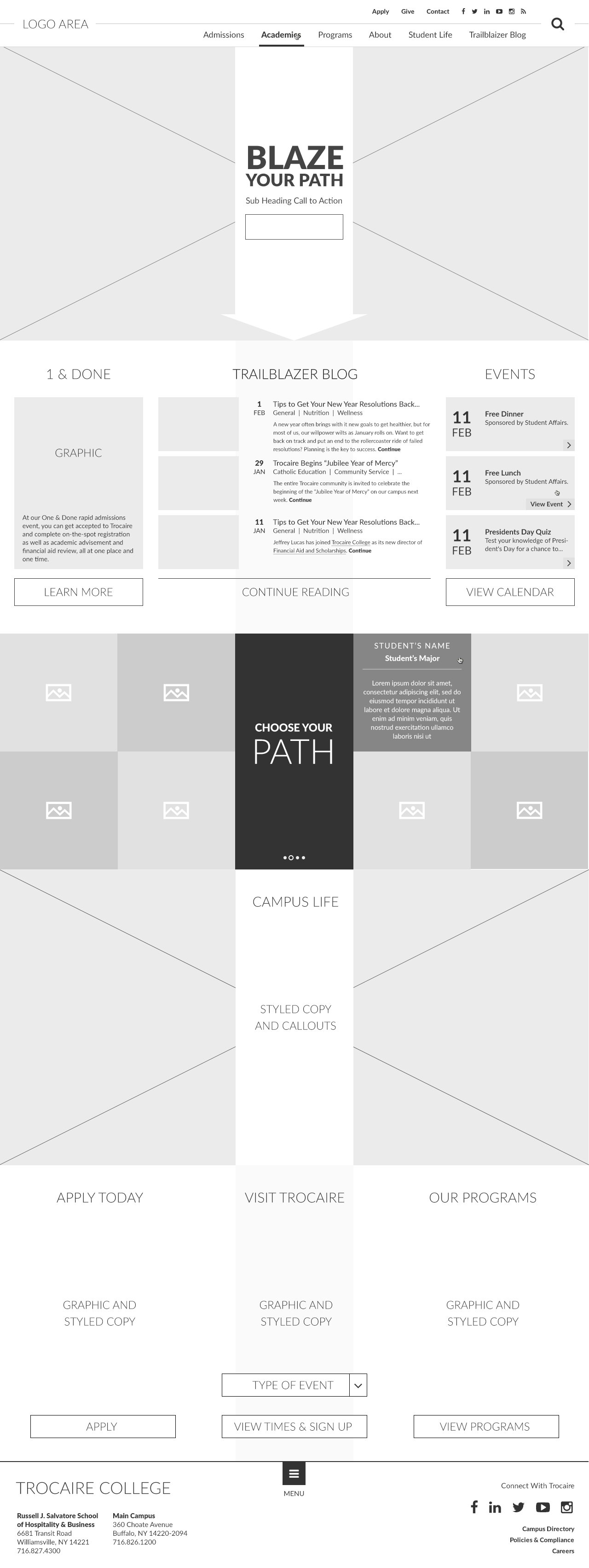
The Concept.
From the beginning, I wanted to highlight student stories through the “Choose Your Path” concept. I presented four layout directions in desktop and mobile to validate content flow and early interaction decisions before committing to a single direction.
The path theme started after I noticed the college’s original logo and newsletter used the name “Trailblazer,” which suggested a natural narrative thread. “Blaze Your Path” was the first iteration and later evolved into “Choose Your Path” as the messaging refined.
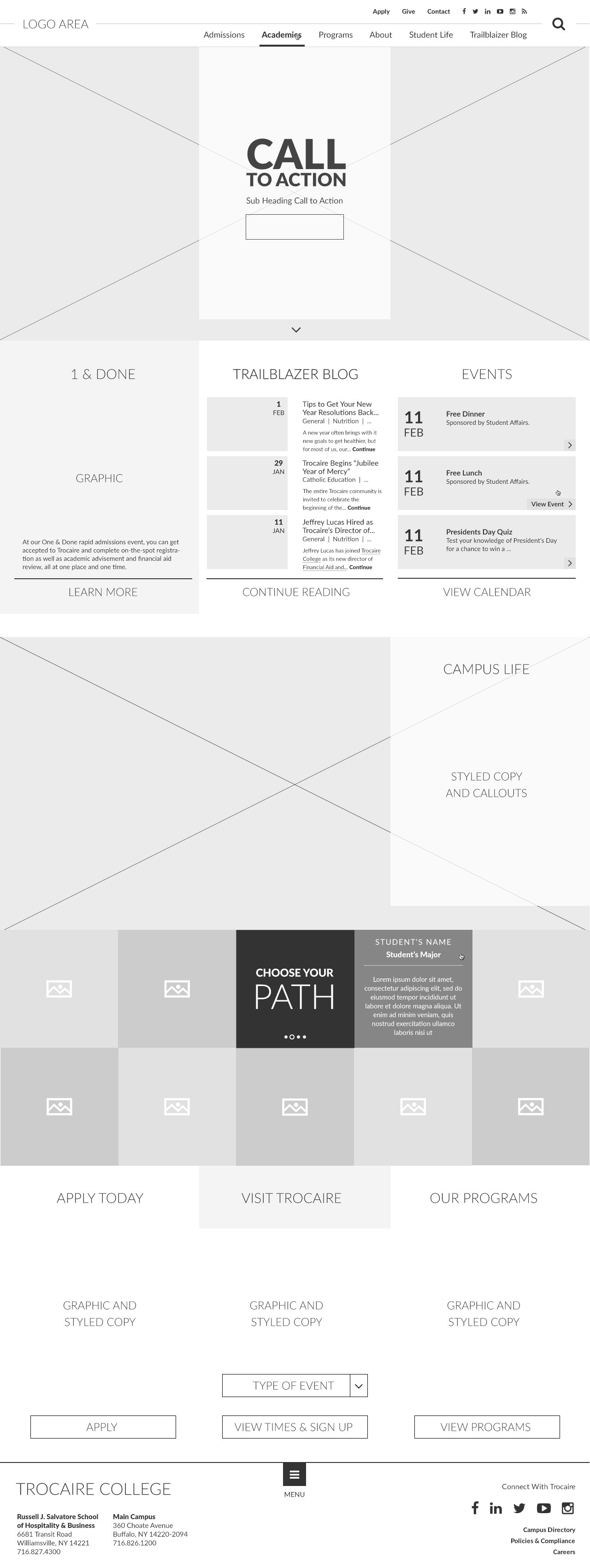
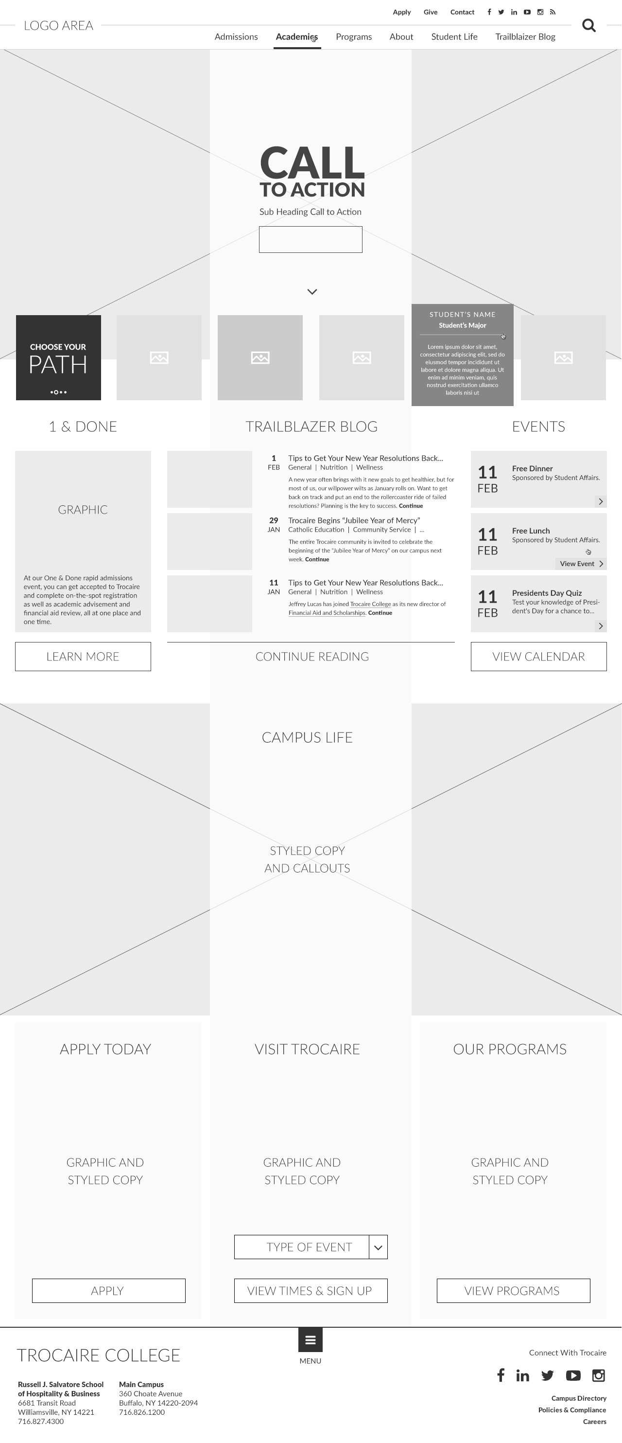
Homepage.
The homepage offered a brief overview of what to expect from Trocaire College through the Choose Your Path interactive element, as well as campus highlights, and calls to action for applying and visiting the campus.
Multi-Step Forms.
Multi-step forms were used in instances of the site where the college needed to collect more information than a general contact form. The multi-step forms were used to help break up the fields into more digestible chunks with a clear indicator of progress.

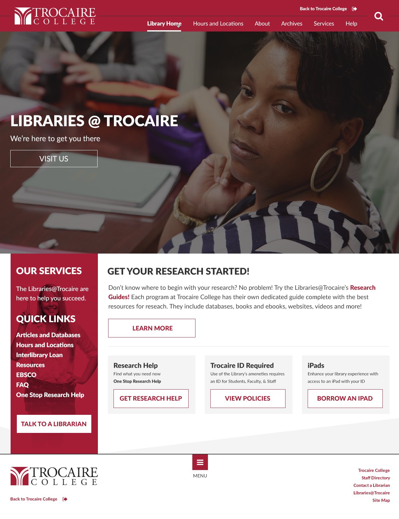
Multi-Site Differentiation.
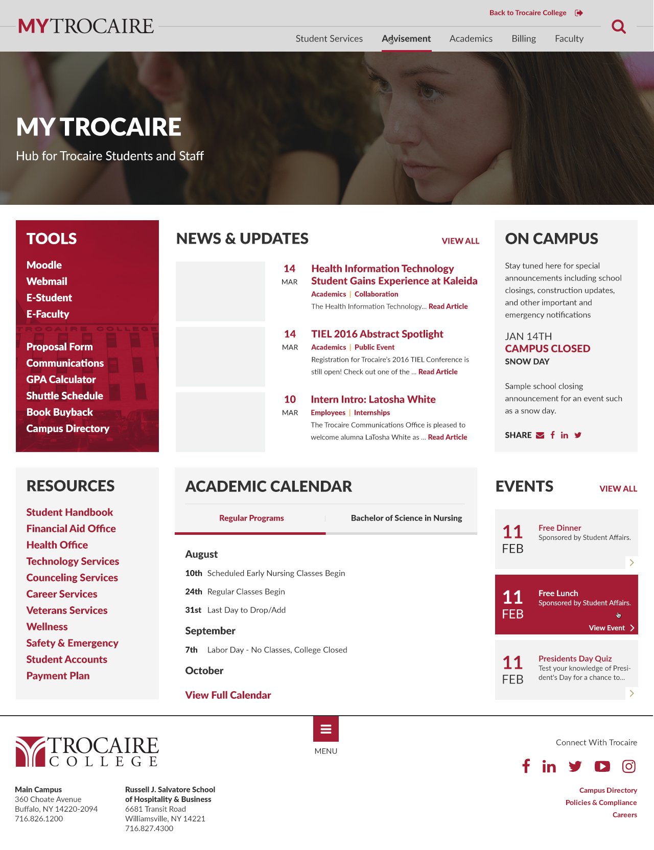
For our build of Trocaire's website we also had to take into consideration two internal facing sections of the site. Previously navigation to these internal facing areas of the site was confusing where you were and how to navigate back to the same site. The original MyTrocaire student hub used the same navigation as the main site but rearranged and changed all the links and the Library page had been built on a separate WordPress setup and didn't match the same design.
The Solution.
The solution was to keep the same general navigation layout but to color code the three as well as give each their own logo so you know where you are and have a link back to the main homepage.
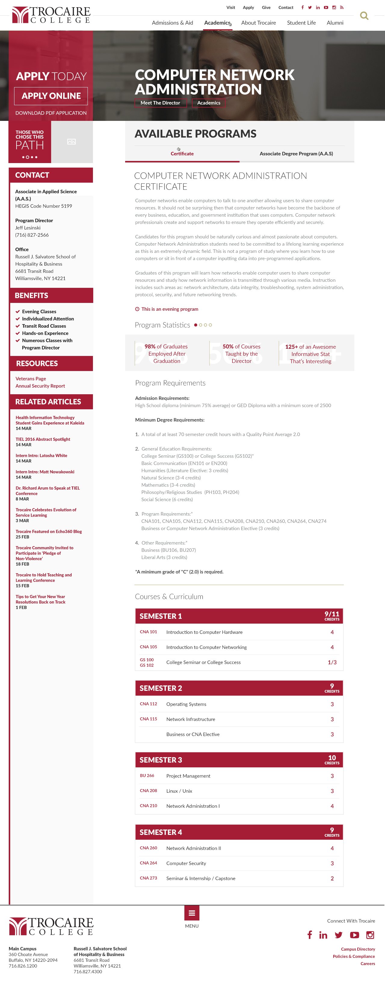
Degrees & Certificates.
Each degree and certificate program had its own in-depth page with a full breakdown of the program. This outlined benefits and descriptions, placement stats, course road map, department head contact information, choose your path stories from program participants, and links for more information and application.
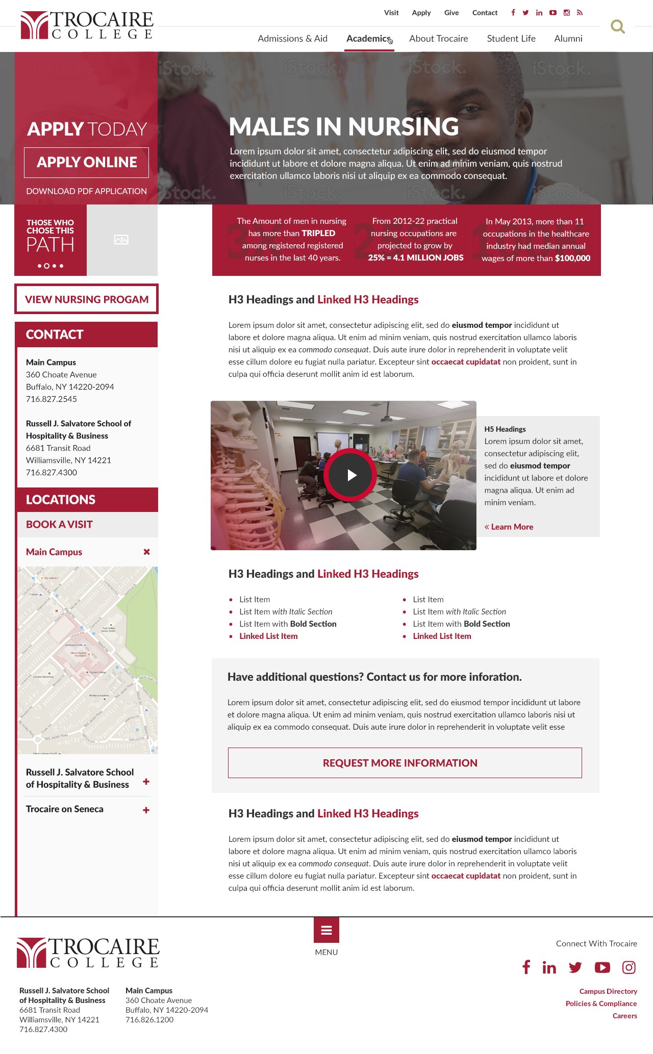
Highlighted Campaign Landing Pages.
Select programs had targeted campaign landing page designs. This templated landing page was designed to be shorter and more impactful to draw attention and curiosity to the campaigns it was a part of. For those who wanted more information, call outs to the program's main information page and contact links were provided.
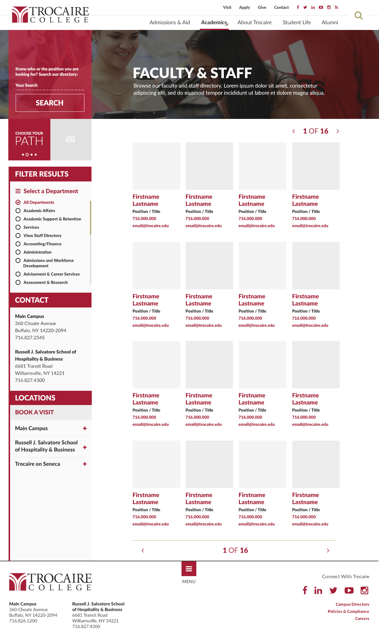
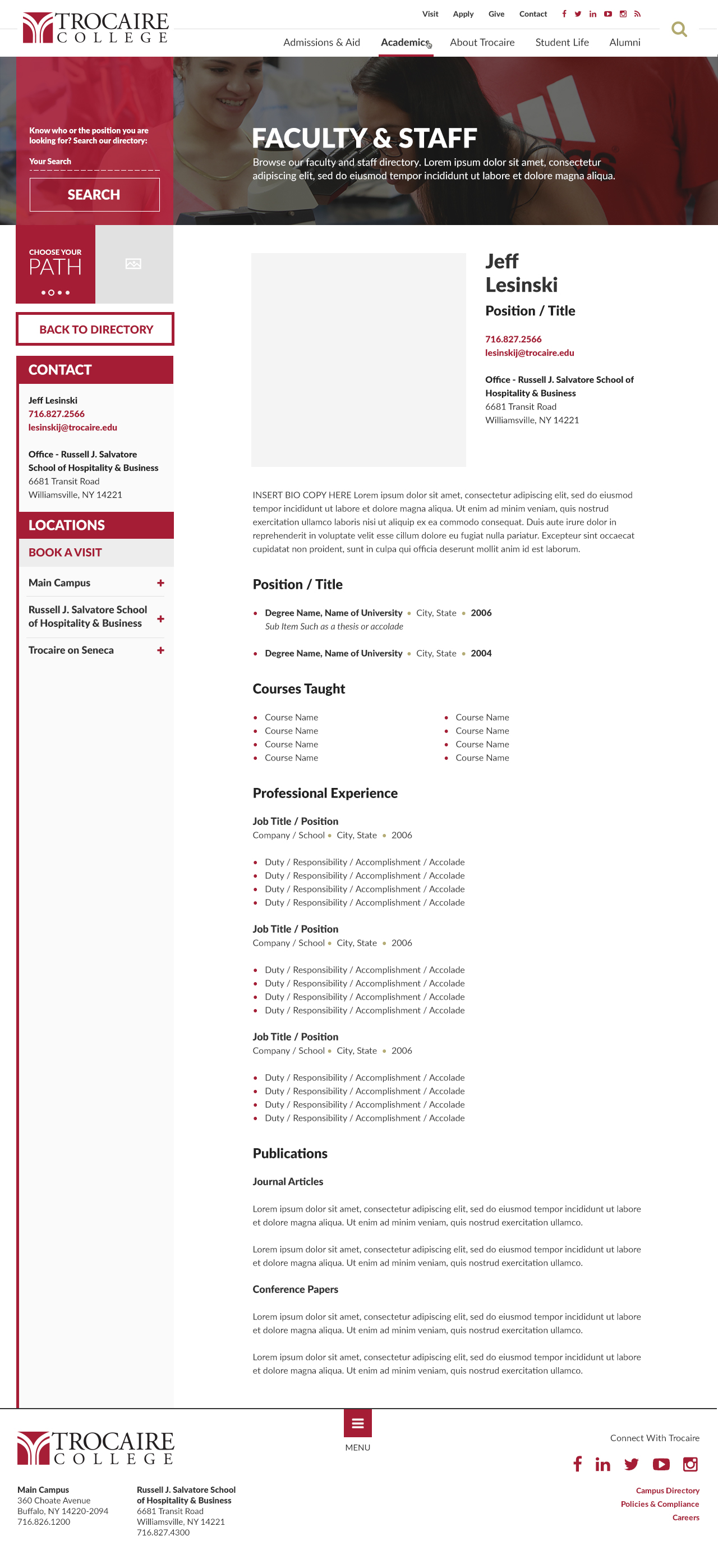
Filterable Directories.
To make it easier for students to find, identify, and get in touch with faculty and staff, a robust and extensible directory was designed to be quick and intuitive to use. A standard template was designed and developed for a solid baseline to continue to be developed on. Since WordPress runs the back-end, updating and maintaining staff entries is as easy and intuitive as writing a blog post.
Client Testimonial.
Hearing directly from the client helped validate the direction and reinforced what mattered most: clarity, confidence, and an experience that makes it easier for prospective students to take the next step.
Still Curious?
Browse One of My Other Case Studies, Writings, Resources, Or Reach out for a Chat.
You can contact and connect with me through email, on Dribbble, or LinkedIn as well.