A New Web Presence for the Walsh Family.
- Design
- UI + UX
Framing the Work for Walsh Duffield.
At A Glance: Led UX and UI design for a new, story-driven website that helped Walsh Duffield communicate their family values, simplify complex insurance content, and support two business goals: cultivating new clients and attracting great talent.
Role: UI + UX Designer (Web Experience, Persona Development, And Supporting Creative).
Partners: 19 IDEAS Strategy + Development Team, And Walsh Duffield Stakeholders. Photography + Video Produced By 19 IDEAS.
Scope: Responsive Website Redesign, Information Architecture, Content Simplification, Interactive Timeline Concept, And Print Advertising.
Tools: Sketch, InVision, Illustrator, Photoshop, After Effects, And HTML/CSS Handoff Specs.
Constraints.
- Wide Audience: insurance serves many age groups, so the experience needed to feel modern without alienating older demographics.
- Content Density: reduce “insurance jargon” and consolidate pages without losing trust or clarity.
- Story + Utility: balance culture and history storytelling with clear paths to contact, services, and careers.
What I Owned.
- Persona development to clarify key audience segments and decision drivers.
- Information architecture and page patterns designed for quick scanning and clear next steps.
- Homepage and core template UX, including interaction concepts and responsive behavior.
- Visual design system application across web pages and supporting creative.
- Print advertising aligned to the site messaging and refreshed presentation.
Outcomes.
- A modern, responsive site built on modular sections for maintainable content growth.
- Clearer navigation and consolidated content that made offerings easier to understand.
- Storytelling moments (history, culture, and people) that supported both clients and recruiting.
Persona Development.
To tell the story well, we first needed to understand who we were speaking to. I led persona development to clarify the different audience segments Walsh Duffield serves and what each group needs to feel confident taking the next step.
- Families And Individuals: looking for clear guidance, trust, and simple explanations.
- Business Owners: focused on risk, coverage clarity, and responsive support.
- Future Employees: evaluating culture, stability, and growth opportunities.
Brand Promise: Safe & Well.
While this project didn’t start as a full branding engagement, the strategy work helped formalize a simple brand promise that carried through the experience: keeping every Walsh Duffield employee and customer Safe & Well. It became an anchor for messaging, hierarchy, and how we framed services in human terms.
Copy and Content Counts.
Personas and the brand promise made one thing obvious: the content needed to be simpler. The experience focused on plain English, clearer navigation, and storytelling that felt personal instead of corporate.
- Reduced and consolidated pages to remove duplication and confusion.
- Restructured navigation so users could find services faster.
- Shifted copy away from jargon and toward real-world benefits.
- Elevated history and culture storytelling without burying calls to action.
The Walsh Website.
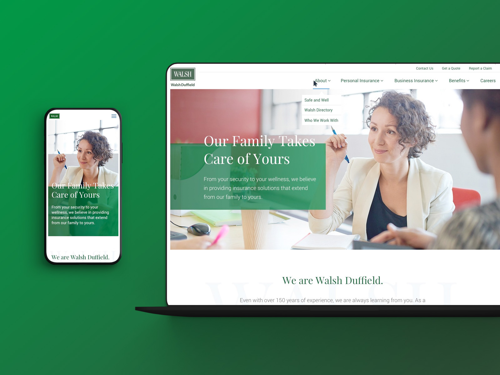
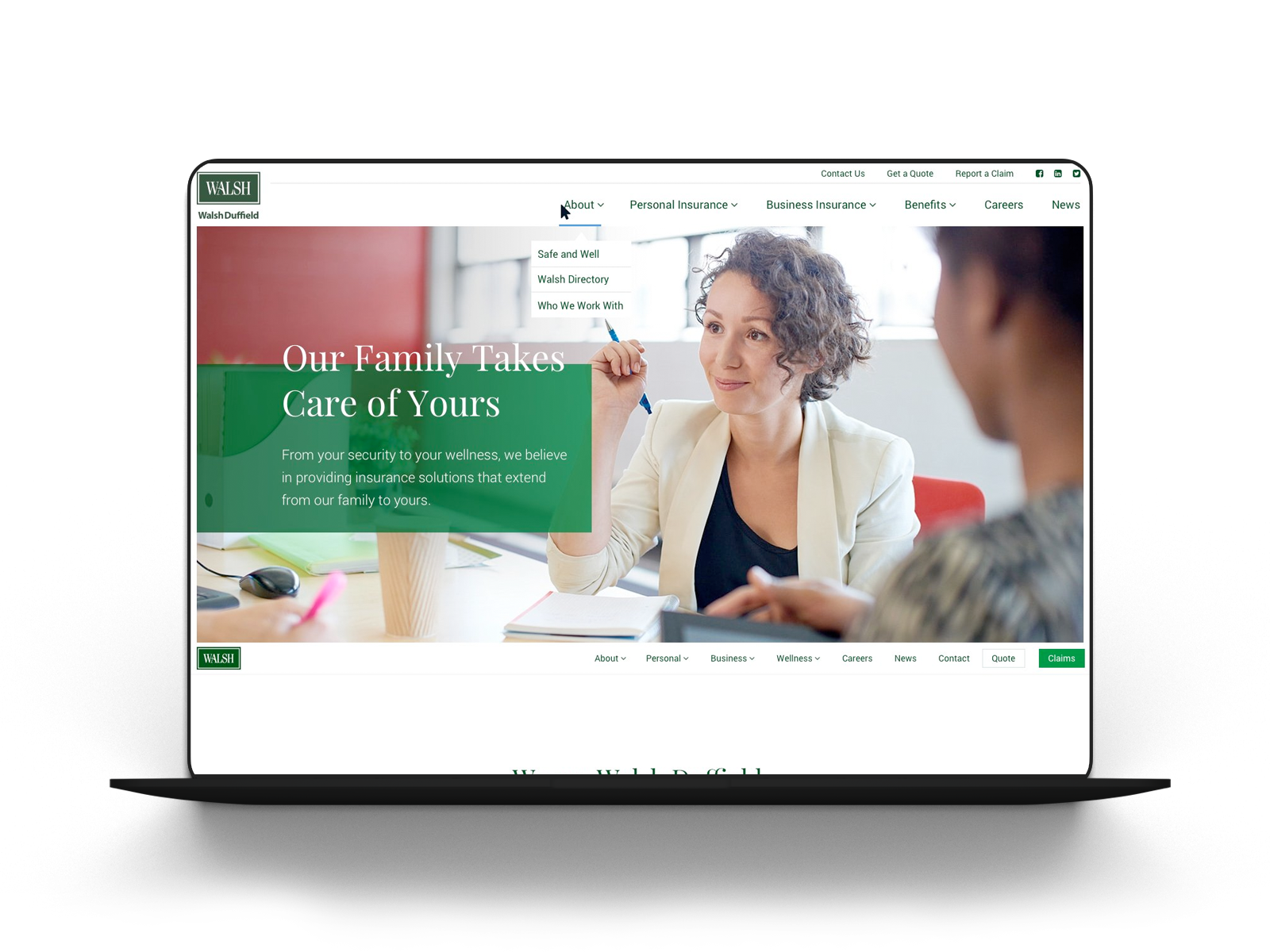
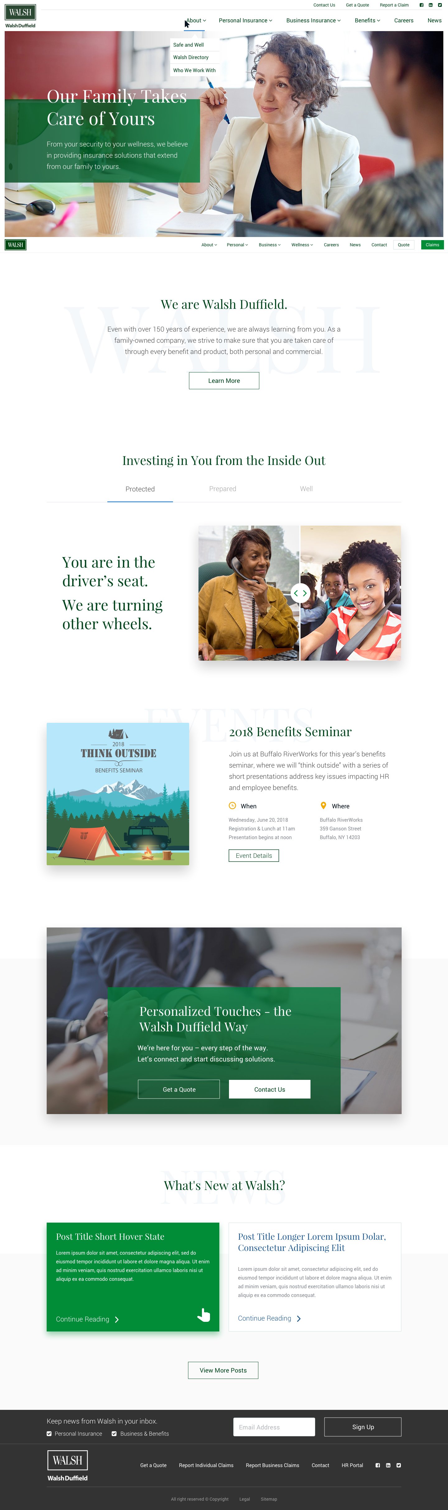
The website was designed as a modern marketing and recruiting platform. It balances story and credibility (history, culture, people) with utility (services, contact, careers) and uses a modular system so pages can evolve without redesigning from scratch. The experience was built to work well for both younger and older audiences across mobile and desktop.
Designed a modular system to be responsive across devices
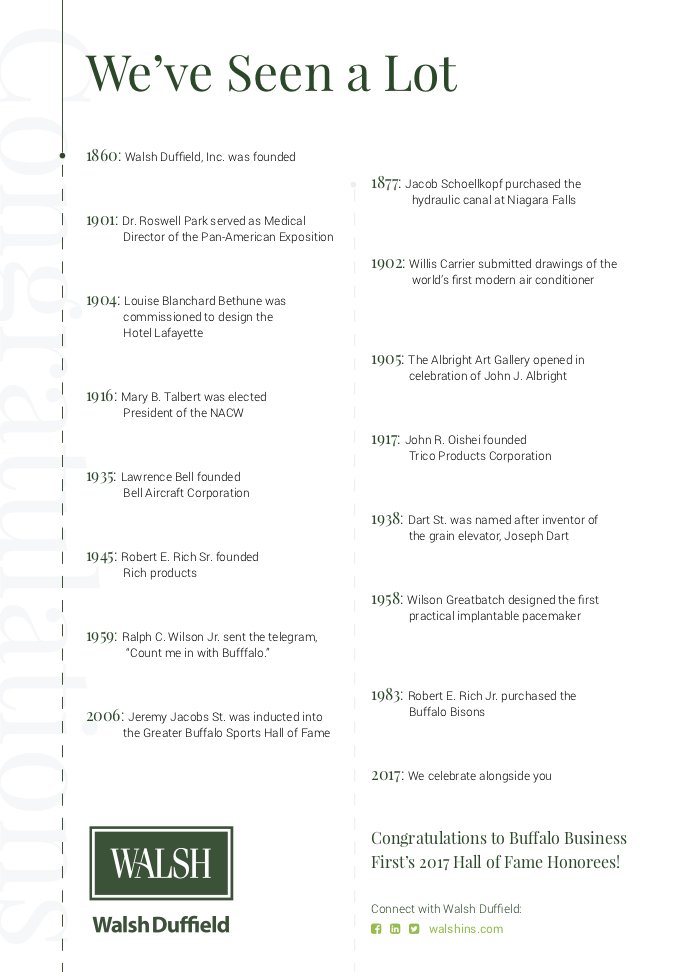
Featuring an interactive tree timeline of company history
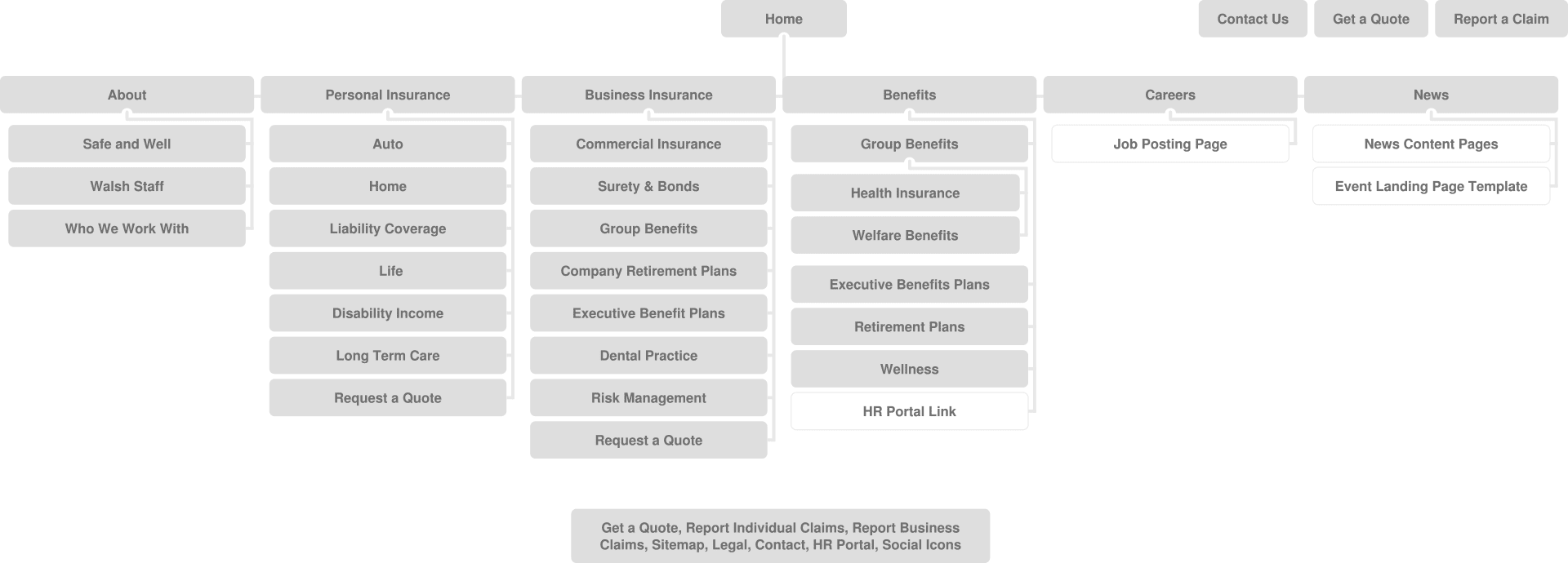
Introduced a streamlined and restructured sitemap and content strategy
Featuring 19 IDEAS shot photography and video
Homepage Pattern.
For the homepage, we wanted to communicate a brief overview of the Walsh Duffield Company's family values approach to their business. Being one of the oldest family-owned companies in Buffalo and how they treat their employees and customers, we wanted to convey that to the public.

Streamlined & Refined.
The new sitemap for Walsh Duffield streamlined and restructured the content from their original website. The goal was to keep information clear and concise as well as easily accessible. To accomplish this many pages were trimmed and combined to create this new structure.
About Walsh Duffield.
The About experience dives deeper into Walsh’s values and history, then caps it off with a video (produced by 19 IDEAS) and an interactive timeline inspired by tree rings. The goal was to make the company’s long history feel human, not corporate.
Early Concepts.
These early wireframes show the modular foundation of the site. As content and messaging evolved, the layout shifted toward a more concise, streamlined approach. We also explored ways to separate business and personal lines of service before landing on a simpler structure that supported quick scanning and clearer next steps.
The Little Things.
Beyond page layouts, the experience benefited from a long list of small decisions that added up: clearer hierarchy, subtle interactions, and better storytelling moments throughout. The broader engagement also included strategic considerations like refining how the site is discovered and understood, which helped the new experience feel cohesive end to end.
Print Work.
In addition to completing the web redesign for Walsh Duffield, I completed various other graphic design work as well including print advertising.
Still Curious?
Browse One of My Other Case Studies, Writings, Resources, Or Reach out for a Chat.
You can contact and connect with me through email, on Dribbble, or LinkedIn as well.