The Ultimate Destination-Wedding Website.
- Design
- UI + UX
Framing the Work for DanandKat.ie.
At A Glance: Designed a private destination-wedding experience that simplified travel planning for guests while giving the couple complete visibility into RSVPs, schedules, and payments. The site blended storytelling and logistics into one seamless portal.
Dan and Katie hosted a four-day celebration across two Irish counties, plus a hometown event in Dublin. Most guests were traveling from outside Ireland, so the website needed to remove friction and make planning feel effortless. I led the UX and UI design, with a contracted illustrator contributing the bespoke artwork used throughout the experience.
Role: UX + UI Designer, Experience Strategy, And Visual System Execution.
Partners: 19 IDEAS Development, Client Stakeholders, Illustration Contractor.
Scope: Destination Wedding Website, Guest Accounts, RSVPs + Payments, Itinerary Builder, And Admin Dashboard.
Tools: Sketch, Illustrator, Photoshop, UX Flows, And HTML/CSS Handoff Specs.
Constraints.
- Complex Logistics: four days, multiple locations, and varied guest journeys had to stay clear and digestible.
- Global Audience: guests traveling internationally needed a single source of truth for planning.
- Secure Data: RSVPs, payments, and personal details required private accounts and admin oversight.
What I Owned.
- Information architecture for itinerary, travel, and RSVP flows.
- UX design for private guest accounts, payments, and admin dashboards.
- Visual system and layout direction, including illustration integration.
- Responsive behaviors and interaction specs for development.
Outcomes.
- A single portal that reduced planning friction and centralized all wedding details.
- Digital RSVPs and payments that simplified logistics across multiple events.
- A private admin view that organized 50+ data points for guest coordination.
Simplifying a Thousand Moving Parts.
The site focused on three core goals: build a seamless itinerary around the four-day event, provide a one-stop hub for any question or detail, and collect RSVPs plus advance payment in one place. I structured the experience as a step-by-step flow that moves guests from high-level context into personalized schedules, travel guidance, and RSVP actions.
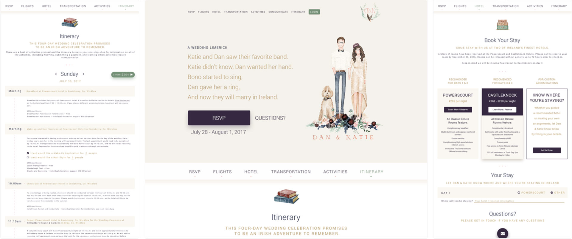
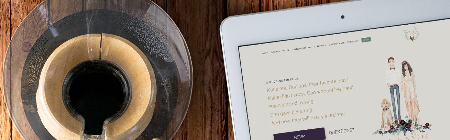
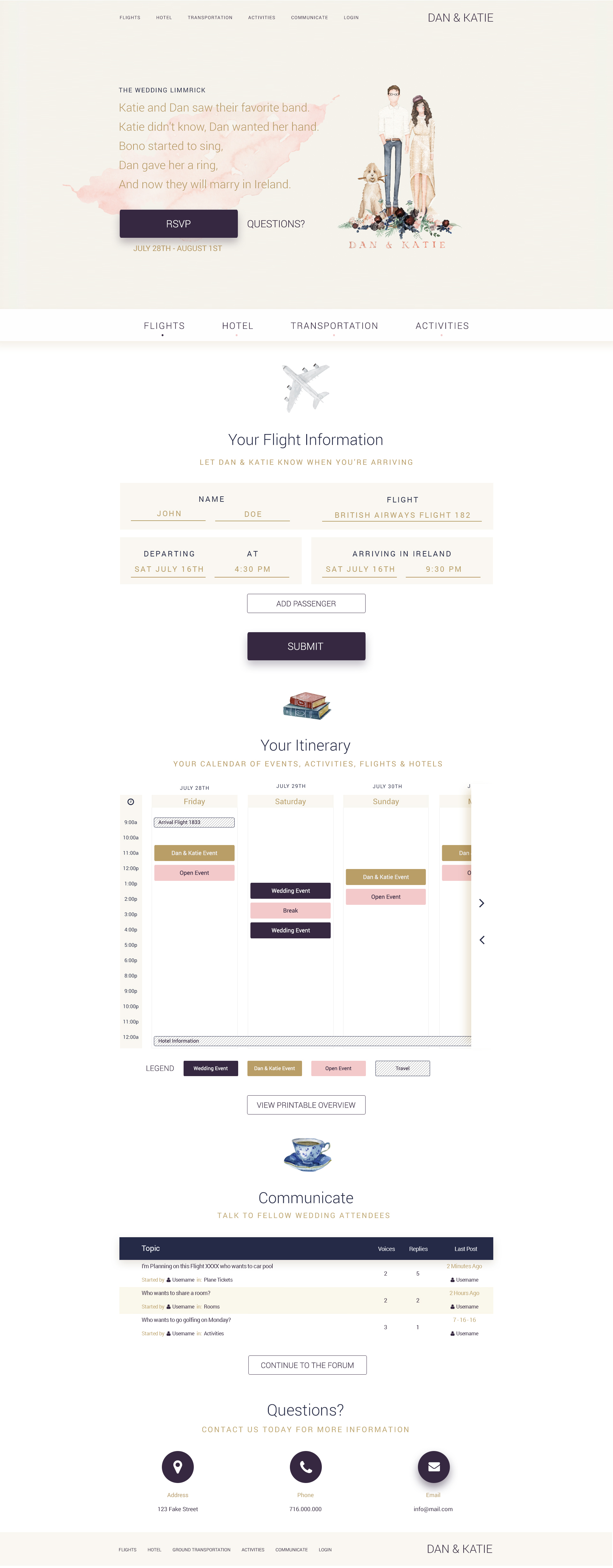
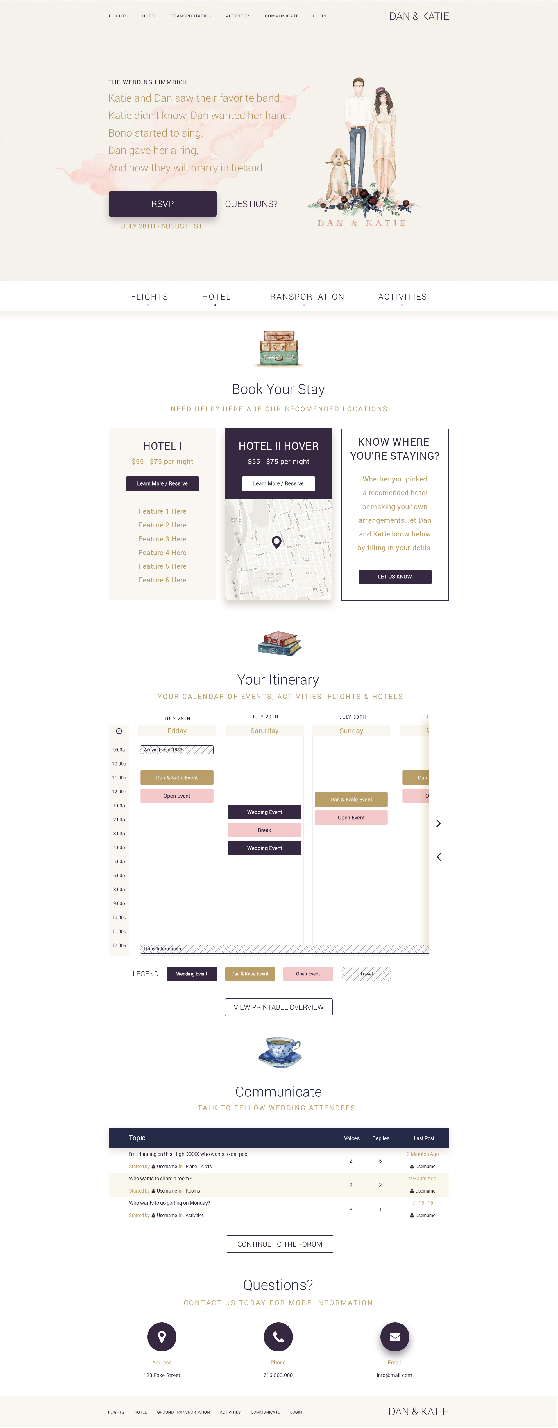
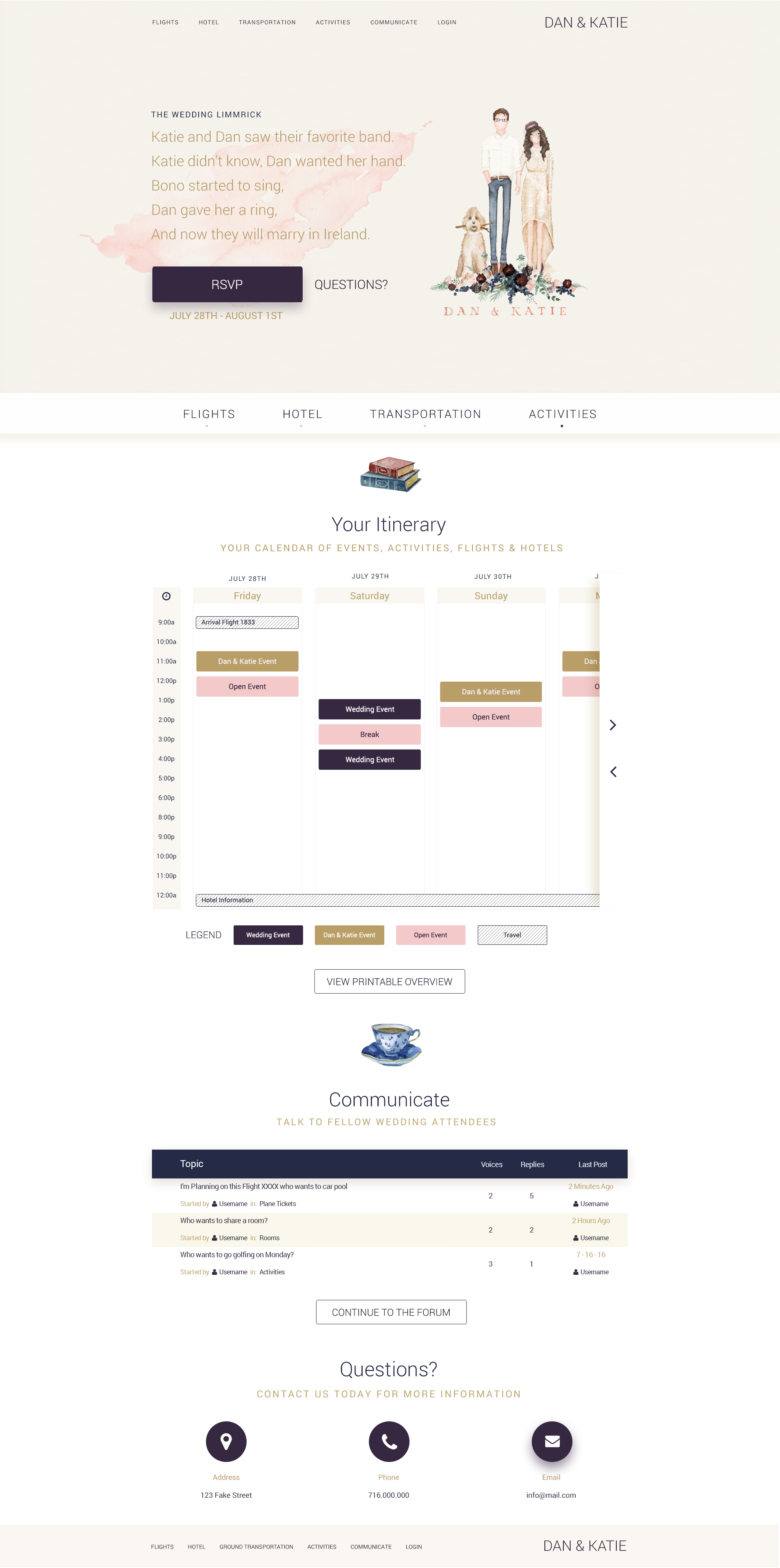
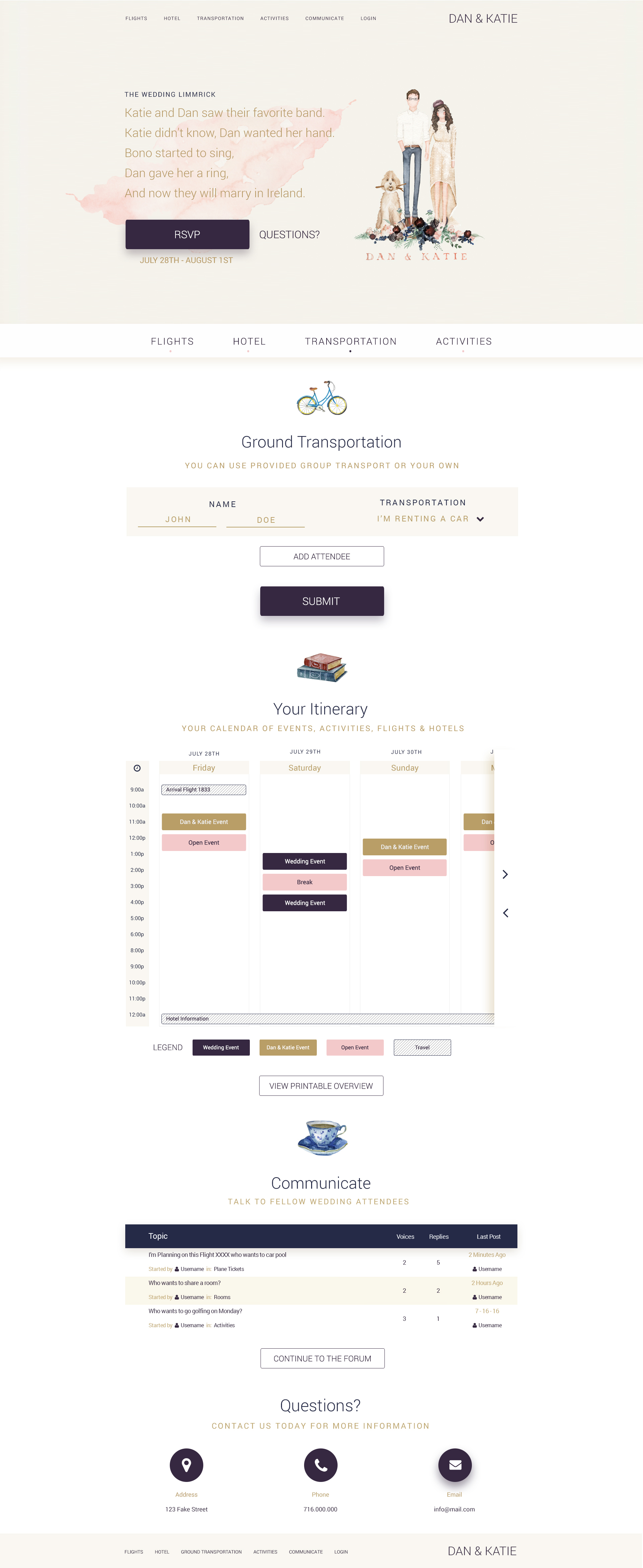
Planning Tabs for Travel Logistics.
Tabbed navigation organizes the most time-sensitive details—flights, hotels, and transportation—so guests can jump directly to what they need without digging through long pages.
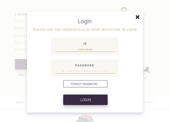
Private User Accounts for RSVPs.
Instead of paper RSVPs, guests created secure household accounts from credentials included in their invitations. Each household could enter attendee details, dietary restrictions, and travel information, keeping everything centralized and easy to manage.
Activities and Transportation at a Glance.
Activities and travel sections were designed to be scannable at a glance, helping guests build their trip timeline without bouncing between emails, PDFs, and spreadsheets.
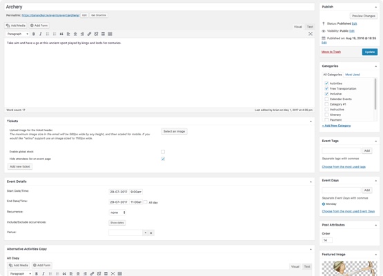
Administrative Controls.
To keep things flexible, administrative users could edit RSVP data on behalf of guests, ensuring the couple always had the most current information. The system captured 52 unique data fields and generated a downloadable spreadsheet to keep planning organized.
Illustrations That Matched the Invitation.
Custom illustrations from the invitation booklet carried into the site to create a cohesive story. I treated the artwork as a core brand asset, making sure it worked across the homepage, itinerary pages, and supporting content.
Wedding Crest and Portrait System.
The crest and illustrated portrait reinforced the wedding’s visual identity and provided a consistent anchor across the guest experience.

Streamlining the User Journey.
We mapped the full guest journey and focused on a clear step-by-step path: read the story, plan travel, RSVP, and confirm event attendance. Every screen reinforced what to do next without overwhelming guests.
Applying a Linear Process.
A stepped process helped guests build their itinerary based on where they were staying, which events they planned to attend, and their travel needs. This kept complex decision trees approachable and reduced confusion.
Testing, Testing.
We ran internal tests across every page, then followed up with four real guests to uncover clarity gaps and improve the RSVP flow before launch.
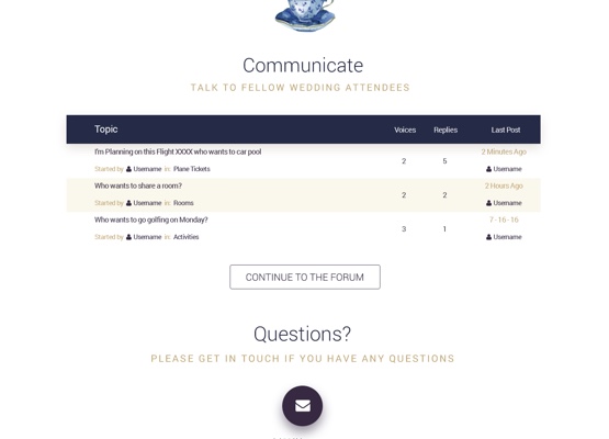
Communication and Payment in One Place.
A private forum enabled updates and guest-to-guest communication, while integrated PayPal payments collected activity fees two months in advance. That meant fewer surprises for travelers and a smoother planning process for the couple.
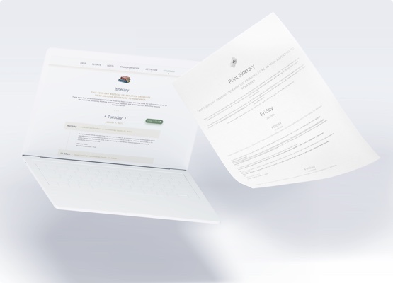
Printable Itineraries.
Each group could download a printable itinerary to use offline during travel, keeping schedules accessible at every step.
Still Curious?
Browse One of My Other Case Studies, Writings, Resources, Or Reach out for a Chat.
You can contact and connect with me through email, on Dribbble, or LinkedIn as well.